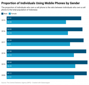
83 Data Visualization: Mobile Phone Usage by Gender in Indonesia
miller9264

This is the data from the original data source translated into English:

You can view the original excel and source here: https://www.bps.go.id/indikator/indikator/view_data/0000/data/1224/sdgs_5/1
I chose a grouped bar chart because I believe that a side by side comparison over time is most appropriate for the data I am presenting, which is data on how many men and women have mobile phones each year. The data provided by the Central Bureau of Statistics is discrete and only included two gender identities, male and female, which makes it simple to visually compare them side by side. Having the bars be proportional to the values they represent also helps emphasize the difference between genders. Considering that gender equality is an issue that can change throughout time, I believed that picking a grouped bar chart could highlight the incremental changes from 2015 to 2020. A visualization like a pie chart would not be accurate, because each statistic is a proportion of individuals within that gender category that own a phone to the total population of individuals within that category. That being said, if a pie chart was used it would be misleading and not add to 100%. I also believe a line chart would be too complex and confusing due to how many years are shown in the data. Therefore, I found a group bar chart to be the most legible and suitable option for presenting this data.
Citation:
Badan Pusat Statistik. (2020) Proporsi Individu Yang Menggunakan Telepon Genggam Menurut Jenis Kelamin (Persen) [Webpage for Data Set] Survei Sosial Ekonomi Nasional (SUSENAS). https://www.bps.go.id/indikator/indikator/view_data/0000/data/1224/sdgs_5/1