123 Country Report: Data Visualization
albertelli5

https://datacommons.org/place/country/NLD?utm_medium=explore&mprop=count&popt=Person&cpv=isInternetUser%2CTrue&hl=en
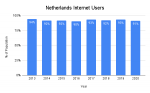
I chose to use a bar graph to display the percentage of internet users in The Netherlands for various reasons. First, a bar graph allows you to compare the usage over the years, and second it provides clear, and easy to read findings. By displaying the percentage of users with the varying lengths of the bars viewers can easily make comparisons.
World Bank, 2020