129 Country Report: Data Visualization
sohal9

- UNESCO (2018). Nigeria. http://uis.unesco.org/en/country/ng?theme=education-and-literacy
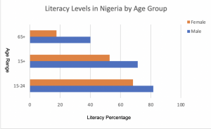
- I chose this visualization tactic because I believe it does the best job of representing the differences between literacy levels in all age groups between males and females. The graph that was created by UNESCO was a time plot of over 25 years; however, it was hard to compare and contrast the differences at each level at a specific period because too much was going on with 9 different lines. For my chart, I focused on the year 18, maintained the 3 age ranges, and got rid of the “total” data point, which represented the average between genders. I decided to follow the topic of literacy levels because it is such an indicator of the future. As Nigeria is the most populous country in Africa, and soon to crack the top 5 most populated countries in the world, I believe that literacy is a very prevalent topic in the country. With such a growing population, a large chunk of Nigeria’s population is extremely young and educating that regeneration is of great importance. Over 75% of the population who is above the age of 15 is educated, and is going to continue to increase. In order for Nigeria to not only grow in population size, but to grow in livelihood, education is a deciding factor which will propel Nigeria’s success.