150 Country Report: Data Visualization
boyer444
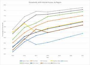
Data Visualization exploring household internet access in different regions of South Africa

As has been discussed a bit in class, Africa as a continent and the individual countries in Africa are often viewed as poverty-stricken with no internet access and poor living conditions. However, this is not the case by any means, as shown by the data set above. I chose to use this data set in order to counteract a common stereotype that many hold today.
This data set and visualization identifies the percentage of households that have access to internet in each region of South Africa. I chose to utilize a line chart to show this data set given the large amount of data over multiple years. A line chart with a line for each region was the most discernable form of visualization that would allow consumers to be able to easily identify information and trends from the data without prior knowledge.
(2021). Possession of Digital Devices and Internet by Region (EuroMonitor; Version 1) [Data set]. EuroMonitor. https://www-portal-euromonitor-com.proxy.lib.ohio-state.edu/portal/statisticsevolution/index