98 Country Report: Data Visualization
mason994
Data from Eurostat:
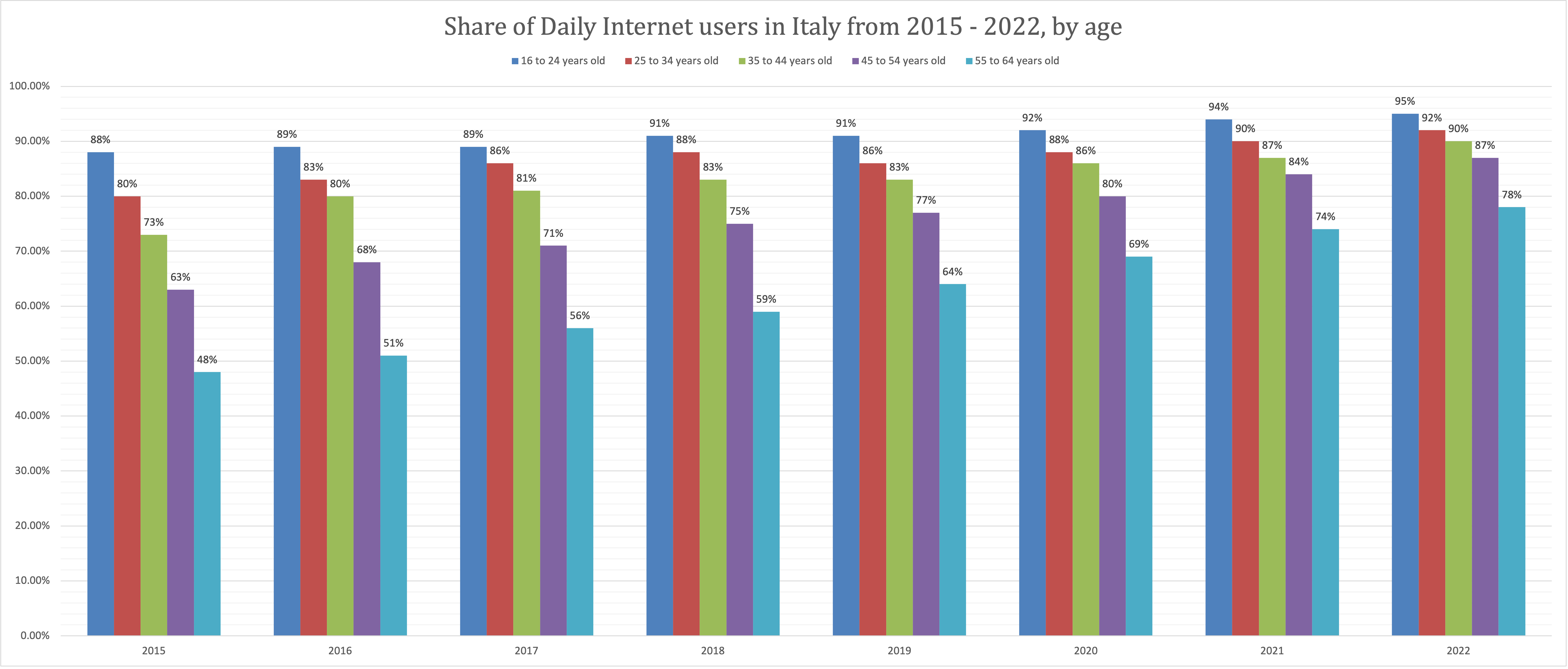
The data I chose represents the percent of Italy’s population that uses the internet daily, segmented by age. I wanted to visualize this data as I think it is important to consider which demographic of the country are primarily using the internet and contributing to the digital footprint of Italy. I will most likely use this information later when analyzing more media created in Italy. Using Excel, I chose to represent the share of people using the internet by age as a clustered bar chart. This variation of a bar chart allows for another level of analysis as it accounts for another variable. I wanted to not only show internet usage in Italy, but internet usage by age. This visualization allows me to break down the daily internet usage both by year and by age. While it does allow for more data representation, the one downside to using this type of visualization is that it can lead to confusion. To combat this, I made sure to use distinct colors and include a legend right at the top of the graph so the user can clearly see what is being represented in the visualization. I also considered using a stacked column chart, but I believe the clustered bar chart is more visually appealing and easier to understand at a glance.
Works Cited
Eurostat (2023). Internet use and activities (ISOC_BDE15CUA) [Data set]. ISOC. https://ec-europa-eu.proxy.lib.ohio-state.edu/eurostat/databrowser/view/ISOC_BDE15CUA__custom_5202437/default/table?lang=en