84 Country Report: Data Visualization
mikalauskas2


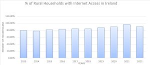
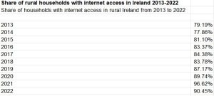
The bar chart above describes the data on the number of rural households in Ireland that have had internet access over the past decade. I chose the bar chart because it allows the viewer to compare each of the years to one another to see the growth of internet access and the drop from 2021 to 2022. This is important because it exemplifies how internet access is not always growing. It could be shrinking due to natural disasters or political uprisings. I believe the bar chart allows viewers to grasp the number of rural citizens that have internet access easily because the years are clearly labeled, as well as the percentages.
Shibboleth authentication request. (n.d.). Retrieved March 1, 2023, from https://www-statista-com.proxy.lib.ohio-state.edu/statistics/1258618/share-towns-rural-households-internet-access-europa-ireland/?locale=en
Shibboleth authentication request. (n.d.). Retrieved March 1, 2023, from https://ec-europa-eu.proxy.lib.ohio-state.edu/eurostat/databrowser/view/ISOC_CI_IN_H__custom_2144558/bookmark/table?lang=en&bookmarkId=d5ac20e3-8958-4082-84c3-3b50c2eb719c