105 Country Report: Data Visualization
cowley38
Births per 1000 people vs. Years (this is a better and more clear link)
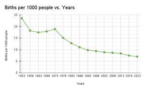
A pressing problem in Japan recently has been their declining birth rate, so I decided to visualize Japan’s birth rate over the past 50 years to present day. Japan’s declining birth rate is a problem because it means that there’s fewer working adults for economic growth, as well as a lack of people to take care of the growing elderly population. To visualize this data, I used a line graph. Using the datavizcatalogue, I saw that line graphs are used to display data over time and that’s exactly what I needed to do, so that’s why I decided to go with a line graph.
This is the source in which I got my data from. I didn’t copy the graph, but used the table listed to create my own graph instead using increments of 5 years. I tried my best to cite the data source in apa, but it pulled data from another source- the UN- and it didn’t cite the source very well.
Macro Trends. (2023). Japan Birth Rate 1950-1923. [Data Set]. Macro Trends. https://www.macrotrends.net/countries/JPN/japan/birth-rate