152 Country Report: Data Visualization
Grace Murphy
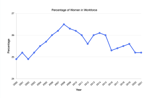
Data source: https://data.worldbank.org/indicator/SL.TLF.TOTL.FE.ZS?end=2021&locations=MA&start=2000
I chose to look at the percentage of women in the workforce in Morocco. I chose to utilize a line graph in order to better visually show the increases and decreases throughout the years. The y-axis depicts percentage while the x-axis shows the respective year. Tracking the ups and the downs in correlation to a certain year can be useful while considering certain historical, cultural, or political events that may have occurred that year in order to result in an increase of decrease in female participation in the workforce. (For some reason, no matter how I uploaded the file for my graph, it came out blurry; the peak is 26.5% in 2008 while the lowest is 24.9% in 2001 and 2002).
Citation: World Bank (2021) Labor force, female (% of total labor force) – Morocco (SL.TLF.TOTL.FE.ZS) [Data set] https://data.worldbank.org/indicator/SL.TLF.TOTL.FE.ZS?end=2021&locations=MA&start=2000