Main Body
Chapter 4. Using Graphics and Visuals Effectively
In this Chapter
- Reviewing types of visuals commonly used in technical documents
- Establishing a standard format for tables, figures, and equations that appear in a document
Most technical communications require more than text to concisely and accurately communicate concepts or techniques. In first-year engineering you will likely use tables, graphs, sketches, equations, and photographs to present data as clearly as possible. The text should tell the story and figures, tables, and equations can be used to support or organize the text. Most assignments in these courses will only require simple data visualization such as graphing a set of points, but it is important to establish good habits when creating graphics.
Graphics can make large amounts of data accessible to your reader. However, graphics have to be created properly in order to aid understanding. Crowded or busy graphics can leave readers more confused than they were before. Graphs drawn incorrectly can cause readers to draw inaccurate conclusions. Data can be used to mislead readers when not represented responsibly.
Visuals should be chosen based on their ability to communicate the intended message. Lab directions will often suggest what type of visualization to create, but you should know which to select if it is not dictated.
| Visual Type | When to Use |
|---|---|
| Table | A table is useful when many specific values need to be accessible (e.g., comparing trial runs, displaying measured speeds or mass). |
| Scatter plot | Scatter plots are ideal when plotting many points where both the independent and dependent variables are numerical. Once the data is plotted, trend lines might be identified and drawn in Excel or other data software to suggest an approximate relationship between the two variables. |
| Bar graph | Bar graphs are typically useful in cases when the independent variable is a category (or rank) and the dependent variable is numerical (e.g., showing number units sold in the last 4 quarters, enrollment numbers for classes). |
| Line graph | Line graphs are often used in situations where there is a mathematical relationship between X and Y, such as graphing equations. In other contexts, they might be used to visualize trends (past and/or predictive) and other dependent relationships. |
| Pie chart | Pie charts can be useful when you are trying to group items or populations by percent, into five or fewer categories (e.g., categorize a city’s age demographics). Percent values should be labeled. |
| Equation | Formulas are needed whenever a calculation is part of the analysis, unless it is a calculation where there is a universal understanding of the associated equation, such as the average of a set of numbers. |
| Sample calculation | Sample calculations are used to provide the reader with step by-step examples of values obtained from data analysis. |
Practice & Application: Exercise H – Telling a Story with Numbers
Formatting Tables, Figures, and Equations
Each table, figure, and equation should be introduced in the text before it appears. An introduction consists of the visual number and description of the contents. If the visual is on a different page or in the appendix, the page number should be included as well. For example,
- “Table 1 on the next page illustrates how the output voltage and magnitude gain decrease as the frequency increases” or
- “Figure 2 (page 3) highlights the stress vs. strain trends.”
The description should fit in with the remainder of the text. If a table or figure is mentioned more than once within the text, it should be located after the first place it is mentioned.
Within the body of the document, only equation formulas should be given. Definitions and units for each variable should be provided. Sample calculations should be given in the appendix and referenced within the document.
Visuals located in appendices should mention the visual’s number and which appendix it is located in. Figures and tables commonly combine the appendix letter and figure number into Figure A2 or Table C1.
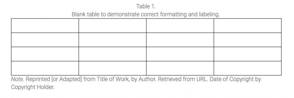
Tables
Tables arrange information in a row and column format. Each table should have a label above the table that contains a number and a title. Labels should be centered and follow the format “Table 1. A brief descriptive title in sentence case.” Tables do not need to follow specific color or formatting standards, but they should be easy to read and uniform throughout the document.
Figures
For the purpose of lab documentation, anything that is not text, equation, or a table is a figure. Graphs, sketches, and photos are all figures. Figure labeling and referencing is almost identical to that of tables, except that figures are labeled below the figure. Labels should be centered and follow the format “Figure 1. A brief descriptive title in sentence case.”

Graphs should always follow proper formatting practices and include axis labels with units, titles, and legends where appropriate. They do not need to follow a specific color scheme or style, but they should be easy to read in both color and grayscale and uniform throughout the document. Titles should provide context and meaning for your reader.
Practice & Application: Exercise I – Using and Explaining Graphics
The slides below provide an overview of best practices for formatting and using figures correctly.
Equations and Sample Calculations
Use the Word Equation Editor for all equations, found under the Insert tab.
- Use built in structures like fractions, integrals, and radicals, to create equations.
- Use the Symbols tool to add common symbols.
- All equations should be numbered. In this class, numbering should continue in the appendix. Styles can vary based on context and discipline, so ask if you are unsure of what numbering convention to use.
Equations should be centered, with a single space before and after a set of equations. If equations are grouped, the spacing can be 1.5. If the equation has a specific name, it can be listed on the left. The units should be displayed as in Equation 1 below. If the unit symbols are explained, it could be shown as in Equation 2.
For example, if Ohm’s Law was used in the documentation, the equation could be displayed
| Ohm’s Law | [latex]V=I R[/latex] | (Volts) = (Amps) * (Ohms) | (1) |
| Ohm’s Law | [latex]V=I R[/latex] | (V) = (A) * (Ω) | (2) |
Within the appendix, sample calculations should be given for any calculations made during the lab exercise and subsequent data analysis. Data can be presented in a table, in this case Table 1, with equations following (Equations 3-5). An example is below:
| Current (Amps, A) | Resistance (Ohms, Ω) | Voltage (Volts, V) |
|---|---|---|
| 0.1 | 100 | 10 |
| 0.2 | 150 | 30 |
| [latex]V=I R[/latex] | (3) |
| [latex]V=0.2 A \times 150 \Omega[/latex] | (4) |
| [latex]V= 30 V[/latex] | (5) |
Choosing the right visuals helps you present results effectively and makes information available to your audience in multiple ways—you’re reinforcing your conclusions with clear visual data, making your stance more believable.
Practice & Application: Exercise J – Interpreting Graphs in Context
Application: Sample from Technical Document Showing Use of Visuals
… [Excerpt] …
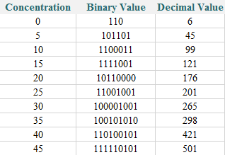
At each concentration, the Arduino displayed a binary value through the LEDs, which was read by the team members and converted into a decimal value using Equation 1 below. A sample calculation can be found in Appendix A.
| [latex]N_d = d_7 \cdot 2^7 + d_6 \cdot 2^6 + d_5 \cdot 2^5 + d_4 \cdot 2^4 + d_3 \cdot 2^3 + d_2 \cdot 2^2 + d_1 \cdot 2^1 + d_0 \cdot 2^0[/latex] | (1) |
| Where [latex]N_d[/latex] is the decimal number that corresponds to the binary number [latex]N_b = d_7 d_6 d_5 d_4 d_3 d_2 d_1 d_0[/latex] | |
The values from the first trial are shown in Table 1. As the concentration increased, the value displayed by the Arduino increased.
Table 1. Binary and decimal readings from varying concentrations of fluorescein
The values from both trials were plotted in Figure 1. The data follows a roughly linear, positively correlated relationship.
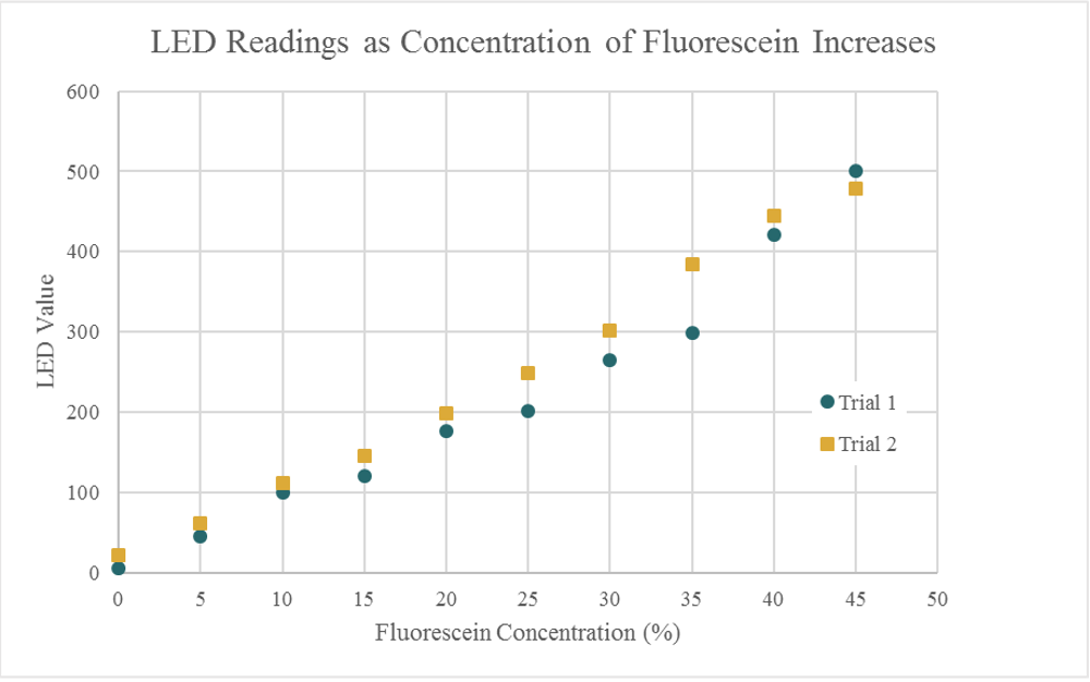
Figure 1. Decimal LED readings from two trials with fluorescein concentrations from 0-45%
More trials will allow the team to create a trend line that will serve as a calibration curve to determine the concentration of fluorescein in an unknown sample.
Key Takeaways
- Choose the visual that will most effectively convey the information to the reader.
- Introduce and explain each visual as it appears in the text. Visuals without descriptions are rarely helpful for an unfamiliar audience.
- Use good practices to make graphs clear and easy to read.
- Maintain consistent style and formatting throughout your visuals to avoid distracting from the message.
Additional Resources
UNC Writing Center: Figures and Charts
David McMurrey’s “Tables, Charts, Graphs: Show Me the Data”
