8
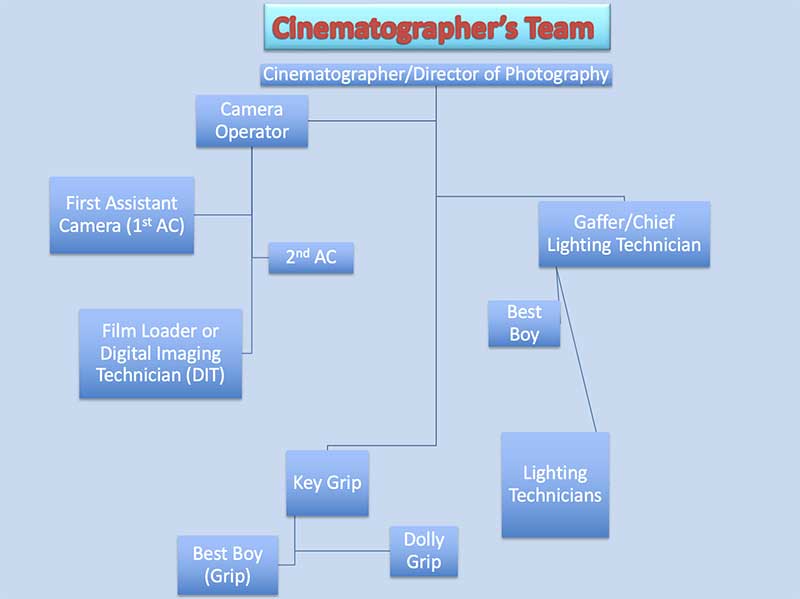
Cinematography is the act of capturing moving images on film or (in the 21st century) digital storage. This is where pre-production goes “live” and becomes what we see on the screen (before the additions, subtractions, and manipulations of post-production, as we will discuss later). In casual conversation, we tend to associate the art of cinematography with the director, but as we have seen this is not for the most part the case (although there are directors who also serve as their own cinematographers, this is very rare in commercial film). The cinematographer, or, Director of Photography, is the one behind the camera, or directing the team of camera operators in a multi-camera set up. As you recall, the director has been there throughout the preproduction process, helping to convey the vision she wishes the preproduction team to bring to life, through the oversight of the Production Designer and the Art Director and their various teams. Once everything is ready to go—sets built, costumes made, lighting design established, and actors rehearsed—the film shifts into production mode, and the director shifts from collaborating primarily with the Production Designer to collaborating primarily with the Director of Photography, the second-in-command for this stage of the filmmaking process.
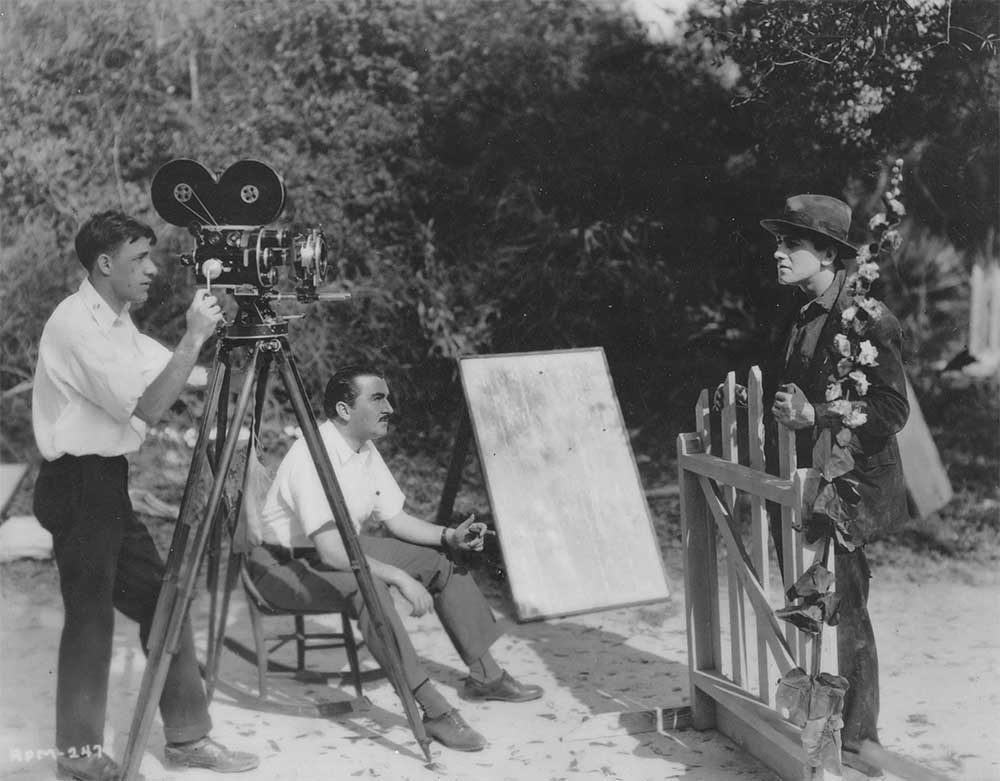
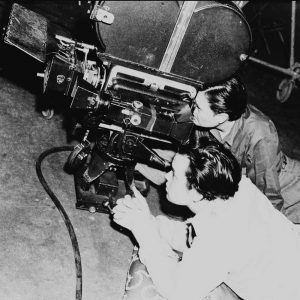
- Cinematographer Arthur C. Miller operating a hand-cranked Bell & Howell 2709 camera, with actor Richard Barthelmess and director George Fitzmaurice, shooting Experience (1921)
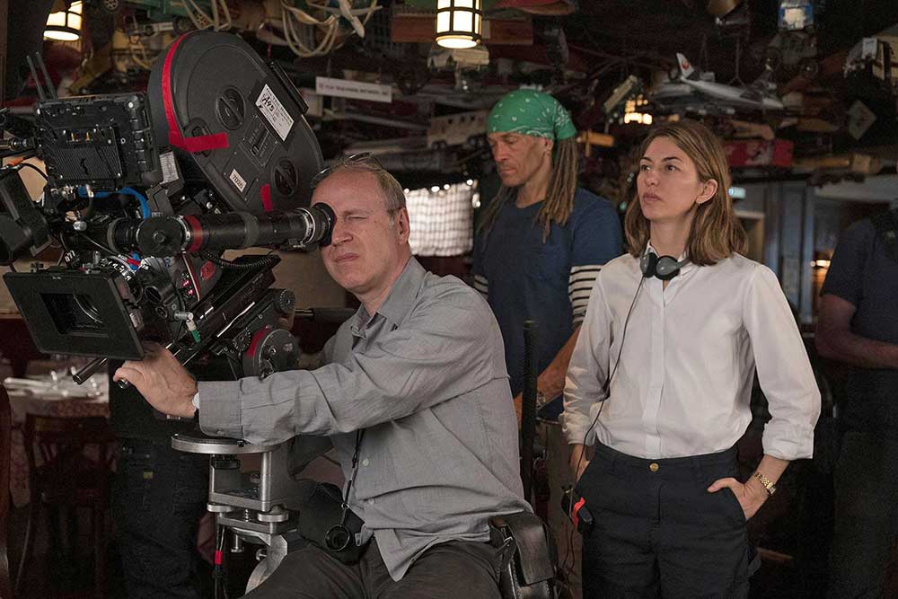
- Cinematographer Philippe Le Sourd operating a Arricam LT 35mm camera, shooting On the Rocks (2020) with director Sophia Coppola
The two production photos above are from films a century apart. In that time, a lot has changed in film production (not least in the shift from a photography crew of one to a crew dozens of operators and technicians a century later). But the basic structure has remained largely intact: the director is focused primarily on the performances, while the cinematographer is focused on capturing on film those performances and all the costumes, sets, and designs created by preproduction team.
Cinema is a word that was coined very early in the history of film, around 1899. It combines kinesis (movement) with photo (light). Almost immediately, the new word cinematography followed, with the addition of yet another Greek root, graphia (writing), one already in use since 1839 to describe the new art of photography. The etymology of the term reminds us how early students of film saw it as emerging directly out of photography, and the practice of cinematography remains even now very closely related to that of still photography, with the added element, of course, of movement.
The cinematographer’s responsibilities include:
- Properties of the shot: film stock, lighting and lenses
- Framing of the shot: depth of field, angle, movement
- Speed and length of the shot (editor in post-production has a role here as well)
- Special effects: working with the special effects team to generate footage for effects to be added in post-production
Just as the production designer must translate the director’s preproduction vision into material costumes, sets, and props, so too must the cinematographer know how to translate the director’s production vision onto film. They accomplish this through mastery of all the technical aspects of photographing moving images (lenses, cameras), a deep understanding of what has been tried before (conventions of camera movements, angles), and intuition for what remains to be discovered in the service of the particular film at hand. The cinematographer is thus a master technician, a film historian, and an artist in their own right.
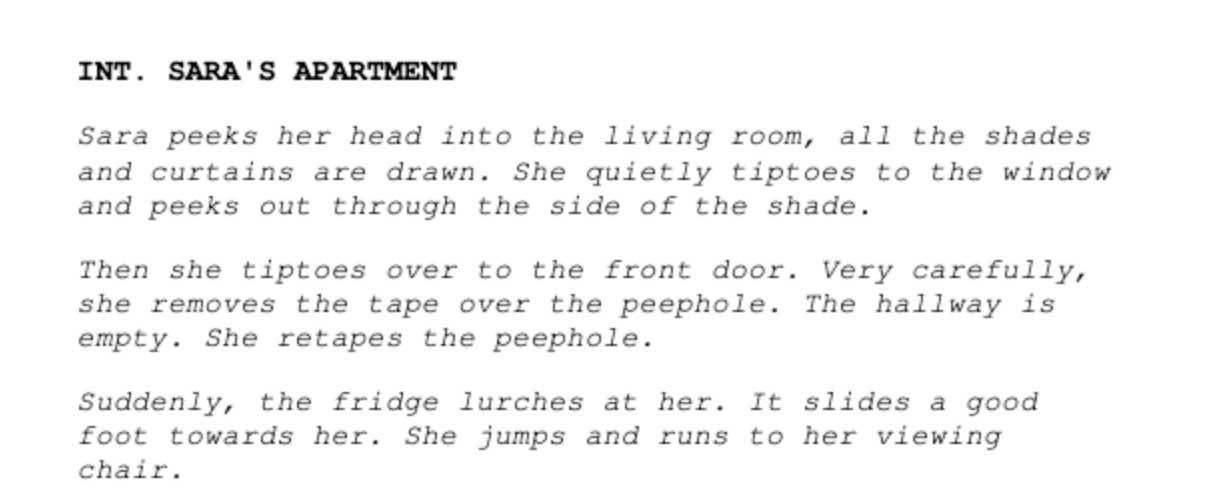
To give you a sense of the extents of the contributions of a cinematographer, we should start with a shooting script . This is the very last version of the script that is used during production by everyone on set. By the time a script has arrived at this final stage, it is several steps removed from the screenwriter’s original version, now shaped by the director’s vision and by the oversight of the production manager. Everything has been broken down into scenes and shots so that the production manager and their team can make sure production is as efficient and smooth as possible. In addition, basic instructions are provided to remind the director and cinematographer how they envisioned the scene. Here is a scene as described in the shooting script (by Hubert Selby Jr. & the director, Darren Aronofsky) from the infinitely depressing film Requiem for a Dream (2000):
When cinematographer Matthew Libatíque and writer-director Aranofsky set out to produce this briefly described scene, they had little in the way of concrete instructions on how to shoot it. Here is the scene as it appears on the screen:
Ellen Burstyn, who plays Sara, describes how the scene was filmed (as well as another scene we will return to next week):
As you can see, a cinematographer is starting with very little beyond a broad description of how the scene should look and feel. It is up to them to figure out how to make it work, often requiring incredible inventiveness, as in this scene where a camera is mounted to Burstyn’s body to create the disorienting subjective experience of the character’s amphetamine-induced breakdown.
Since there is so much that goes into talking about cinematography, we’ll break it down into two weeks, focusing this week on framing, camera movement, and types of shots. That is already a lot, as we will see, but much of it is already familiar.
First, however, we need to talk about something that we will return to next week: aspect ratio, or the relation between the height and width of the exhibited film frame. Films can have a range of aspect ratios, although for much of the studio era in Hollywood is was standardized at 1.375:1 (sometimes known as “Academy ratio”). As film began to compete with television in the 1950s, however, studios began experimenting more frequently with widescreen formats designed to emphasize the spectacle of film, with 1.85:1 emerging as a widescree” standard. European cinema had long had its own widescreen standard at 1.66:1, and a range of other formats existed, including the super-widescreen formats such as Panavision and CinemaScope (2.35:1).[1]
Most older movies will be in the Academy ratio, and most current movies will be in a widescreen format (these days, often 2.35:1). Here are some examples from films in our course:
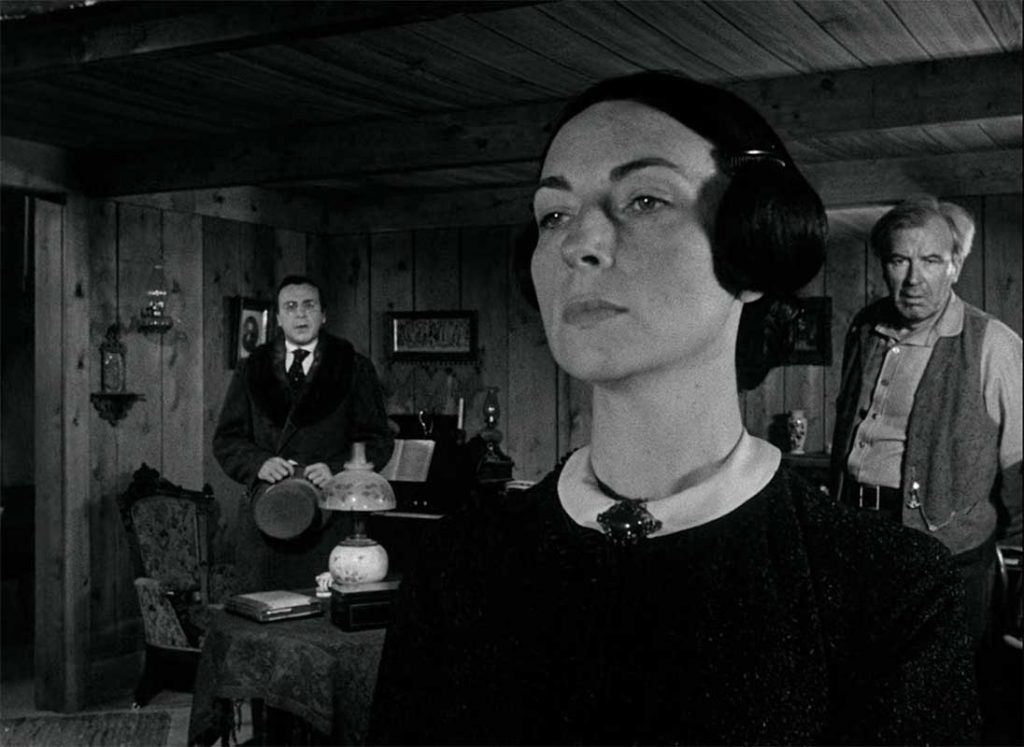
- 1.37:1
- 1.85:1
- 2.39:1
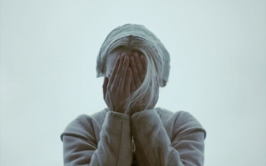
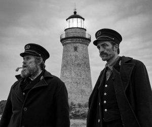
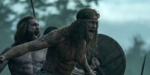
Sometimes in shorthand we refer to these as “standard” and “widescreen,” but even here it is important to remember that there can be variations (and in the 21st century, widescreen is the norm and “Academy standard” the exception). In the digital age, more non-standard aspect ratios are easier to achieve, so we can expect to see variations growing in the future. Here are shots from three films directed by Robert Eggers using very different non-standard aspect ratios:
- 1.66:1 (The Witch)
- 1.19:1 (The Lighthouse)
- 2:1 (Northman)
Sometimes unusual aspect ratios are designed to look unusual, to call attention to themselves, as in The Lighthouse. Here Eggers wishes us to feel the claustrophobia the characters themselves are experiencing within a very narrow ratio (but one which would have been familiar to filmgoers in the late 1920s when it was used by some studios). These cases are exceptions, and as exceptions they make us aware of the arbitrariness of the frame’s dimensions. We generally don’t think much about the edges of the screen once we are immersed in a film. But they are always there, cutting off what we are allowed to see from what we aren’t. And as in any painting, all composition functions within the constraints of the proportions dictated by the frame.
Within that frame, which is what the cinematographer sees through their viewfinder as they operate the camera, we then turn to the issue of composition: the organization and arrangement of objects, lines, and shapes within the frame. If we look at the shots above, we see examples of thoughtful composition. The cinematographer can always see what is being left off the screen alongside what they choose to frame, and the choices are immensely consequential. We see only what ends up recorded (or in the final edit), but the cinematographer is always seeing infinite potential shots as they work. Looking at the shot from The LIghthouse, for example, we can see the careful balancing of our two main characters with the lighthouse between them, serving effectively as both the setting of the film and a third character—as something that binds them together and divides them. One doesn’t even to have to have seen the film or know anything about the story to see all of that in the composition above.
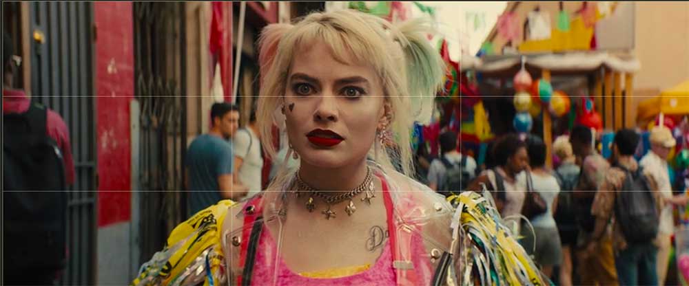
When composing a shot, the cinematographer is often guided first by what is known as the rule of thirds. The rule of thirds is as old as academic art criticism, a way of theorizing composition in a painting dating back at least to the eighteenth century. It was adapted to photography in the nineteenth century and thus, inevitably, became to be a way of thinking about composition in film—despite the major difference between film and photography represented by motion, which complicates any stable composition. The rule of thirds breaks up the frame into 9 even parts (or thirds both vertically and horizontally), and viewed in this way various suggestions arise about, for example, where the horizon line in an image should be placed, and about how various elements might be organized across the grid. A conventional shot focused on a single figure, for example, will often place them at center, with their eyes hitting the upper horizontal line:
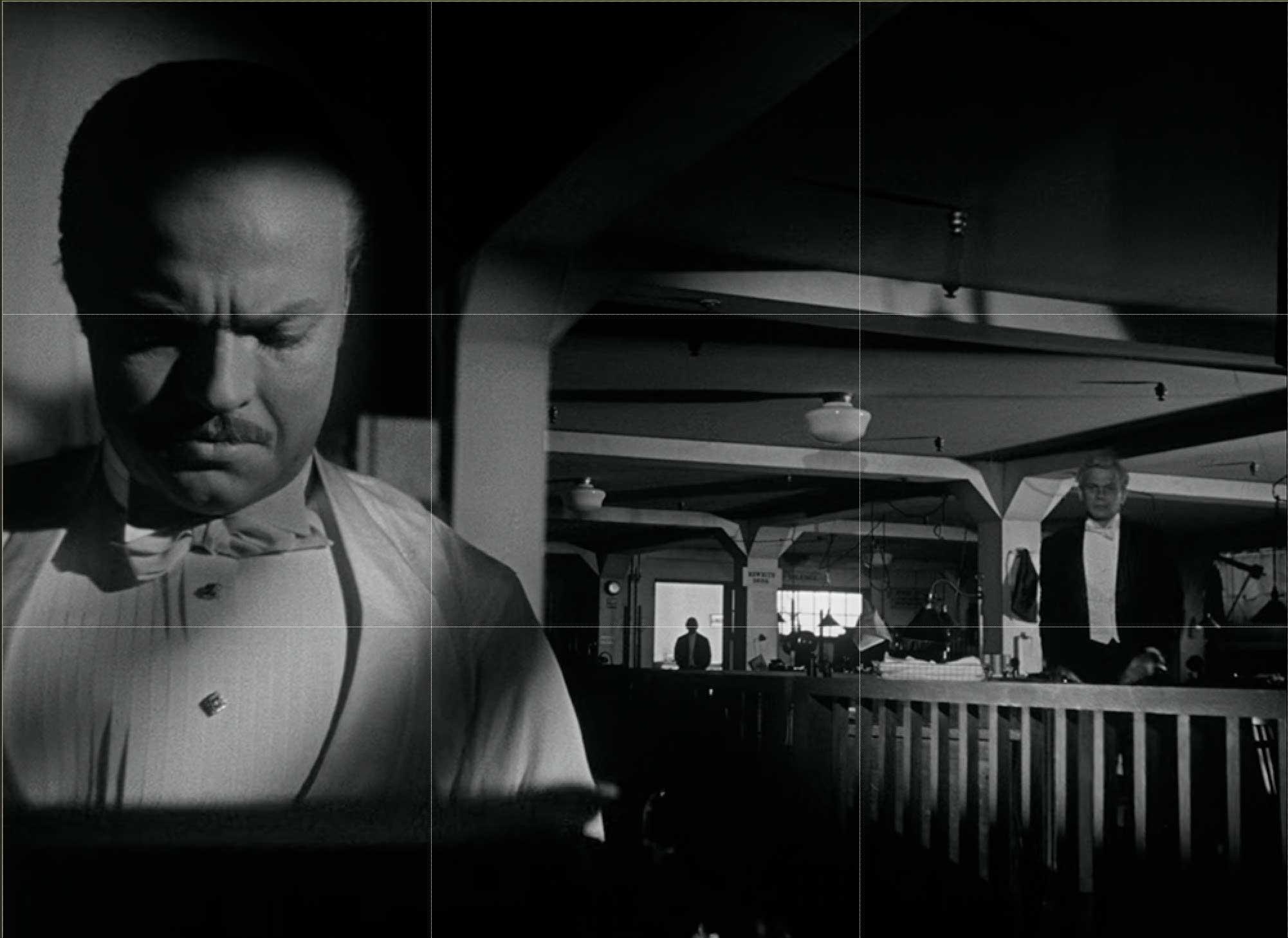
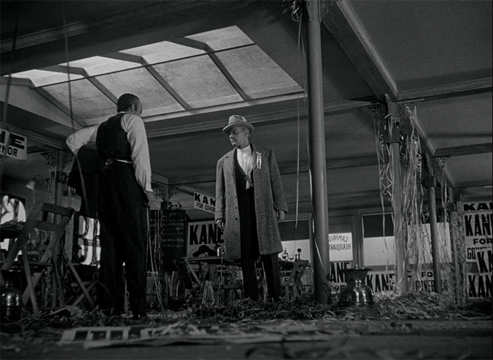
The shot above, from early in Birds of Prey, for example, establishes Harley Quinn at the center of the bustling action, not only centered but also seemingly parting the waters of the crowd around her. When there are multiple figure or dominant objects on screen, composing around the grid can get more complicated and involve more nuanced narrative and aesthetic decisions. Here, for example, is a justly famous shot from Citizen Kane in which Kane is finishing a negative review of his wife’s performance after its writer, Leland, passed out drunk, unable to finish it. Leland approaches Kane, while his manager, Mr. Bernstein, watches from the deep background:
As with the shot of Harley Quinn above, here we see the upper horizontal line cross Kane’s eyes as he looks down at his typewriter, establishing his dominance over the scene. The vertical lines, meanwhile, break the composition into fields of depth, with Kane in the foreground, Bernstein in the background, and Leland in middle-ground. Cinematographer Gregg Toland was a master of deep focus, which involved composing not only across the two dimensions represented by the aspect ratio, but also thinking about the screen as creating, in shots like these, meaningful depth allowing for another dimensions of composition. While the earliest lenses did not have the capacity of capturing this much depth in focus, by the late 1930s such composing became increasingly possible. (Today in the digital age, as we will discuss, an opposite challenge presents itself for cinematographers, as often too much of a given shot is in equal focus, often flattening depth.)
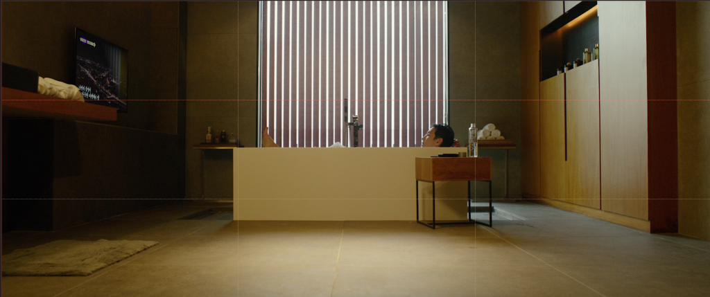
In Parasite, we can see how framing and composition is used to advance one of the central themes of the film: the ways in which environment shapes destiny for the individuals who inhabit it.
- The Parks at home…
- even when they are not at home
For the Parks, the environment is perfectly composed around them, whether they are in their well-appointed house as in the shot on the left, or out planning an “impromptu” birthday party (right). Mr. Park in his bath is at the center of the frame, perfectly balanced between the symmetrical lines converging towards him. Mrs. Park in the grocery store is similarly in sync with her environment, the upper line of the grid running directly across her eyes and the shrimp she is examining directly in the crosshairs of the upper right grid.
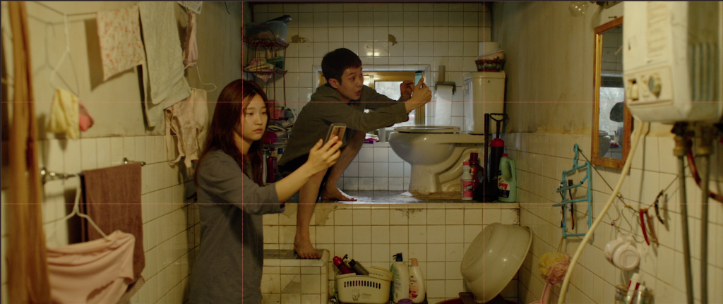
In contrast, of course, we have the Kims and the very different environments they are forced to inhabit:
Here neither Ki-woo nor Ki-jung are aligned with the rule-of-thirds grid. In the chaos of this space, the only thing centered is the toilet itself, which organizes and defines everything around it. If part of the message of the film is that environment is destiny—or, as Chung-sook argues, the Parks are “nice” because they have grown up surrounded by wealth and the environment wealth has build for them—then we see in the composition and framing how the Kims are never allowed to fit “nicely” into their chaotic, cramped spaces.
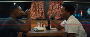
As one last example, let us consider two of the few moments when our protagonist in Moonlight experiences something like happiness and balance with the world. In the first, he is in Juan’s arms learning that he has the power to float on the ocean and not simply be swept away by it. In the second, as an adult, he has returned to Miami to see Kevin after many years. While the reunion is fated to be short-lived, at this moment in the diner where Kevin works the two fall back into their own harmony with each other.
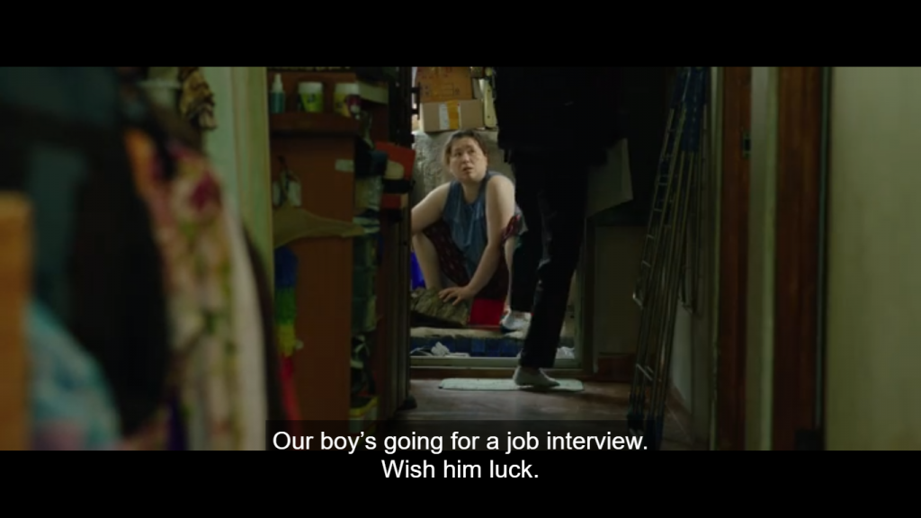
One last compositional element we should always be on the lookout for is what we call internal frames, or frames-within-the-frame:
Here we see two different kinds fo internal frames. On the left, we have the opening shot of the film, with the Kim’s semi-basement window functioning as an internal frame, spelling out from the start (before we have even met them) the ways in which their horizons are limited (and barred). On the right, Chung-sook is framed by the door on one side and legs on the other as her son heads off to his first interview with the Parks. These compositional elements serve as internal frames signifying how squeezed in her life is, such that we feel her literally being squeezed—as if into a box.
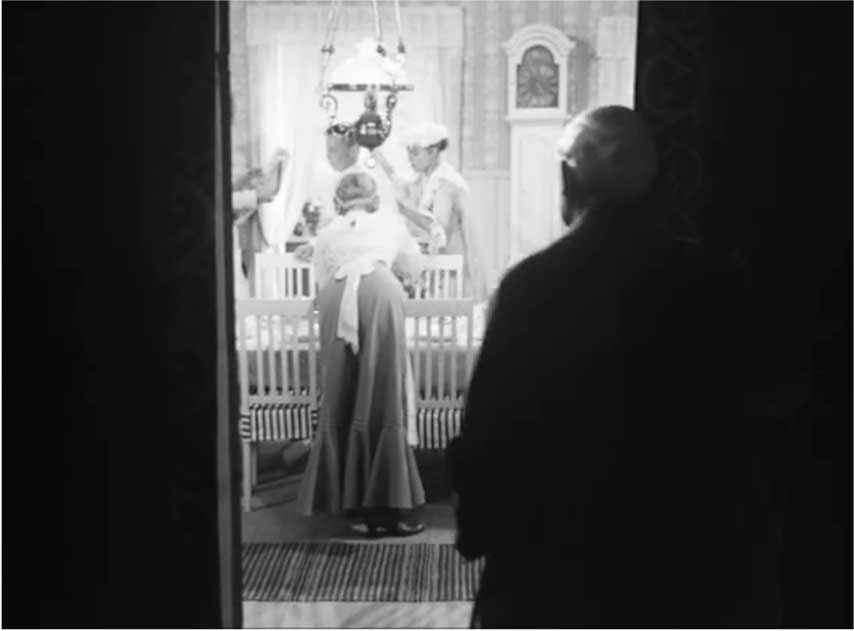
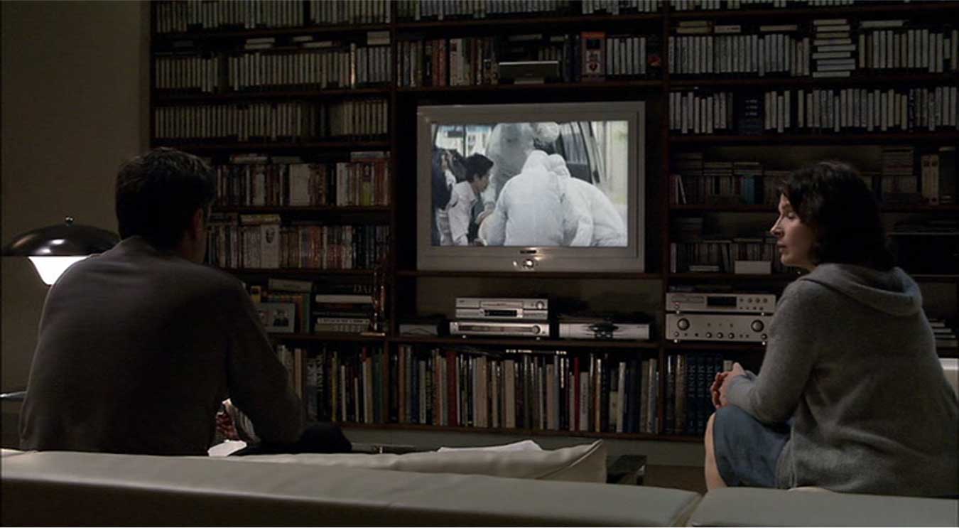
In the shots below, we see how a door frame or a television screen can do very different kind of work in terms of organizing space, guiding the eye, and advancing a narrative:
- The Shining (dir. Stanley Kubrick, 1980)
- Wild Strawberries (dir. Ingmar Bergman, 1957)
- Caché (dir. Michael Haneke, 2005)
••
So far we have been focusing on the compositional organization of elements within the frame. Along with this framing , of course, a cinematographer needs to make decisions about where to place the camera in relation to the subject. A camera far away from the actors will place the setting in a dominant relation to the characters, whereas a camera very close to the actors will allow their presence to dominate the screen, making it very hard for the viewer to focus on anything else.
Here we have a relatively precise set of terms at our disposal. The opening of Rashmon provides a useful way in to breaking down these terms:
https://www.youtube.com/watch?v=kkDhQVUKkyY
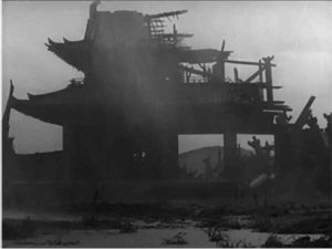
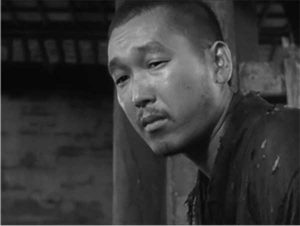
As this opening sequence plays out, a series of cuts bring us progressively closer to the main characters, the Woodsman and the Priest. In the first shot in the sequence, they are so far away as to be indistinguishable against the ominous ruins of the gate. It is not until we get to the third shot that we can begin to make out their expressions and get a sense of their emotions. The final shot in the sequence gives us a more direct access to the Priest and the look of sadness and longing for answers he directs to the Woodsman (and, in a way, to us as well). This sequence of shots brings the camera progressive closer and closer, allowing us to begin to position our main characters in relation to the setting and to have insights into their state of mind before a word is even uttered.
Each of these shots has a specific name, defined by the relationship of human subject to the frame:
- Extreme long shot
- Long shot
- Medium shot
- Close-up
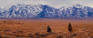
As you can see above, the extreme long shot will often have no figures visible, sometimes serving—as in this case—as an establishing shot, a shot which lets us know where the scenes to follow will take place, often doing the work of establishing the setting for a scene. At the opposite end of the spectrum, an extreme close-up will give us access to only a small part of the face, with no sense of the setting at all. And in between, we have a series of graded terms describing the shifting balance between figure and frame, from one end of the scale to the other:
| extreme long shot (XLS or ELS) | a wide view of a location, with emphasis on setting and general background visual information |
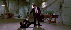
| long shot (LS) | contains the full body (head to toes) of at least one character, with some visual information about setting and background |
| medium long shot (MLS) | one or more characters, usually from the knees up (sometimes called the “American shot”); especially useful for interactions between two characters |
| medium shot (MS) | often shows character from the waist up |
| medium close-up (MCU) | shows character from chest to top of head |
| close-up (CU) | the full head is contained within the frame, along with perhaps the top of shoulders |
| extreme close-up (XCE or ECU) | captures only part of the face of the subject |
Visually, we can illustrate the shots with these examples:
- XLS Django Unchained (dir. Quentin Tarantino, 2012)
- LS Reservoir Dogs (dir. Tarantino, 1992)
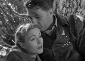
- MLS Stagecoach (dir. John Ford, 1939)
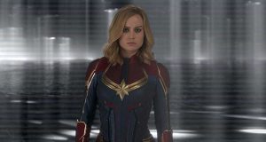
- MS Captain Marvel (dir. Anna Boden & Ryan Fleck, 2019)
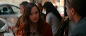
- MCU Inception (dir. Christopher Nolan, 2010)
- CU Amelie (dir. Jean-Pierre Jeunet, 2001)
- ECU Silence of the Lambs (dir. Jonathan Demme, 1991)
As with so many of the terms we learn, these are primarily of use as a way of communicating to one another what we see on the screen. By sharing these basic definitions, we can discuss, for example, the prevalence of dramatic shifts between long shots and close-ups in a certain film, and both parties will know what we are describing. By themselves, the terms tell us little, other than basic facts about how much of the actor and how much of the background we see in a given scene. As with our discussion of framing and composition above, these terms only become meaningful in terms of analysis when we are able to ascribe meaning to the choice of, say, a medium shot over a long shot in a given scene, something that will always require attention to other elements of the film narrative as well.
Far easier than the above, but worth mentioning as it will come up in writing about film, are the terms we use to describe how many characters are photographed in a given scene. These are straightforward:
- Public Enemy (dir. William Wellman; 1931)
- Two-shot
- Three-shot
The other major category of shot we want to think through at this stage involves not the proximity of the camera to its subject, but its angle on the subject being filmed. Most of these terms are fairly intuitive, but combined with the previous category of terms for types of shot they can unlock a great deal of insight in our analyses of films.
The majority of shots in narrative film will often be eye-level shots, providing us with an angle on the events taking place that would be roughly equivalent to what we would see if we were standing in the scene. While this shooting angle feels natural, it is carefully constructed to create that impression of observational neutrality.
Of course, while we call this angle an eye-level shot, we know that in the real world we look up and down as often as we do straight ahead. In fact, the camera angle in a narrative film is much more stable and static than our own eyes as we go about our daily activities. In effect, we are turning over our usual surveillance of our surroundings to the camera when we watch a film, and while our eyes will still move around the frame, we rely on the camera to make the big decisions about when to look up and when to look down.
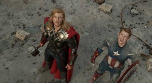
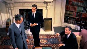
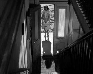
Looking down—a shot that takes place from on high looking at something below the camera—is called a high-angle shot. This can take place in an interior space to give us a sense of the overall layout of a room and where the individual characters are positioned within the space (working somewhat like an interior establishing shot, as described above) or it can be used to create a sense of imbalance of power or perspective. Here some couple of examples of high-angle shots:
- Avengers (dir. Joss Whedon,
- North by Northwest (dir. Alfred Hitchcock, 1959)
- Shadow of a Doubt
- Shadow of a Doubt (dir. Hitchcock, 1943)
The first of these shots is when the Avengers suddenly see the full extent of the hoard being unleashed upon them from above. The angle serves to make these superheroes, who by this point in the film we have seen accomplish miraculous things, suddenly seem vulnerable and small compared to what is coming their way.
The second shot above comes from one of the true masters of suspenseful camera angles: Alfred Hitchcock and his cinematographer Robert Burks. Here we look down on a scene in which our hero, Roger Thornhill, is quite literally cornered by men who he knows mean to kill him. Even as they are assuring him he is in no immediate danger, we sense the confines of his well-appointed prison and the fate that seems now inevitable.
Finally, I included two shots from my favorite Hitchcock film, Shadow of a Doubt. For much of the first half of the film, our heroine, young Charlie, has been thrilled to welcome her long lost beloved uncle, after whom she is named. By the time of these two shots, however, late in the film, Charlie has begun to learn that her uncle is not the man she thought he was. In the first of these two shots, she has finally put the pieces together after conducting research in the library, and the camera pulls back away from Charlie as the revelation sinks in, reminding us of her youth and isolation as the only one who knows the monster her family is harboring in its bosom. In the second shot from this movie, we look down on Charlie framed by the doorway, her shadow starting the climb the stairs to the room her uncle occupies even as she stands, brave but rightfully apprehensive, on the threshold.
As you can see, a common effect of a high-angle shot is to make the object of the camera’s gaze seem smaller or vulnerable than we saw it previously at eye-level. For a director like Hitchcock, who relishes making us squirm in suspense, it is a powerful tool in his arsenal. But it is most effective, as in Shadow of a Doubt, when used sparingly and saved for the end when tensions are ramping up ahead of a final confrontation.
A low-angle shot, by contrast to the high-angle shot, is a shot looking up at something taller than the camera’s position. We see some powerful examples of low-angle shots in Citizen Kane, especially as Kane’s relationships start to deteriorate:
Working with Toland, Welles achieved an extremely low-angle shot for these scenes by getting the camera onto the floor, or, in the case of the scene with Leland above, under the flooring:
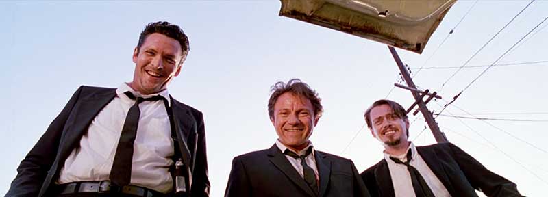
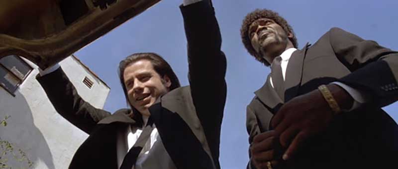
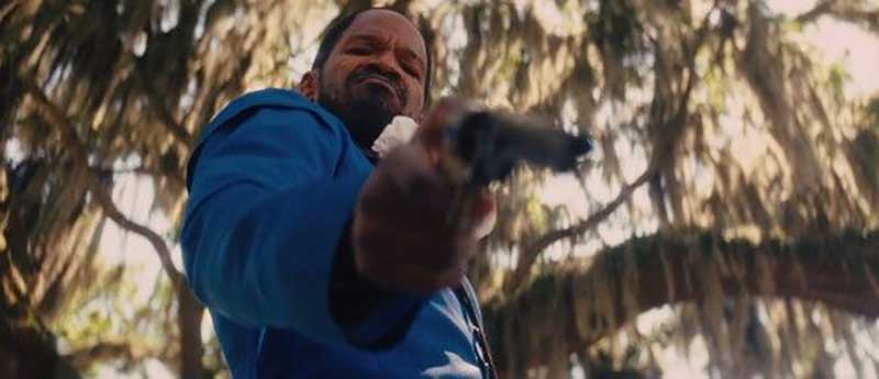
Welles is far from the only director with a predilection for the extreme low-angle shot. Quentin Tarantino has become associated with what has come to be called the “trunk shot,” and indeed a version of it (not all of them involving actual car trunks) can be found in all of his films, with different cinematographers behind the camera:
- Reservoir Dogs
- Pulp Fiction
- Django Unchained
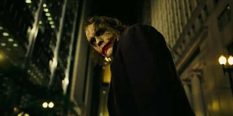
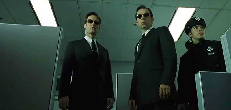
Most low-angle shots, however, are not this extreme. Even a slight shift below eye-level can have an emotional impact, suggesting a power or looming danger in the subject being filmed:
- There Will Be Blood (dir. Paul Thomas Anderson, 2007)
- The Dark Knight (dir. Christopher Nolan, 2008)
- The Matrix (dir. Lana & Lilly Wachowski, 1999)
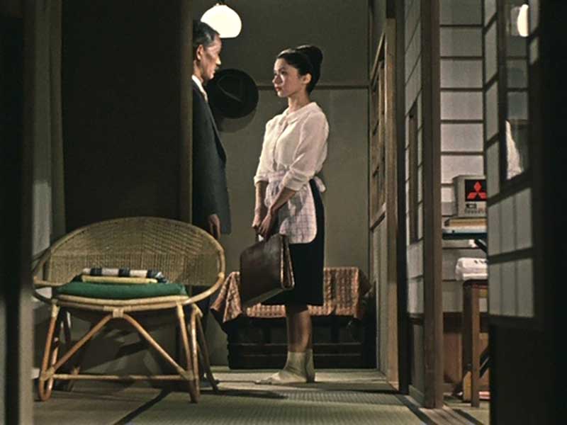
That a low-angle shot often makes the viewer feel vulnerable in relation to the subject being filmed makes sense, in that it brings us back to our childhood when the adult-world loomed large and in whose presence we were often vulnerable or powerless. But as with other examples, it can have other effects as well. As always, context is everything. For example, the great Japanese director Ozu rejects the eye-level shot as the default, using instead a low-angle shot that positions the viewer not in the position of standing among the characters, but instead as a guest of the home, sitting among the characters. The effect of this default camera angle in Ozu’s films—often described as Ozu’s “tatami mat shot”—does not make the viewer feel vulnerable or weak but instead welcome and at home, even intimate with the characters:
- An Autumn Afternoon (dir. Yasujirô Ozu, 1962)
- Late Spring (dir. Ozu, 1949)
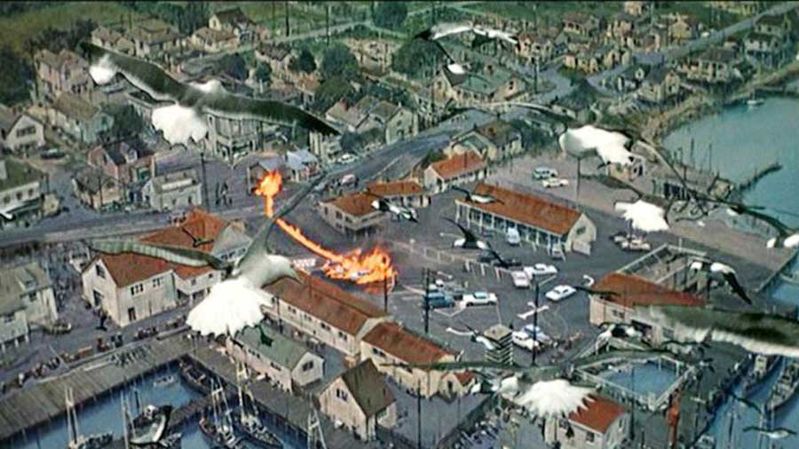
A final angle in our arsenal is the most extreme version of the high-angle shot: the aerial-view or bird’s-eye-view shot. Taken from a plane, helicopter, or a very tall crane—or, increasingly today, from a drone—these shots create an omniscient view on the world below. Here are two examples from Hitchcock and Burks:
- Birds (1963)
- North By Northwest (1959)
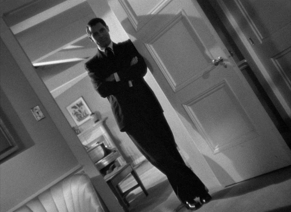
In our discussion of camera angles, we have focused primarily on the angle of the lens in relation to the subject: eye-level, high, or low. But cameras can also tilt side to side. They are most often kept level in order to maintain a viewpoint that appears balanced. After all, even when we tilt our heads in the real world, we compensate automatically through involuntary eye movement (vestibulo–ocular reflex), which is why even tilting your head to your shoulder won’t result in the world suddenly appearing 90 degrees akimbo. In film, however, there are moments when the camera being off-center can create subtle or extreme effects to lend emotional impact to a scene. This is especially valuable when the shot in question is designed to convey the effect of what a character is subjectively experiencing. This angled shot is called a dutch-angle shot (or canted shot). In the shot below from Hitchcock’s Notorious (1946), we see one of the protagonists (played by Cary Grant) through the subjective experience of the other protagonist (played by Ingrid Bergman), who is being slowly poisoned. Her failing vision and grip on reality is captured by the extreme angle of the shot set up by cinematographer Ted Tetzlaff (roughly 30 degrees off):
Dutch angle shots do not have to be explicitly subjective shots (that is, from the point-of-view of a character). In Do the Right Thing, directed by Spike Lee with cinematography from Ernest Dickerson (who would go on and become a director himself), dutch-angle shots are used on and off throughout the film to capture the rising tension in the neighborhood during the course of a brutally hot summer day. However, towards the end of the film as the tensions come to a crisis, Lee and Dickerson use dutch-angle shots repeatedly to show how everyone involved in the crisis is off-balance, combustible:
Dutch-angle shots convey imbalance, or mental or physical instability in the subjects being filmed (or the environment in which they find themselves). They are especially intense (and therefore need to be used with a very deliberate touch) because unlike the other shots we discussed here, these are not views on the world natural to us—except in times when we are severely inebriated, feverish, emotionally overwrought, or otherwise in a condition we recognize as not “natural.” As a result, these shots produce a different kind of tension than a high- or low-angle shot. When handled as they are in Do the Right Thing, they bring us fully into the collective madness of the moment unfolding before our eyes in the film’s climax.
We will continue our discussion of cinematography, beginning with camera movement, next week. For now, start looking for examples of everything discussed in this chapter in the films you watch in the weeks ahead. You will be amazed how much is about to start revealing itself.
Media Attributions
- Cinematographer’s Team
- Screen-Shot-2021-02-28-at-11.18.21-PM
- Screen-Shot-2021-02-28-at-3.23.26-PM
- Screen-Shot-2021-02-28-at-3.31.11-PM
- Screen Shot 2021-10-17 at 7.31.28 PM
- Moonlight1
- Moonlight2
- notorious
- On imdb.com you can find the aspect ratio for every movie by looking up "technical specifications" for a given film. Here we are looking for the "theatrical ratio" which can be different from the film ratio ↵
the final stage in a film's production after principal photography, involving editing, the addition of sound/visual effects, musical scoring, mixing, dubbing, etc.
version of a screenplay used during the production of a motion picture
responsible for budgets, shooting schedules, and managing the day-to-day business side of a film production
the position of the camera in relation to the people and objects being filmed
the relationship between the height and width of the screen
the organization and arrangement of objects, lines, and shapes within the frame
an EXTREME LONG SHOT which shows the viewer the location of the scene to follow and the relative position of objects within that space.
a camera angle in which the camera is mounted on the same vertical plane as the subject's face
camera angle in which the camera looks down at the subject, but not from directly overhead
camera angle in which the camera looks up at the subject.
a shot made with the camera leaned to one side and filming at a diagonal angle
