Want to create or adapt books like this? Learn more about how Pressbooks supports open publishing practices.
5 Style
Style is one of the most fascinating and infuriating aspects of art to discuss. While style is the result of a series of techniques and devices that can be broken down and analyzed precisely (as we will do in the weeks ahead), style itself—the combination on screen of those techniques and devices—can be maddeningly challenging to describe in words. In the weeks ahead we’ll study some of the individual techniques and technologies that contribute to that overall effect, but this week let’s think about what we mean when we talk about style.
Of course, such frustrations make sense. I remember in college having trouble trying to paraphrase a poem by the 19th-century American Poet, Emily Dickinson. I confessed my frustrations to my professor. He reminded me that Dickinson turned to poetry to say what she needed to say precisely because prose wasn’t up for that particular task. Of course turning it back into prose was going to be frustrating. That had never before occurred to me. As someone who has since devoted himself to trying to understand and explain works of art, I have tried to keep that lesson in mind, if only so that I go easier on myself when I find it challenging to summarize a work and its effects into critical prose. Here are the first two stanzas of the poem by Dickinson that resisted my grasp almost 40 ago:
There’s a certain Slant of light,
Winter Afternoons –
That oppresses, like the Heft
Of Cathedral Tunes –
Heavenly Hurt, it gives us –
We can find no scar,
But internal difference –
Where the Meanings, are –
Looking at this poem now, I can feel what she is describing—that “certain Slant of light” as the sun starts to move towards the horizon and the shadows lengthen through the dark, bare trees. She is, first and foremost, describing something visual: late afternoon on a winter day. And then she is trying to capture the ways in which that visual experience makes one feel. It is here where prose fails her and she turns to poetry, turning to elliptical metaphors to come as close as possible to the ways in which the feeling of that moment evades transcription, leaving not a “scar” (a marking upon the body that can be read) but invisible “internal difference” where true “meanings are.”
This is what makes people love or hate Dickinson: her deep interest in describing the indescribable. In the service of her lifelong poetic project, she developed a unique style of poetry, combining the conventional rhythms of the hymns of that resounded through her New England town on Sunday mornings with gem-like symbols and an unconventional syntax that strove after all that remains inexpressible in conventional prose (or hymns).
Poetry is a medium that is made of words, but it is also visual: we see on the page the line breaks and punctuation precisely as the poet intended. Dickinson adopted short lines, and she freely used the dash as a primary form of punctuation, giving her lines on the page a unique look: fragmented, like a to-do list, or like a word game waiting to be completed by the reader … shards of insight waiting to be put to use.
How would we describe this style? In the end, so unique and powerful is Dickinson’s style that we today describe it simply as “Dickinsonian.” If that sounds tautological, it is. For many of our most important and unique artists in any medium we acknowledge their uniqueness first in their style which resists easy comparison to anyone else around them. Think about Tom Waits,Bob Dylan or Björk. The first time one hears them sing, your ears prick up or recoil (or both). They do not sound like we have been taught “good singing” should sound. Waits’ voice is gravely, like he is singing through sandpaper and a three-pack-a-day cigarette habit. Dylan’s voice is nasal, strained, pleading. Björk’s voice itself is conventionally beautiful, but what she does with it—the strange serpentine wanderings and hyperbolic phrasings—can strike one as pretentious or perhaps vaguely deranged. In all three of these cases, inevitably, they were greeted skeptically by critics when they first appeared on the scene, precisely because they did not fit a style that was understood by convention to be “good.”
Many artists with unique styles will never get past this initial resistance, disappearing after one shot (or never getting that shot at all). But when it works—when the timing is right and the audience embraces a unique style despite the critical resistance (or the critics celebrate the unique style despite the initial audience neglect)—these artists can end up becoming a style unto themselves. Thus today we can talk about singing in a “Tom Waits style,” “Dylan style” or “Björk style,” and many people would immediately be able to conjure up that style in their mind’s ear even if they could not put that style it into words.
Film is of course not only a visual medium. For example, we can (and soon will) talk about the style of the sound outside the storyworld of the film (the score) and of the sound inside the storyworld (sound design). But film is foremost a visual medium, having evolved for thirty years before sound was first introduced. So when we talk about the style of a film we are often first describing its visual look and feel. In the weeks ahead we will break down the components that contribute to this look and feel: setting, design, staging, lighting, color, framing, composition, camera movement, focus, stock, exposure, speed, and editing. But even if we don’t yet have at hand all the technical language to describe these different elements, we can already feel and begin describing the style that is the result of these components coming together on the screen.
Fortunately we have a lot of everyday experience talking about visual style. When we say that a friend has a “unique style” or “no style” or something in between (“sporty,” “preppy,” “chic,” “artsy”), we are often thinking first and foremost about fashion. Consciously or unconsciously, when we pick out what we are wearing each morning, we are making decisions about the style we wish to project to the world on that day. Our choices might come from association or affiliation (this outfit marks me as a member of my group of friends; this t-shirt identifies me as someone who loves anime, or sports, or my university). Often they are inspired by a particular mood: how we are feeling about ourselves that morning, how visible we wish to be in the world, etc. We can wear clothes that convey we are interested in being approached for conversation, or clothes that convey, politley, “leave me alone!” We can wear clothes that are aspirational (conveying wealth or status not reflected by our current bank account balance), or based on imaginative identification with a time before we were born (Victorian, or retro styles from the 60s, or 90s… no 80s, please).
When we are describing fashion styles, we often zero in on certain items associated commonly with a certain style—for example, oversized flannel shirts as a marker of “grunge style.” But the flannel shirt alone doesn’t do it. The style is the effect of many components of an individual’s visual self-presentation: clothes, hair, accessories, facial expressions, posture and affect—even the way an individual moves through the world. These days, when various styles of the past are often mixed and matched in complex ways, it is harder to pin individuals down in terms of a unified style—and that is often the point. Fashion has become a complex and often subtle form of self-presentation that explores the tensions we all experience as we navigate our multiple identities, including the aspirational and imaginative.
All of which is good practice for thinking about film. Just as our individual styles are made up of many elements and often conflicting impulses, so too is a film—and even more so since the choices going into the ensemble are made by many individuals. Whole teams are in charge of the costumes and fashions we see on screen. Another team focuses entirely on hair and makeup. Another decorates the sets and creates the feel of the interiors through which the individual actors move. Another team thinks about how best to light interiors and actors to create a certain mood or effect. Another chooses lenses and film stocks and filters to create a certain visual feel. And so on. Each of these individual teams (themselves made up of individuals with different tastes and personal visions) and the choices they make combine together to create the style of a film.
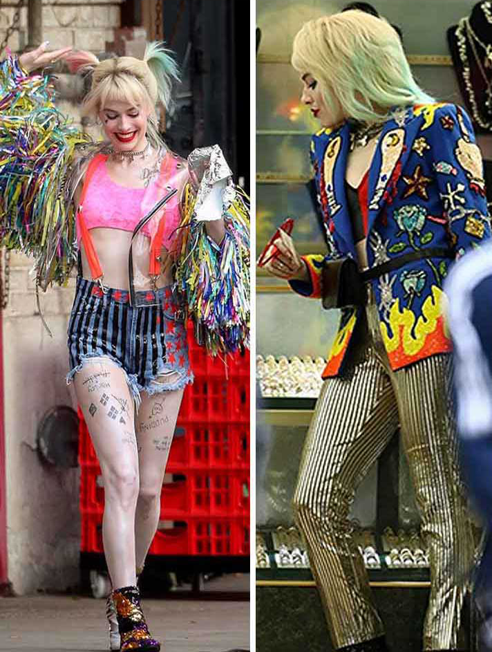
Style can and does contribute to film narrative. Here is an example from Birds of Prey (and the Fantabulous Emancipation of One Harley Quinn) (dir. Cathy Yan; 2020). When we meet Harley Quinn at the start of the movie she is not doing well, having recently broken up with the Joker and finding herself now the target of all the enemies she made while previously under his protection. Her fashion choices reflect the chaotic energy of her life at this moment. As the film continues, we see Harley progressing in various ways towards a place of agency and independence, ultimately culminating in her decision to start her own business and to define her own self-worth. All of this is conveyed often more clearly through Harley’s evolving fashions than it is through anything explicitly spoken:
Harley Quinn’s fashion choices at the start of the film (left) and at the end
Working with director Cathy Yan and production designer K.K. Barrett, costume designer Erin Benach thought carefully about what story each of Harley Quinn’s dozen or so “looks” would convey about her changing state of mind throughout the film. Here, for example, is how she describes the thinking behind the outfit from early in the film:
Behind her story is always something a little bit off from center and a little bit crazy, with the idea being that caution tape may be a place to stay away from, and maybe it’s a way to caution the world against what she might do. So, we kind of took the idea of that caution tape and tried to repurpose it into a costume. We always wanted to create something that felt like Harley made it herself, so she’s sort of a crafty person in the backroom and she can make stuff herself — you know the shorts that she’s painted and the jacket that she’s put together herself. That’s why we did it like that. It’s fun and a little bit crazy like her.
In film, every stylistic choice is doing work, and we can focus on issues on style on the granular level: costume, makeup, music, lighting, etc. But we are also thinking about how we respond to the style of a film on the macro level—the style of the film as a whole. It is the director and her creative team that work to make the style that emerges from all the local style choices cohere in a way they want. In the case of Birds of Prey, for example, Harley’s fashion choices are reflected in the exuberant and often over-the-top colors and energy of everything from makeup to set design to soundtrack.
All of this can sound overwhelming, but this is an area where we can trust our gut instincts to a large degree. The great writer-director Billy Wilder claimed that, before the breakup of the film studios, each studio had a style so distinct that one could walk into any theater ten minutes into a movie and instantly know which studio made it.
This is a surprising claim. After all, the productions of Hollywood in the 1920s-40s were deliberately subdued in terms of visual style, especially when compared with films from the same period coming from Asia or Europe. From the earliest days of the establishment of the Hollywood approach to narrative film, we find guidelines being laid out arguing that “film must create the impression among the audience that they are witnessing the … action, unknown to the characters of the play. [The audience] should be put in the position of being at the ‘knot hole in the fence’ at every stage.”[1] This quote comes from a screenwriting manual from 1913, over a century ago, and even after the studio system was replaced by modern Hollywood, the basic principle remains largely intact, as we discussed in the previous chapter: audiences are encouraged to imagine themselves having an ideal voyeuristic view on “the action” unfolding before their eyes.
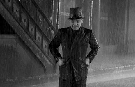
Such an approach to narrative film requires necessarily a style that does not call attention to itself, or the illusion would be shattered. As a result Billy Wilder’s claim to be able to spot the studio’s unique styles in any film seemed absurd to me when I first heard of it. Many years (and hundreds of movies) later, I can believe it. The studios did have unique visual styles, even if the differences were sometimes subtle. Here, for example, are some images from three Warner Bros films from the 1930s, in three very different genres: gangster, musical, and (to use the genre label from the 30s) “social problem pic”:
Public Enemy (dir. William Wellman; 1931)
42nd Street (dir. Lloyd Bacon; 1933)
I Was a Prisoner on a Chain Gang (dir. Mervyn LeRoy, 1932)
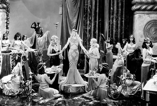
Even though these three films have very different stories and moods, there is a visual similarity to them that is clear when we look at these stills: high-contrast, sombre grays, with a gritty feel to all three. We could productively compare these to three films from Warner’s rival Paramount from around the same time:
Three-shot
Cleopatra (dir. Cecil B. DeMille, 1934)
The Lives of a Bengal Lancer (dir. Henry Hathaway, 1935)
Even just looking at still images, we can clearly see something different in the look and feel of Paramount films from the early 30s. Where Warner films often felt committed to urban realities, Paramount films were often glamorous and ethereal. This is true across the three very different genres represented by the stills above: romantic comedy, historical epic, and adventure. Shadows dominate in Warner, where highlights and sheen seems to sparkle in Paramount. Some of this is in lighting (high-key at Paramount vs. low-key at Warner, as we will discuss in detail in chapter 7). Some is due to costume and makeup. Paramount had a lot of European emigres working at the studio at the time, and the studio encouraged them to bring their experience with fashion and style to the screen. Thus Paramount films became known for their sexy, glamorous sophistication, while Warner films became known for their realism and unflinching gaze.
Which came first, style or genre? It is hard to know for sure. Certainly Paramount’s satiny style lent itself to certain genres: romantic comedy, romantic historical dramas, romantic adventures—in short, romance. Warner’s gritty style lent itself to crime and to urban problem films. And yet, Warner in the early 30s was also the home to some of the most innovative musical films of the period, featuring the kaleidoscopic visual arrangements of the director-choreographer Busby Berkeley (see an example below from Dames [dir. Busby Berkeley & Ray Enright, 1934]). And despite the fact that musicals don’t seem ideally suited to this style, somehow it worked, the high contrast style accentuating the play of light and dark in the psychedelic numbers.
All of which is to say that the house style that emerged often encouraged a focus on certain genres, but studios would always take a stab at whatever genre was hot at the moment, whether it was perfectly suited to their style or not.
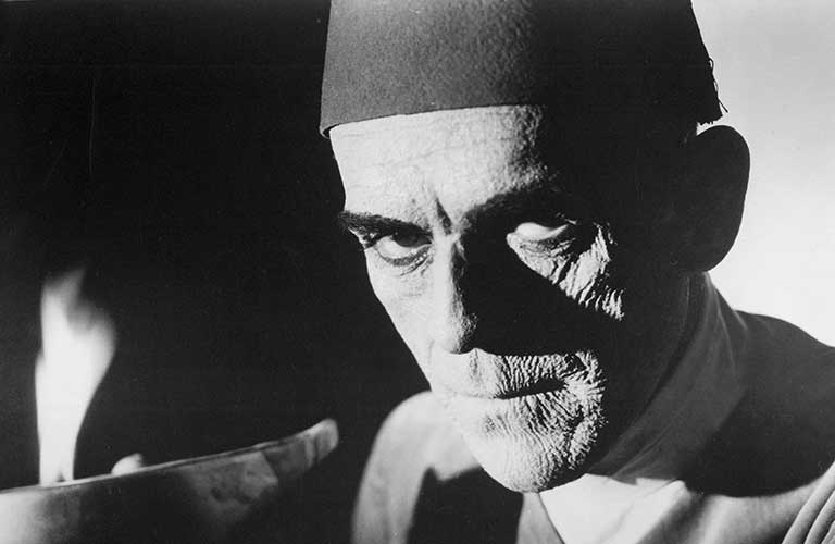
Another example of the “house style” in the studio era can be found in the monster movie genre that took root at Universal in the early 1930s. Universal had earlier been associated with horror movies in the silent era, especially with the films starring Lon Chaney (such as Phantom of the Opera [1925]). Chaney was known as the “man of a thousand faces,” due to his uncanny ability to transform himself using makeup, but he died in 1930 and everyone assumed Universal’s run of horror movie successes was in the past.
On the world stage, meanwhile, events were churning towards economic catastrophe and war in Europe. Even before Adolph Hitler came into power, German filmmakers (and especially those of Jewish descent) could see the writing on the wall. A steady stream of people started to leave the vibrant film scene of Berlin for California. The head of Universal Studios was Carl Laemmle, who was himself a German Jewish emigre from a generation earlier, and he had maintained strong connections with Germany throughout his long career in Hollywood. Thus, it made sense that emigres from Germany’s film industry would show up at Universal’s door in hopes of work. In 1930, the same year Lon Chaney died, Karl Freund, the pioneering cinematographer, arrived at Universal. One of his first projects was Dracula (1931).
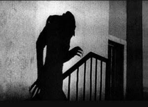
Freund and his fellow German emigres to Hollywood had been deeply involved in a movement known as German Expressionism. Here are some examples of the German Expressionist style as found in films of the 1920s:
Nosferatu (dir. F. W. Murnau; 1922)
The Cabinet of Dr. Caligari (dir. Robert Wiene; 1920)
This style of German film was an attempt to bring to the screen similar experiments happening in German art, especially in printmaking. Here is an example:
Karl Schmidt-Rottluff, Mourning Women on the Beach (1914)
As you can see from these examples, this is a style in art and film that was not focused on photographic realism, but on expressing internal emotions through the use of external signs (shadows, strong slashes of blacks and whites, etc). When looking at German Expressionism one feels you are gaining insight into the interior state of mind of the people we see represented, at the expense of details about their lived environment or individual appearance.
Because expressionism foregrounds itself as a style, it is not ideally suited for the style-less style of Hollywood filmmaking. And yet at Universal they found a way to put it to excellent use: horror movies.
Dracula (dir. Tod Browning & Karl Freund, 1931)
Old Dark House (dir. James Whale; 1932)
The Mummy (dir. Karl Freund, 1932)
As a genre, horror lends itself to extreme emotions and their representation on screen, and thus adapting elements of a German expressionist style to Universal’s horror movies was almost a natural fit. Had Freund and others not shown up from Germany when Chaney died, perhaps we would never have the Universal monsters we all know today: Frankenstein, Dracula, the Werewolf, and the Invisible Man. Had Freund shown up at the door of Paramount, they might have had no idea what to do with him. But as it turned out, even an extreme style seemingly at odds with a Hollywood aesthetic could find fertile ground in a studio stable already shaped by German approaches to art, one also previously committed to a genre that allowed for more extreme visual styles than, say, romance.
In this way we can see how the studios’ unique styles emerged somewhat organically out of the combination of personnel the studios had under contract. Back in those days, the big studios effectively owned everyone who worked for them. Actors, directors, writers, all the way down the production ladder to key-grips—all were under rigid long-term contracts and many would spend their entire career making movies for only one studio. If style is the result of the choices made by individual artists and craftspeople working within their individual domains in front of and behind the camera, it is inevitable that this stable of personnel would ultimately result in a visual style that would translate across films and genres.
In fact, it is this recognizable studio style that is some of the best evidence for why we should always be cautious in our natural tendency to credit directors with “authorship” over films. As we will see in the coming weeks, directors play a vital but by no means deterministic role in the look and feel of a movie. And a little investigation will usually reveal that aspects of a style we associate with a director often have as much to do with other studio personnel: cinematographers, set designers, etc.
Part of why the New Hollywood period of the late 1960s and 70s remains so exciting to film fans is because, with the collapse of the studio system and their “stables” of personnel during the previous decade, we start to see more idiosyncratic styles on the screen. Starting in the 1970s the studio’s name on a film no longer offered a clue as to the style of the film to follow. Instead filmgoers began associating style more clearly with key personnel—especially the director. Without a studio dictating a style, the individuals making the films could push a style of their own, often violating in dramatic ways some of the basic principles established way back in 1913. Let’s take a look at the title sequence in Taxi Driver (dir. Martin Scorsese; 1976):
Here, overly-saturated colors, the subjective camera through the eyes of our unstable protagonist, and the romantic saxophone theme in the background, creates an odd, unsettling mix. Long before we hear our protagonist speak his first words we already have a sense that he possesses an overinflated conception of his own purpose on earth (a knight in shining armor, as the final bloody sequence of the film confirms), but one whose reliability we should question from the start. The style here fits the content of the film; it does concrete narrative work. But is also expresses something about the vision of the director, Scorsese, as well as the screenwriter (Paul Schrader), the cinematographer (Michael Chapman), and the legendary composer Bernard Herrmann in what would be his last film score. Some of what we identify as the style here will be traceable, like fingerprints, to other work Scorsese and his colleagues will do separately and together. Other aspects of this style are built for this story alone, while still others are the alchemical result of precisely these creative personnel having collaborated at this moment, on this project.
All of which is to say that we should be wary of falling into the habit of chasing after the “unique style” or fingerprint of a director on a film—an approach long associated with “auteur theory,” which imagines an individual organizing artistic vision behind a film. We will better serve the films we study by thinking about how style serves (or fails to serve) the film at hand. Of course, we should always attend to certain stylistic tendencies in an individual director, composer, cinematographer, or screenwriter, etc. However, as much as possible, I encourage us to keep in mind that the style of a film—today as much as in the days of old Hollywood—is the result of dozens, even hundreds of collaborators. And when it works, it is about adding a powerful layer of feeling to a film that deepens its meaning, even if that meaning remains—like Emily Dickinson’s slant of light—just out of our grasp as we try to translate into prose.
Of course, the challenges of translating style into prose does not mean we should not try. The trying, as Dickinson shows, is what brings us closer to the truth, closer to the magic of how meanings are made internally. So we will spend a lot of time together searching after words to describe the style of that certain slant of light.
Playing with Movies
After you have read this chapter, you might be uncertain as to whether you know how to talk about style. After all, there is little in the way of concrete language we can lean on as labels for style. I promise, however, that you are already good at talking about style. Let’s put that to the test. Below are two prompts to play with.
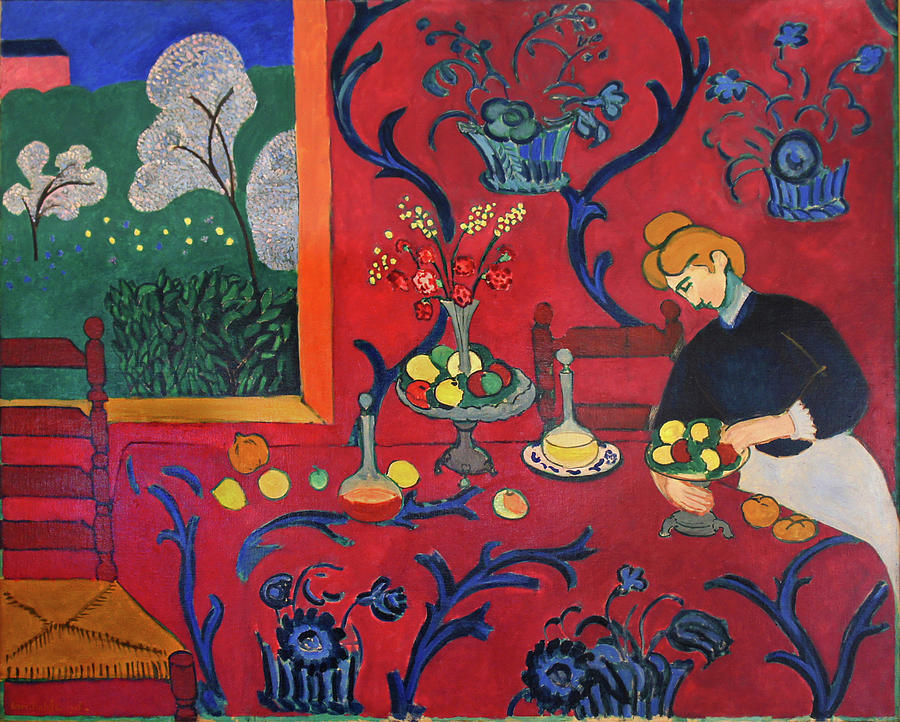
1) Below are two paintings. Even not knowing anything about painting or the artists or when they were painted, you can still talk about the stylistic attributes of each. Prove me right in the discussion thread 🙂
2) No film has no style, because everything we see on screen has been put there by creative teams focused on building a world full of visual signs to help shape our reading of the narrative as a whole. Pick an interior set or a character’s clothing (wardrobe)—or even hair & makeup—from a scene in either Scream or Eternal Sunshine. Take a screenshot and examine the details in the set or outfit (or hair and/or makeup). Focus what is being conveyed about the character or their environment by the choices the artists setting up the sets or designing the wardrobe are making. No detail is too small to merit attention and no interpretation can be far fetched, because we know every little detail we see is there to convey some meaning.
Media Attributions
8c76e0776c91afca6a542be54adac244
margot-robbie-harley-quinn-birds-of-prey-costumes
EVLddAzUcAEwj-s
Media_635979_smxx
Screen-Shot-2021-02-02-at-7.57.50-PM
Quoted in The Classical Hollywood Cinema by David Bordwell, Janet Staiger, and Kristen Thompson (New York: Columbia University Press), 311. ↵