10 Editing I
With this chapter we move from production into the realm of postproduction. By definition, the material recorded during production cannot be put together into its final form until production has finished and every scene has been filmed. Indeed, by the time editing begins, the cast is heading home, along with most of the preproduction and production crew. Suddenly, from a team of hundreds bustling about before and behind the camera, the work splits off into teams who will work on the raw material that the production process has generated—sound editing and design, special effects, and, of course, our topic for this week: editing.
Perhaps it is for this reason that we tend to undervalue the importance of and creative artistry behind editing and most postproduction work (except special effects). There are no celebrities on hand for this labor, usually only the director (sometimes a nosy producer) is around. As Thelma Schoonmaker, who has edited every Martin Scorsese film since Raging Bull (1980), put it, “Editing is a lot about patience and discipline and just banging away at something, turning off the machine and going home at night because you’re frustrated and depressed, and then coming back in the morning to try again.” But even as she acknowledges the unromantic aspects of film editing, she also reminds us that, ultimately, it is in the editing room that the raw materials of a film become a work of art: “It’s hard for people to understand editing, I think. It’s absolutely like sculpture. You get a big lump of clay, and you have to form it—this raw, unedited, very long footage.”
Schoonmaker’s analogy of the editor as a sculptor is a powerful one, and most definitely one that seems to challenge our assumptions that the genius of a film lies primarily with its director or at least with the collaborators involved in production. She means no disrespect here to the actors or director in calling what they give her “a big lump of clay”: after all, she has edited every film Scorsese has made for the last 50 years. What she is trying to convey is how very raw and unfinished are the materials that arrive in the editing room. And most actors and directors (or thosewho are not too full of themselves to admit it) agree:
Editing is where movies are made or broken. Many a film has been saved and many a film has been ruined in the editing room. — Joe Dante
The film is made in the editing room. The shooting of the film is about shopping, almost. It’s like going to get all the ingredients together, and you’ve got to make sure before you leave the store that you got all the ingredients. And then you take those ingredients and you can make a good cake – or not. —Philip Seymour Hoffman
The notion of directing a film is the invention of critics – the whole eloquence of cinema is achieved in the editing room. — Orson Welles
Lest I err in one extreme in attempting to correct for our errors in the other, it does need to be pointed out that editing is never only an afterthought, reserved for the editing team in postproduction. From the ideation (screenplay) stage onward, everyone—and most especially the director—is already thinking about the final edit. Part of why storyboarding (and more recently, previsualization) remains such a crucial part of the preproduction process is to ensure that in planning out the production, the images and sounds necessary for the final mix will be prepared and filmed. No film exists without editing, but that editing is in the minds of all who help to shape the preproduction and production processes, just as surely as the editor is always thinking about the vision of those at work in the earlier stages.
In the end, the message here is one I have repeated so often it might well be wearing thin: film is a collaborative art form—one that, no matter how much we might wish otherwise, cannot be attributed to a single genius or vision. In a sense—although its goals are as different as can be—it comes closest to resembling the vast collaborative work that resulted in such triumphs of the medieval age as Chartres cathedral in France. Numerous donors, guilds, skilled craftsmen, and laborers were necessary to bring stones, timber, and glass together to create what ranks today as one of the most remarkable achievements of the medieval period in Europe. Some seven centuries before electricity, and over two centuries before the birth of print, an endeavor of this scale involving thousands of hands—from quarry workers to stained-glass window designers—took almost a century to complete. That it happened at all is a testament to the power of the Church in Medieval France, the deep meaning invested in the relics of the Virgin Mary which were housed at Chartres, and the system of feudal government which enabled lords to command those who served them to do their bidding as surely as they themselves were duty-bound to serve those above them in the feudal hierarchy, culminating at the apex in King and Pope.
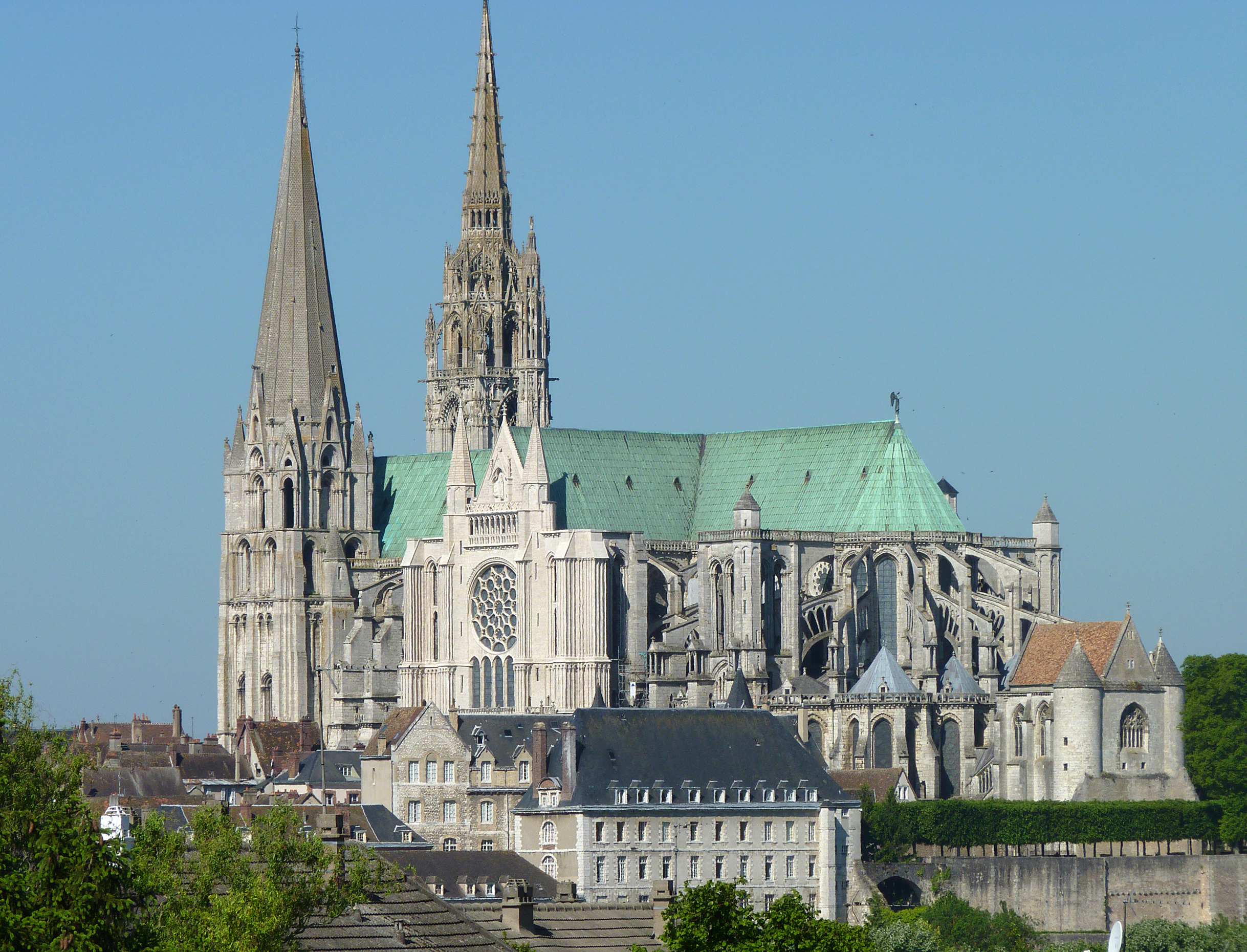 If Chartres is the epitome of collaborative art inspired by religious faith and a feudal system of political economy, we can argue that movies in the 20th and 21st century are the epitome of collaborative art for the modern age, one largely motivated by capitalist structures and imperatives (as opposed to the medieval imperatives of Church and King) and by a deep commitment to the power of mass entertainment. Editing is literally where it all finally comes together and the metaphorical cathedral rises from the materials assembled and crafted.
Where the great medieval church was built out of bricks, one by one, in a film the building blocks are shots. Editing is fundamentally the work of placing one shot—one piece of continuous film—in relationship with another piece of film (in this chapter we are focusing on the visual track only, but we will turn in subsequent chapters to sound editing as well). There are very few narrative feature films that contain no cuts—and therefore require no editing. Several films have been created to look as if they were shot with one continuous take—for example, Rope (dir. Alfred Hitchccock, 1948), Birdman (dir. Alejandro G. Iñárritu, 2014), and 1917 (dir. Sam Mendes, 2019)—but in these cases, it was the work of clever editing that enabled the illusion of one single piece of continuous film on the screen. As we discussed briefly in class our first week, the 2002 film Russian Ark (dir. Alexander Sokurov) explored the affordances of digital filmmaking to capture the performances in one continuous take. And yet, a quick look at the credits for this film reveals an editing team, who performed extensive edits of a different sort: digitally removing objects, compositing effects, color-corrections, altering speed and size throughout to create in postproduction some of the effects that in a traditional film would have been accomplished in different camera set-ups during the production process. We will talk more about some of the new forms of editing introduced in the digital age, but for now suffice it to say that there is no film without editing. As Francis Ford Copola puts it: “The essence of cinema is editing.”
Let’s let Alfred Hitchcock walk us through his understanding of editing—or montage—in this clip from a 1964 interview:
There is a lot to unpack in this clip, but let’s start with a crucial point first: Hitchcock’s use of the term “montage” as a synonym for editing. When I was a young film student I found the use of the term montage particularly confusing, because it can be used in very different ways. Hitchcock uses it as a synonym for editing, and this is indeed an accurate usage. He prefers it to “editing” because, as he describes it, he sees editing not as primarily about cutting but about building, assembling a whole from parts.[1] The word montage—which doesn’t get adapted into common usage in film studies in English until well into the 20th century—is borrowed from the French, originally meaning “assembling the parts of a mechanism to make it work.” And when applied to film, this original definition works very well indeed.
Of course, we learned early on about “montage sequences ,” an editing technique used to compress time. So already we have two different meanings of “montage.” Making matters a bit more confusing, “montage” had been used in a much more specific sense by Soviet filmmakers in the 1920s and 30s to describe a radically different approach to editing than that represented by the classical Hollywood approach to editing. While film grammar in Europe and the U.S. was developing techniques and principles dedicated to what will come to be called “continuity editing” (making the cuts as unobtrusive as possible), Soviet filmmakers such as Sergei Eisenstein, Lev Kuleshov, and Vsevolod Pudovkin often worked in the opposite direction, calling attention to the jarring juxtaposition of shots in their edits. Indeed, Eisenstein famously described montage as “an idea that arises from the collision of independent shots.” This was the essence of the theory: this approach to montage placed on the viewer the responsibility for making meaning out of an often challenging juxtaposition or “collision.”
An example will help make the principle behind Soviet-style montage theory clearer. In this sequence from towards the end of Eisenstein’s Strike (1925), we see the brutal repression of a strike intercut with images of the slaughter of a cow. The principle is that the shots from scene A (the strikers fleeing) and from scene B (a cow being slaughtered) collide in the viewer’s mind to create an independent—or higher— meaning: C.
The Soviet approach to montage derives in large measure from the work of one of their core members, who experimented with the ways in which different juxtapositions of seemingly unrelated shots will create new meanings that are not contained by either of the individual shots. Here is some footage from the original Kuleshov experiment demonstrating that the same image juxtaposed with different shots will cause us to read not only the relationship between the two shots differently but the original shot itself as well:
Juxtaposed with the soup, we read the image of the man as conveying “hunger”; juxtaposed with the dead child he appears sad, while he appears to our imaginations as lustful when juxtaposed with the reclining woman. The shot of the man, of course, is precisely the same in all cases, and yet over and over again Kuleshov’s subjects reported reading different emotions in his expression—emotions that had everything to do with their own imaginative work in making narrative meaning out of juxtaposition of two images.
It is this experiment Hitchcock is playing with at the end of his interview above, when he juxtaposes the same shot of himself—first neutral and then smiling slightly—with a shot of a mother and baby, and then with a shot of a woman in a bikini. In the first instance, Hitchcock points out, we will read the gaze and reaction as that of a kindly man touched by the sight of the young child. In the second, we read the exact same shots—now juxtaposed with a very different image—as revealing what he calls a “dirty old man.” 
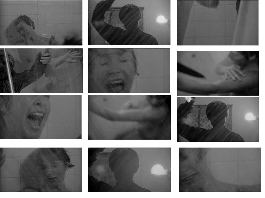
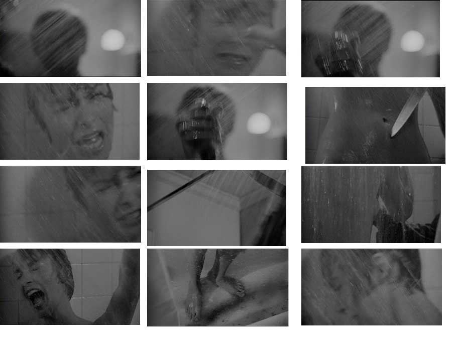
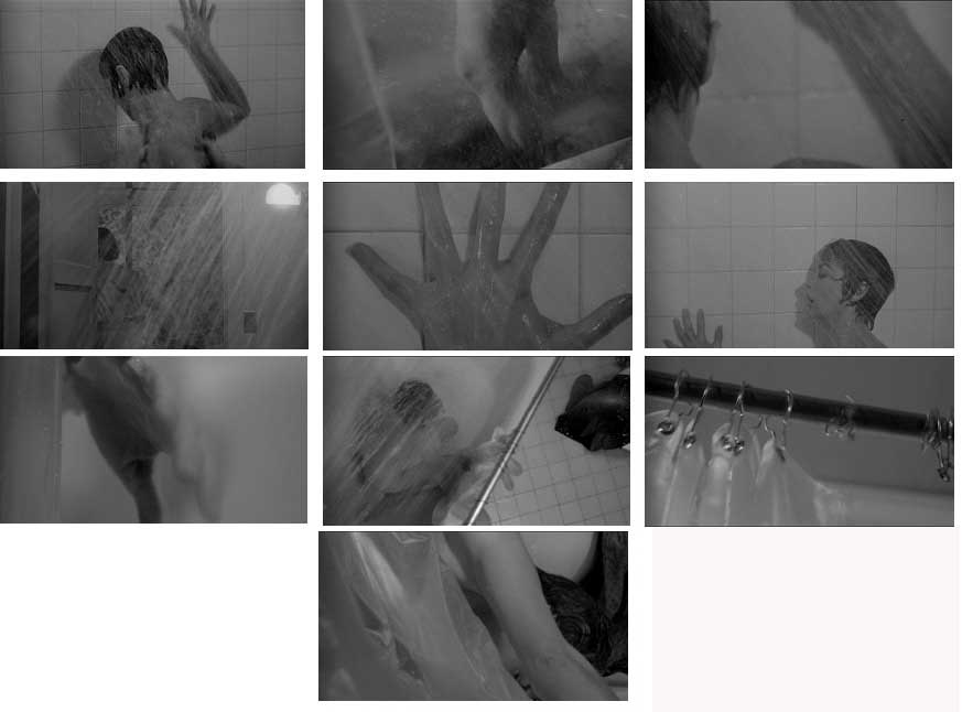
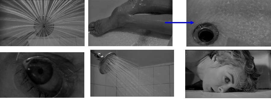
For Hitchcock, this approach to editing is what he calls “pure cinematics.” In his discussion of the editing of the famous shower sequence from Psycho (1960), however, he uses a different term—”Impressionistic editing”— to describe how he went about constructing the sequence. Unable (and presumably unwilling) in 1960 to show on screen a naked woman being stabbed, the sequence in fact shows neither: there is no nudity, no knife entering flesh. Indeed, there is no blood (chocolate syrup was used to create the effect of blood running down the drain). Out of the many fragments that make up this sequence, the viewer assembled in their imagination the impression of being witness to events they have never actually seen. I recall with some embarrassment a friend and I in 1979 watching this sequence in slow motion on VHS trying to see the nudity we were certain had to be there. When we could not find it, we blamed it on the quality of the VHS. The arrival of DVD 20 years later, with its capacity for frame-by-frame stills, only proved the brilliance of the illusion. Let’s break down the sequence, shot by shot:
- Part 1
- Part 2
- Part 3
- Part 4
- Part 5
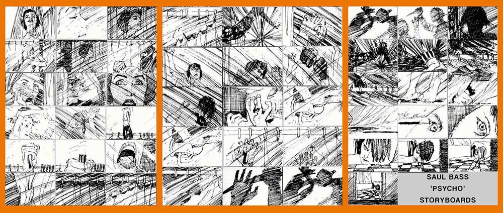
With the exception of the transition from Marion Crane in the shower to the sudden appearance of her assailant in Part 1 of the above breakdown (marked by a blue arrow) each of these marks discrete shots—pieces of film assembled together. That is, there is a cut between each of these short shots. Here is the sequence as a whole juxtaposed to the storyboards that Saul Bass created with Hitchcock for the sequence before production:
The storyboards, part of the preproduction process, show how very much Hitchcock and his collaborator on this famous scene—the designer Bass—were conceiving of the sequence as a relatively unprecedented rapid-fire series of cuts: 50 cuts in total in the 2 1/2 minute sequence. Inevitably, of course, the storyboards and the final film do not match exactly. As we have discussed, a lot changes in production as the logistics of lighting, the environment in which the shooting is to take place, and myriad other factors cause actors, director, and cinematographer to improvise and revise. But the basic vision is all there, even as the final version has considerably more individual shots than the large number already originally conceived in preproduction. Thus we see how editing is where all the parts come together—from pre- to post-production—and yet it is by thinking about and planning for those individual puzzle pieces that editing has the materials to work with (or, to borrow from the Phillip Seymour Hoffman quote earlier in this chapter, the ingredients with which to bake).
The second model of editing Hitchcock defines he calls “orchestration.” Here his example is the second murder in Psycho. The first murder of Marion Crane was entirely unexpected by audiences—after all Leigh was the only famous actor in the cast and everything in Hollywood convention promised that the glamorous star could not die, at least not until the end. The second murder, of Detective Arbogast, is absolutely expected by the audience. Here it is not about the surprise and the horrifying spectacle of a visceral violence that cannot be shown but only alluded to; instead, the focus is on building the audience’s suspense: how and when will the still-unidentified monster strike next.
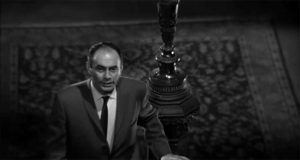
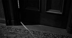
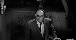
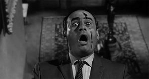
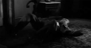
Unlike the shower sequence, this scene is made up of very few shots. In addition, where the shower scene moved between slices of the action (gruesome pun intended) at an almost break-neck speed, the Arbogast murder lingers on shots, allowing suspense to build. Here is a breakdown of the individual shots edited together to make this scene:
- 1- High-angle medium shot
- 2-ground level shot of door opening
- 3-High-angle medium shot
- 4-Extremely high-angle long shot shot of murder
- 5-HIgh-angle close-up
- 6-Eye-level medium-long shot
All the suspense of the first half of this short scene lies in the second shot, the camera almost at ground level, capturing the slow opening of a door at the upper landing of the stairs which Arbogast is climbing. When we return to him in his ongoing climb up the stairs in the third shot, we see he is unaware of the door’s opening, unaware of what waits for him when he arrives at the second floor. This cut puts us as viewers in the position of knowing something our character does not know, reminding us—as horror movies often do—of our powerlessness to prevent the inevitable. Indeed, by the time he arrives at the second story and meets his murderer, it is almost a relief, the inevitable now upon us as Arbogast descends quickly (captured in a remarkable backwards double dolly down the stairs) back to the first floor.
Look at the first and third shots above. It is very clear that this was originally one continuous piece of film, one later cut in the editing room and spliced with the shot in between. All of this had been planned ahead of time, but there was no reason to stop the camera, switch to a new set-up by the door, and then re-set up at the top of the stairs to capture the second half of Arbogast’s climb. Not only would that be a very inefficient use of the crew’s and actor’s time and energy, but it also would likely result in discontinuities between shots 1 and 3.
I point this out to make clear something that we rarely think of when watching a film: movies are almost always filmed out of order. Many factors can shape the shooting schedule, including cast or location availability. But the primary factor shaping production schedules is efficiency. Even if the production team knows the long shots will be broken up in the editing room into short shots, they will film continuously until the director is confident they have captured enough for the editor to do her work. These longer shots will then be trimmed and cut and spliced with other shots to create the orchestrated effect Hitchcock refers to in the interview.
Until the rise of digital editing, all film editing was done manually with scissors (cut) and tape (splice). On average a production team will shoot as much as 10 times the amount of film as will appear on screen. This additional footage will include rejected takes, but also shots ultimately trimmed as narrative efficiencies are discovered and as scenes are revealed during the editing process to be unnecessary or confusing.
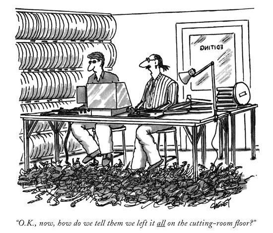
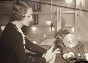
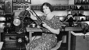
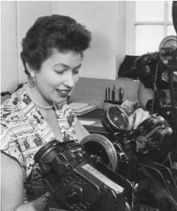
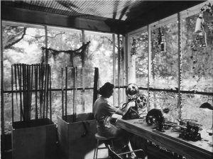
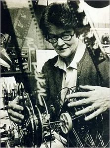
The expression “left on the cutting room floor” refers to a very real experience of editing rooms in the pre-digital age, littered with abandoned footage as the final cut comes together. Here are some historical images of editors are work, holding film up to the light or (after 1924) using a Moviola to be able to watch the film in motion while editing:
- Dorothy Spencer (4 time academy award nominee)
- Irene Morra (1893-1978)
- Anne Coates, Oscar-winning editor of Laurence of Arabia
- Helen van Dongen, pioneering editor of documentary film
- Thelma Schoonmaker, winner of 3 academy awards for films with Martin Scorcese
- Dede Allen, the first editor to receive a solo credit card before a film (for Bonnie & Clyde
In all these examples, film is an analog medium—celluloid and its material descendants—and editing a very linear craft. In the late 80s and early 90s, the first non-linear editing platforms arrived, most famously the Avid systems. For the first time it became possible to take all the footage (still at the time filmed on traditional analog film) and transfer it to a digital format that allowed for the emergence of new approaches to editing. In the image above of Thelma Schoonmaker, we see her working on a Steenbeck editing table, which had displaced the older moviola system beginning in the 1950s (although Scorsese continues to favor the Moviola to this day). This allowed her to queue up several pieces of film at once and move between them easily to envision cuts before making the actual psychical division in the film. The new digital editing systems, however, effectively allowed all of the film to be at the disposal of the editor at once—stored in a digital database on the computer, they could be summoned up in any order and manipulated in new ways.
When we come to our discussion of the rise of digital special effects, we will return to this revolutionary moment in modern cinema. But even focusing on the more traditional kind of editing we are discussing here, it was a game-changer—not least because it revealed to filmmakers (who had been working exclusively with traditional film stocks for a century) an entirely new medium with new possibilities. While digital film would exist solely in an intermediary stage for some time in this early phase of the digital revolution, it was inevitable that, once the technology got to a point where it was possible to film and exhibit digitally, soon almost everything would be digital from start to finish.
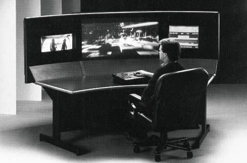
In the 1990s, however, the production and exhibition stages remained dependent on material film, so the film first had to be digitized for editing on a digital system and then transferred back to film for exhibition. And even now, despite the fact that production, post-production, and exhibition are almost always digital, the basics of editing Hitchcock describes haven’t changed much, even if the “cutting” and the “pasting” is metaphorical now, and the editor has new tools at her disposal unimaginable a century earlier. Let’s look more closely at that basic grammar of editing.
••
In effect, we can understand editing as being fundamentally about the relationship between two shots: A and B. Of course, in truth it is the complex patterns and web of all the edits that make the final film, but we can understand the editing principles guiding a film best by focusing on this simple relationship and the different ways it is activated in the edit.
We can think about these relations as establishing at least one of the following four functions (an edit can accomplish more than one) between shot A and shot B:
a graphic relation
a spatial relation
a temporal relation
a rhythmic relation
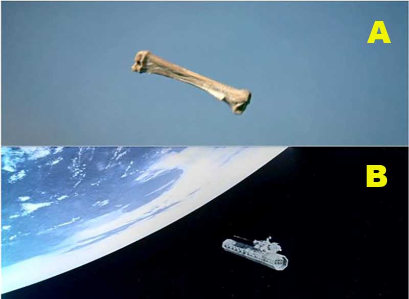
When thinking about a graphic relation established by an edit, it helps to turn to the most extreme example of this kind of edit: the match cut. Here are a couple of famous match cuts from film history:
In the first, from 2001: A Space Odyssey (dir. Kubrick, 1968), we cut from a scene of prehistoric apes discovering that a bone can be used as a weapon (the victorious ape hurls the bone into the air in triumph) to a spaceship whose shape corresponds to that of the bone.
We have leapt from shot A to shot B across millennia of history, from our prehistoric past to a space-age future, in a blink of an eye—the only connecting bridge being this graphic connection of bone/weapon to spaceship. And yet, it proves a strong bridge, allowing us to make connections that do not need to be otherwise spelled out: the scene of violence we open with in which one ape kills another is identified as a moment of human origins, and the space ship in shot B is identified as its direct descendant. The suggestion is clear, even before we have seen anything play out in our future setting: humanity’s inherent drive towards violence and domination remains as much a driving force in our future as it does in our past. Using the economy of visual language and the graphic match established by the edit, we are enabled to bring to mind thousands of words of ponderous discourse on the relationship between human technology and violence without a single word being uttered—with a snap of the editor’s fingers (a corny transition of my own to the example below).
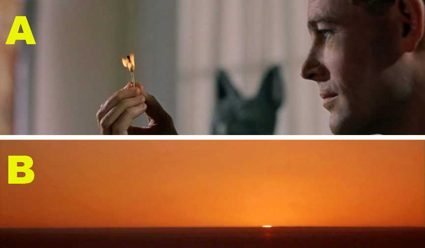
The second match cut comes from Laurence of Arabia (dir. David Lean, 1962), and it is a doubly clever match cut in that it involves an actual match:
Here, our protagonist has just found out he will be able to fulfill his dream of heading into the deepest desert, and as he contemplates his future he lets a match burn down almost to his fingers, blowing it out at the last second. The act of blowing out the match brings us not into darkness but into the desert, where the sun begins to rise (and soon, Laurence himself rises as well over the horizon). Here the match cut functions not to provide a match of shapes as in the example from 2001, but instead to match the color of the flame itself. The leap forward into the future is not a matter of millennia, as in the first example, but only a matter of days, and yet for Laurence it is the journey to another world, to the destiny he has long believed awaits him. (At the end of the film, the viewer will realize that the burning match proved more prophetic than the rising son as a description for Laurence’s fate).
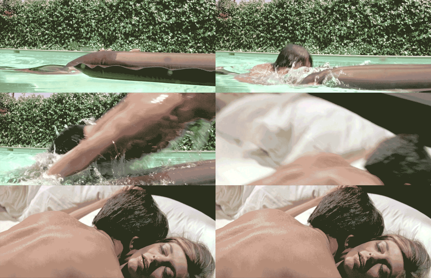
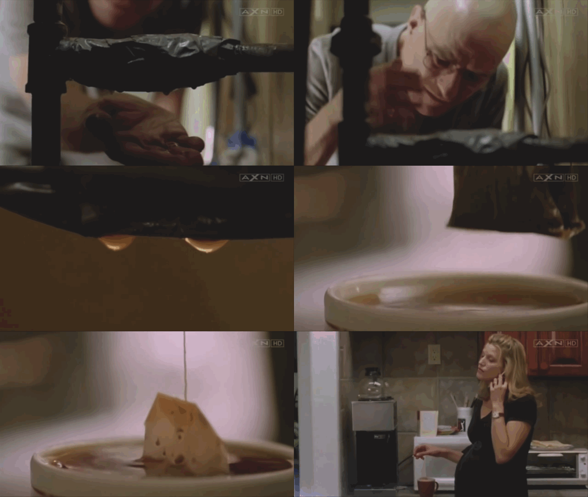
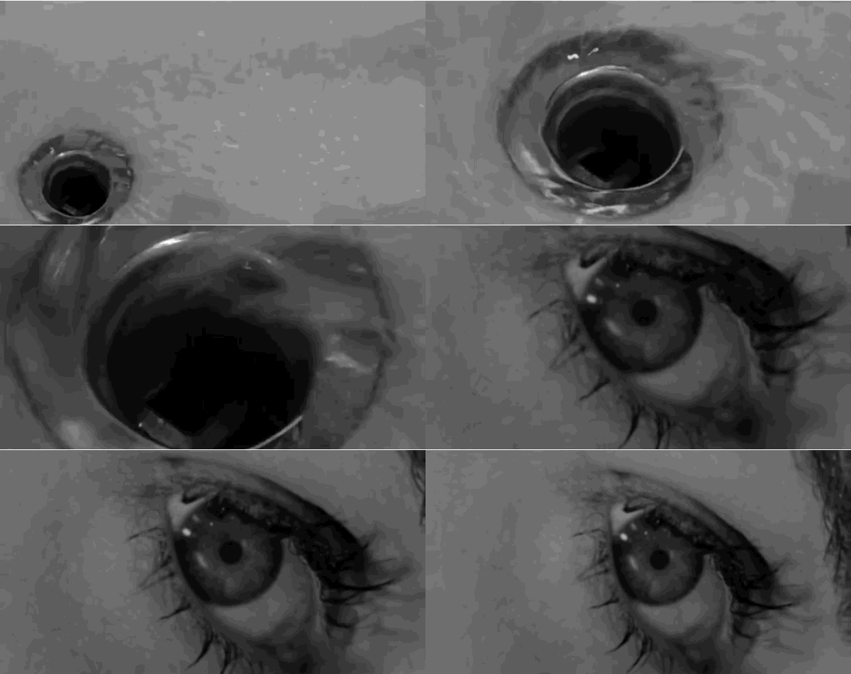
In all of these examples we are describing a graphic relation between the shots, one that then causes the viewer to go back and make sense of the connection implied by the visual association. For many film fans, this is one of the most enjoyable edits to spot, and as a result there are plenty of examples out there on the internet and in GIF form. Here are three:
- The Graduate
- Breaking Bad
- Psycho
These three examples do very different work. In the first, from Nichols’ The Graduate, our protagonist hauls himself out of a pool in shot A, and falls on top of a lover in shot B. The movement from shot A to B is graphically seamless, and yet of course the spaces and times are clearly different. Here the graphic match suggests the ways in which our protagonist has become accustomed to a certain way of life and how these actions have become routine.
In the second, from the television series Breaking Bad, we see a cut between our increasingly corrupt anti-hero working on a leaking pipe dripping foul water in shot A, to shot B, in which a tea bag is being dipped into a cup by the anti-hero’s wife. This match conveys the ways in which the evil doings the protagonist is engaged in will ultimately start to infect and contaminate his family as well.
Finally, of course, we return to the match cut at the end of the shower scene in Psycho, in which the water rotating into the shower drain in shot A is matched to a reverse twisting shot pulling away from the eye of the murdered Marion in shot B.
All of these are examples of edits establishing graphic relations. When the match between the two is graphically tight, we will call it a match cut, but all are examples of graphic edits, using visual language to establish connections.
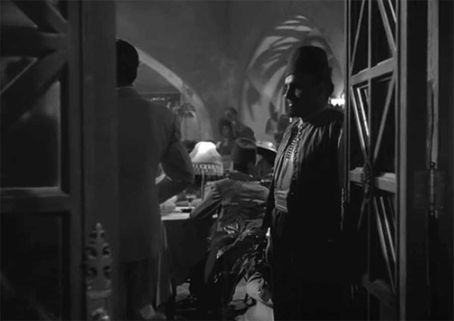
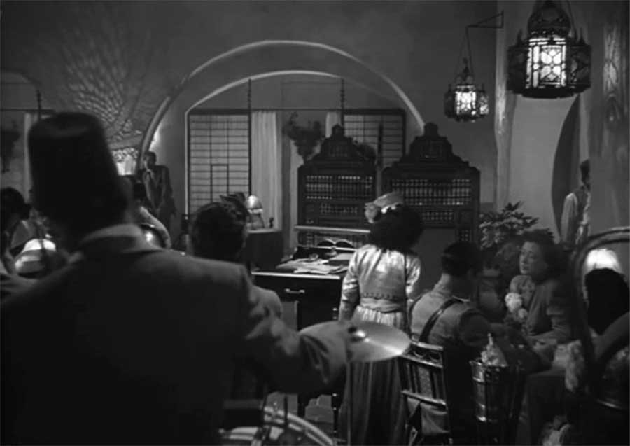
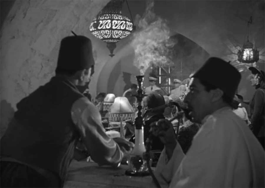
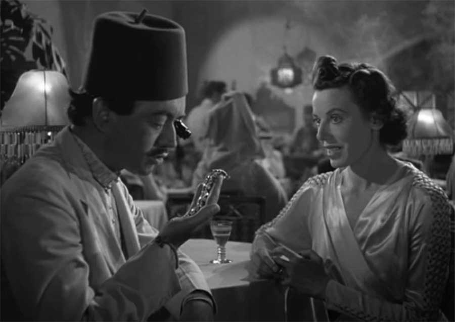
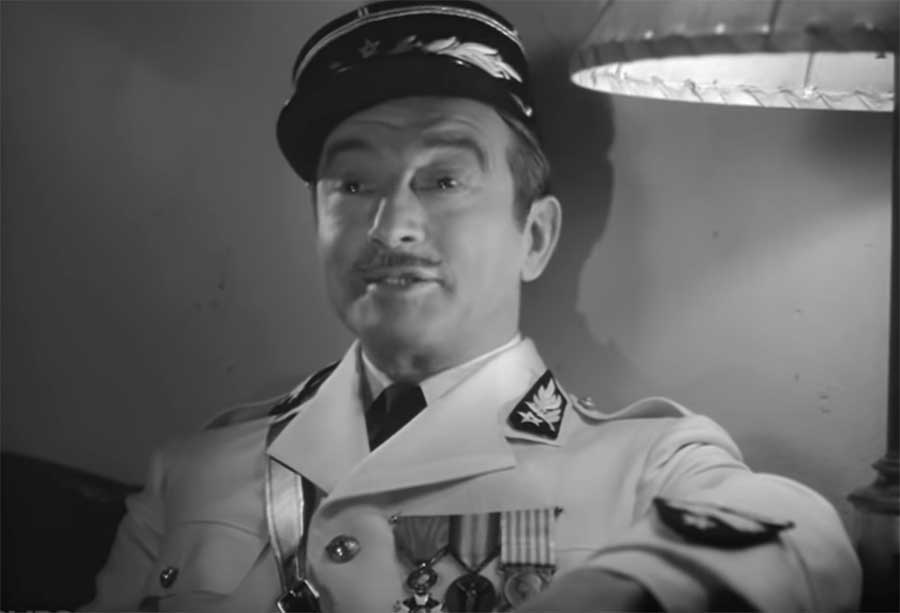
Spatial relations is probably the most common form of edit we see in narrative film, and it is the backbone to what is called continuity editing. We are already very familiar with this editing pattern from the opening of Rashomon, in which, we cut from extreme long-shot, to long shot, to medium shot, and finally to close-up. These edits establish the relationship between our characters and the larger space they occupy, as well as to each other. Here is an example in the classical Hollywood style from early in Casablanca (dir. Michael Curtiz, 1943):
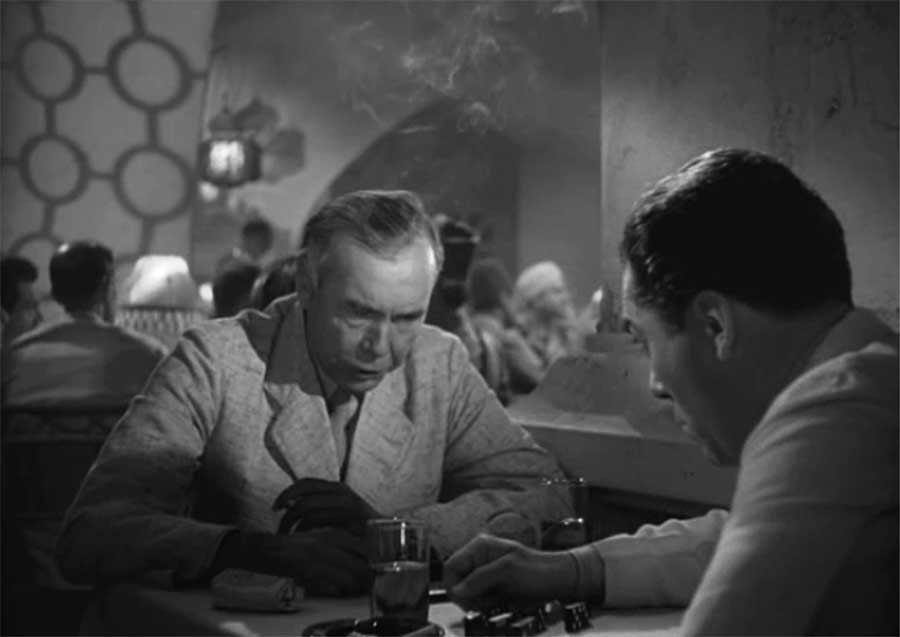
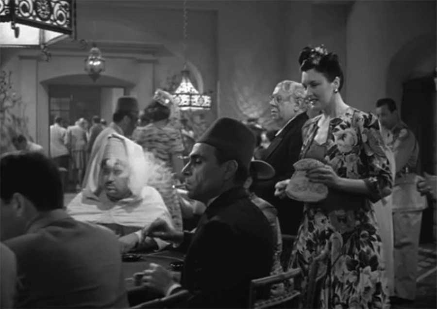
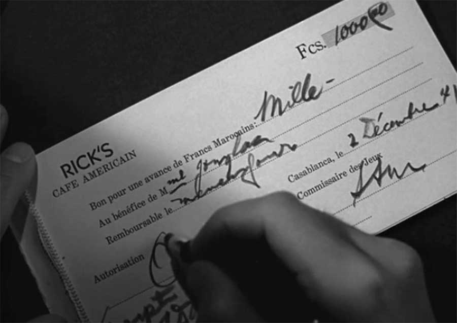
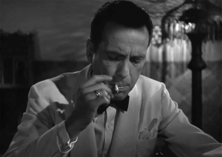
In this scene we are introduced to Rick’s cafe in wartime Casablanca. We see the international refugees who have washed up in this cafe, owned by the reclusive Rick, whose face we do not see until the end of the sequence, and catch snatches of their negotiations and intrigues. Here are each of the shots that make up this scene, culminating in our first view of Humphrey Bogart as Rick:
Of course, keep in mind that there is more happening here than just the cuts: there are pans and dollies that also help convey the sense of the labyrinthine and cacophonous space. But in this scene, it is editing that does the most work to convey spatial relation. We begin with the door opening, and we follow in a couple (who we quickly lose sight of). The first cut continues to track the couple, but by shot C we have lost sign of them entirely, much more interested in all the huddled whispers we are stumbling upon.
A question we probably wouldn’t think to ask is: how do we know all these shots are in the same space? After all, a cut, as we have seen, can take us from prehistoric earth to the far reaches of space. How can we be certain that we are still in the same space we entered as we cut from one conversation to another?
One important marker which conveys spatial continuity here is sound, as Sam (Dooley Wilson) sings in the background of each of these shots. We will talk more about the work of sound in crafting space and continuity in the next two weeks. But even if the film were silent, we would read the shots as occurring in a shared space. Some of this is due to the similar decor, art direction and lighting which suggest continuity. Some, however, is economically conveyed by our own acculturation to the conventions of continuity editing. A century of narrative film has trained us to assume as the default that edits—especially in the Hollywood tradition—are in the service of our comprehension of the scene and its seamless flow. While in truth, any one of these cuts could theoretically be to a radically different space, we will always presume continuity unless presented with clear evidence that our expectations are being challenged by a particular cut. Thus in a matter of 12 shots, each of them focusing on a rather tight space, we gain the sense of a large and complex space whose whole we never actually see. And we learn about our protagonist, without him saying a word: it is he who is in command of this space, even as he sits, isolated and cut off from human company, alone.
One of the most ubiquitous edits that functions in terms of spatial relations is the shot/reverse shot which is widely used to film conversations. Here is an example, again from Casblanca:
Of course, this conversation between two individuals could have been filmed entirely with a two-shot (and there is a two-shot towards the end of this clip), but such an approach puts us at a distance from the conversation. The shot/reverse shot (in which one character represented in shot A and the other in shot B) brings us into the conversation, creates intimacy and investment unique to film. The two shot effectively places us in the position of a theater audience (and indeed in early film this was precisely how dialogue was filmed). The shot/reverse shot places us in the conversation as no theatrical staging could do.
The basic set up generally looks like this:
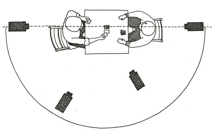 The dotted line represents what is referred to as the 180 degree rule—a system central to continuity editing that ensures that spatial relations are maintained consistently throughout a scene. When it is violated, when the camera moves to the other side of the line, a character walking in one direction across the screen can suddenly be seen to be walking in the opposite direction across the screen, even if her angle through space has not changed. In shooting a conversation, if the camera moved across the line, the image of the person they were talking to would suddenly flip in relation to the preceding shot. In recent decades directors and cinematographers have found ingenious ways to break and complicate the 180 degree rule, but it still governs most basic camera set ups because if violated the editor will end up with footage that breaks all continuities of movement and spatial relations, which is usually not the goal of the filmmakers.
We will have more to say about spatial relations in editing when we return to editing in conjunction with sound. As this chapter is already running long (editing is such a huge topic!), let’s briefly touch upon our last two categories: temporal and rhythmic relations in editing.
We are already familiar with some of the crucial work editing can do in terms of time. In our earlier discussion of narrative and time we considered flashbacks, flash-forwards, elliptical editing, other ways of conveying the movement of time. Much of what we discussed in Chapter 3 is conveyed on the screen via editing. For example, the dissolves in the early sequence in Alien as we watch the crew awaken is used to convey the slow passage of time in a short amount of screen time. The match cuts described above from 2001 and from Laurence both also serve to establish temporal relations between shot A and B, moving the story forward (a matter of millennia in one case and a matter of days in the other).
Certain transitions—visual markers between shots—have become especially associated with temporal markers, including the dissolve, the fade, and the swish- or whip-pan (a largely in-camera transition we discussed earlier with cinematography). Here, from Spaceballs, is an example of a dissolve that announces itself quite loudly:
The question of rhythmic relations established by edits is a bit more abstract, closer to thinking about the use of rhythm in poetry and music than the language we often use for talking about narratives. For that reason I want to return to this aspect of editing in relation to sound and music in a couple of weeks. This scene from Eternal Sunshine of the Spotless Mind (dir. Michel Gondry, 2004) does a nice job in conveying the ways in which edits can speed up and begin to jump in time to convey the mounting panic of our protagonists as their memories of each other are being wiped:
To be continued… after the dissolve….

Media Attributions
- KuleshovEffect_ShortFilmStills780
- KuleshovEffect_HitchcockB780
- Psycho_Screen_Grabs
- o-k-now-how-do-we-tell-them-we-left-it-all-on-the-cutting-room-floor-new-yorker-cartoon_u-l-pgrte70
- 59ded168f204852c455e5dd3c8e3210a
- match-cut
- Match_Cut-865×505
- 8f33b0589b6ec51f66c3e13b1e157590
- Hitchcock had also spent a good deal of time a couple of years earlier being interviewed by the French director and film theorist François Truffaut, and for the French, "montage" is the term used for editing. ↵
a single continuous piece of film, however long or short, without cuts or optical transitions.
The French word for editing. In the Soviet Union during the 1920s and 1930s, "montage" refers to a particular approach to editing in which contrasting and colliding shots and sequences are juxtaposed with the aim of generating new ideas in the viewer's mind beyond those which the images themselves convey
Transitional sequences of rapidly edited images, used to suggest the lapse of time or the repetition of certain actions.
Associated most closely with the films of Spike Lee, the double-dolly shot involves having the camera on one dolly and the actor on another.
editing approach with a logical, often uninterrupted flow of action or dialogue in time and space is maintained by various cutting techniques
an optical effect in which one end of a shot is gradually merged into the beginning of the next by the SUPERIMPOSITION of a FADE-OUT over a FADE-IN
a transition in which a shot dissolves to or from black
an extremely fast pan movement, often used at the end of a shot as a transition to the next shot.


