6 Mise en Scène Part 1: Setting, Design, Staging
If you have grown a bit impatient with some of the language we use in analyzing visual and narrative art—language that can be a bit loose and flexible—I think you might enjoy the next few weeks. We have spent the last few weeks thinking about how narratives are structured and about questions of genre and style. All of these are crucial to how we interact with film and how we talk about it. But one of our goals in this course is to develop our ability to reverse-engineer what we see on the screen—to imagine the smaller individual choices and the reasoning behind them that conspire to make up the overall look, style, impact, and meanings of the movie. This week we begin that work in earnest.
The term mise-en-scène is a French phrase translating roughly as “putting in the scene,” or setting the stage. As a critical term, it derives from the much older art form of theater, where it served as a way of describing the accumulative impact of everything the audience sees on stage in a play or an opera: costumes, sets, lighting, movement of the actors, etc. Of course, film is as a rule much more visually dense than theater because it is a photographic medium, and one that allows for an telescopic intimacy theater cannot afford even those in the front row: the close-up, the insert-shot, slow motion, freeze frame, etc. The unrelenting gaze of the camera’s eye means that everything is noticed—if not the first time by everyone in the audience, by someone, always, and eventually—through countless watchings and documentations of details in sites like imdb.com—by everyone who cares to find out where to look.
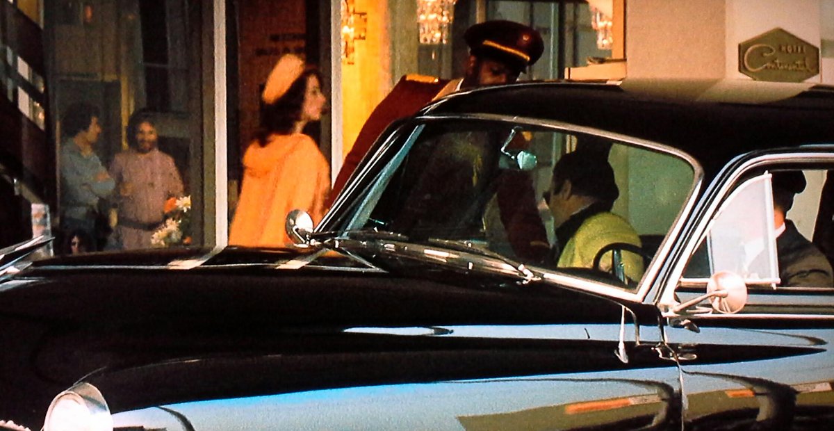
Even accidents will eventually be noticed, especially in the digital age. For example, in Troy (dir. Wolfgang Petersen; 2004), a lavish historical epic set in ancient Greece, a plane can be seen over Brad Pitt’s shoulder. In a scene in The Godfather (dir. Francis Ford Coppola; 1972) set in Vegas in the 1950s, a couple of 70s-style hippies can be seen through the storefront window. Neither of these anachronisms were intended, and yet, having failed to be edited out along the way, they remain forever part of the mise-en-scène of those scenes. As the actor Michael Caine wrote, “The camera misses nothing!” And because it misses nothing, great care is taken before any camera starts rolling to carefully select and arrange everything that will be in its range once shooting begins.
- Troy
- The Godfather
As we have discussed, a feature film will almost always go through five relatively distinct stages, all of which are of interest to us as film students. But three of these will occupy our attention for much of the next few weeks, as this is where all the decisions are made as to the details of what we see on screen. The five stages of film production can be roughly broken down as follows:
| Development | Preproduction | Production | Post-production | Distribution |
|---|---|---|---|---|
| identifying the story | Establish a production company to produce the film | The shooting schedule begins with crew and cast arriving on location or set each day | Visual/ special effects | Final film is distributed to theaters or brought to festivals in search of a distribution deal |
| writing the draft script | Hire key personnel | Crew sets up equipment while the actors get in costimes, hair and makeup needed for the days’ shooting | Sound effects | Promotion of film |
| securing financing and a producer | Develop shooting script
Storyboards |
Scenes are shot multiple times, both for the best takes (versions) of the performance, but also for coverage (different angles and distances that can be edited in post-production) | Score completed and recorded and/or songs selected for soundtrack | Theatrical exhibition, streaming rights arranged, etc. |
| Plan budgets | A second-unit crew will capture additional footage (in-between shots, establishing shots, insert-shots, and closeups) | Editing (sound and image) | ||
| Develop a shooting schedule | ||||
| Scout locations | Additional photography (when something is found to have not worked in the original footage, or when something has changed in the editing) | |||
| Design and build sets and select props | Color grading | |||
| Design costumes, hair, makeup
Finish hiring crew
|
||||
| Rehearsals and refinement of shooting schedule |
While development and distribution are hugely important (and we will talk more about distribution and exhibition towards the end of the course), it is the middle three stages that will occupy us for the next few weeks. From designing sets (pre-production), to camera lenses and shooting angles (production), to selecting and splicing the best footage together to make a coherent whole (post-production), for us as students of film, this is the heart of the matter.
When thinking about mise-en-scène, we are talking about decisions primarily made in the preproduction process—even thought many of those decisions are made quite late, often very close to the beginning of production. And of course aspects of mise-en-scène bleed over into production as well. There is sometimes debate about what falls under the umbrella of mise-en-scène, but all definitions would agree on the following components:
- Settings/Set design
- Props
- Costume
- Hair and makeup
- Lighting
- Staging and composition (how bodies are arranged and move in the filmed setting)
Many definitions will also include the following:
- Acting
- Choice of film stock
- Choice of aspect ratio
- Choice of lenses
It can get a bit confusing, especially because critics can define the term somewhat differently in terms of what they think should be included and what should not. (For example, I personally would consider rehearsal and direction part of preproduction, but the acting itself in front of the camera for me is part of production.) But we must recall that this is a critic’s term, a way of describing an overall effect that can then be reverse-engineered in analysis to better understand its magic. Aligning the critic’s concept of mise-en-scène with the stage of production we call “pre-production,” it is easiest to simply define it as: everything placed in front of the camera before the camera starts folling—including actors. Depending on the film, certain of these elements might be more important than other in their role to contributing to the visual presentation and overall “look” of a movie. But all of the above can play a crucial role.
This week we are focusing on three elements that contribute to this overall “look” of a movie, three categories of “stuff” put before the camera to be filmed: setting, design, staging. These are actually very big categories in a modern film production, often involving many different teams of personnel. Watch the short video essay below, which does a terrific job exploring the various roles involved in designing the world that will be filmed:
Here’s how the Art Director’s Guild describes the work of the Production Designer, the individual who is the most senior member of the design team:
Production Designers are the visual artists and storytellers, who, in consultation primarily with the director, create and develop the overall look, atmosphere and emotion that move the story. They do this through the conception and creation of stage sets and the selection and alteration of practical locations and backgrounds. Production Designers also collaborate with the visual effects team and provide the designs necessary to maintain a coherent blend between the look of the production, cinematography and the post-production visual effects footage.
A couple of things are worth noting in this definition. First, the Production Designer is the boss of the design team, but her decisions are always in dialogue with the director (and if the producer is hands-on, with them as well). The director will have an idea, a vision, a feel. But the director does not have all the necessary skillsets to know how to make it all happen: who to hire, what to buy, build, rent, and outsource to post-production effects. That is the Production Designer’s job—or, more accurately, the details are often the job of the #2 in this team, the Art Director, who manages all the logistics, personnel, skilled craftspeople, and materials necessary to bring that vision to life.
This includes several teams, all under the orbit of the production designer and art director:
- Set decorators: dress the settings with furniture and props.
- Set designers: create technical drawings to build or modify sets, locations and signs.
- Illustrators: create three-dimensional illustrations and/or sketches and designs used in the preparation and production of motion pictures.
- Graphic Artists: create necessary graphics, including signage, books and posters.
- Model makers: create study models of proposed sets.
- Art department coordinators: provide logistical support and research.
- Location managers and scouts: seek out possible locations and manage location filming and permits.
- Prop masters: provide the necessary hand props for actors to use during filming.
- Construction coordinators: coordinate the building of sets with a foreperson, prop makers, laborers, painters, green designers, and scenic artists.
While also under the oversight of the Production Designer, there are two areas that have somewhat more autonomy:
- Costume design/wardrobe
- Hair and makeup
Unlike most of the other aspects of the design, these last two are elements that are attached to the actors themselves throughout their performances. And actors—especially those who have achieved a degree of celebrity—can be very particular about what they wear and how their hair and makeup looks. For that reason, the director, who manages the actors directly, is often called on to serve as a mediator between production design and the desires of the stars (or their agents), negotiating compromise when necessary. Nonetheless, these two areas still fall under the domain of Production Design precisely because they are all elements planned for and designed before the camera starts rolling, or what is often referred to as profilmic elements—that is, anything before the camera.
Finally, although their work will not begin in earnest until after primary production is complete, visual and special effects staff will be involved in discussions with the Production Design team to make sure that all digital and other effects added in post-production will be seamless with the designs on the sets during filming. We will discuss the work of this team in detail in a later chapter.
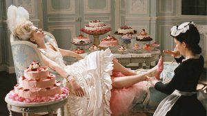
Just as we often reduce a film to its directors, it is easy to distill our understanding of a film’s look and design to the Production Designer realizing the vision of that director. So in the case of Birds of Prey, mentioned in the previous chapter, we have a director, Cathy Yan, who, with her producers (including Margot Robbie), hires Production Designer K. K. Barrett. Barrett had designed the look of some of the most visually distinctive films of the last generation, including Being John Malkovich (dir. Spike Jonze; 1999), Marie Antoinette (dir. Sophia Coppola, 2006); and Her (dir. Spike Jonze, 2013).
- Marie Antoinette (2006)
- Her (2013)
While neither the look or the style of these distinctive films is identical to what Yan had in mind for Birds of Prey, Barrett’s range and willingness to take big visual risks with bold style—whether in capturing the decadence of late 18th-century France in Marie Antoinette or in bringing to life a near-future Los Angeles in Her—suggested someone with the vision and talents to make the unique look and feel of Birds of Prey work. Of course, since the look and feel has everything to do with so many other artists in the various departments a Production Designer oversees, it also suggested someone capable of finding and managing strong creative personalities and visions and getting them to work together towards a unified whole.
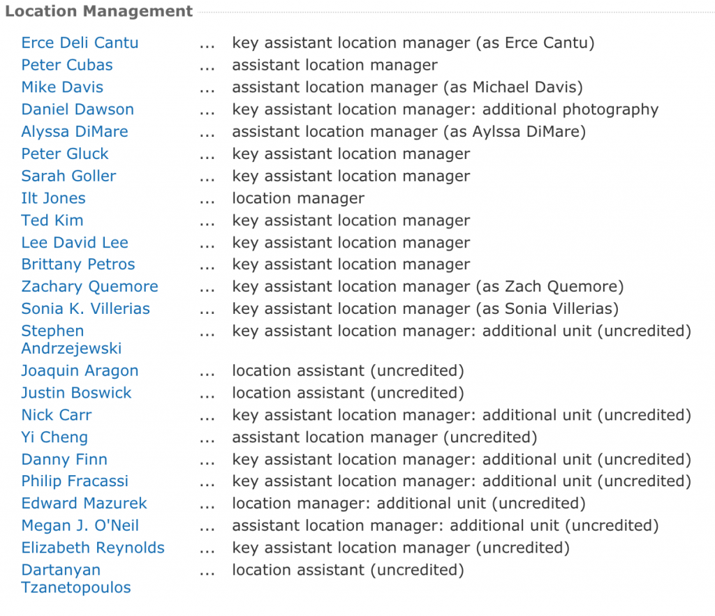
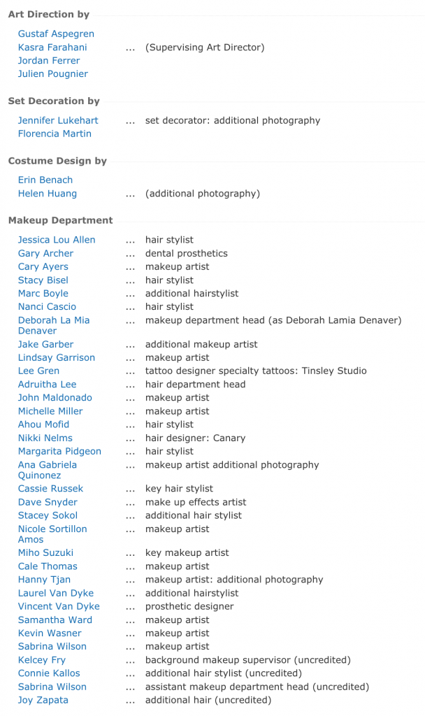
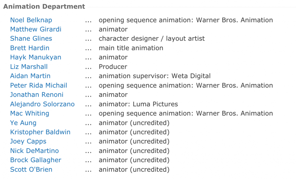
How many people are we talking about, exactly? Let’s take a look at the crew on Birds of Prey that Barrett worked with during the pre-production and production of that film. Here are some screenshots from imdb.com’s crew listings of the movie (click to blow up to readable size):
This list is somewhat unusual in including animation, which in Birds of Prey plays an important narrative role and also contributes throughout to the unique look of the film and its narration. Everything else, however, is pretty standard, including the size of the various departments (bigger budget films with more locations would be larger, while small independent films would often be a good deal smaller). The makeup department alone—which includes hair, tattoo specialists, prosthetics, and more—is over 30 individuals. The costume department is over 40. All told, this aspect of the production involves well over 100 individuals, all artists, all highly trained in their unique areas, all collaborating together under the oversight of the Art Director and the vision of the Production Designer. A look at the same departments K. K. Barrett oversaw as Production Designer for Marie Antoinette (2006) reveals—not surprisingly, given the centrality of elaborate style and design to that film—an even larger team of costume, makeup, hair, and other creative designers and specialists (see imdb.com page).
When we talk of the “magic of film” people generally mean the illusion, the sense of fictional worlds being brought convincingly to life before our eyes on screen. What is really magical about film, in my eyes, is that collaborations on this scale work at all—let alone that they work so well that we are able to experience the final film as a coherent vision. Yes, film production is hierarchical, sometimes to an almost military degree. But it is also built on profound trust in the individual members of the team to make it work, even as each member—no matter how much they try and repress their own individual tendencies as an artist in favor of the Production Designer’s goals—inevitably, necessarily puts their own unique fingerprint on some aspect of the design. The result is a snowflake, each unique in its look and feel once we study it up close, even if from a distance they can all look somewhat the same.
We can’t dive deep in to all aspects of the Production Designer’s team here, but we will come back to various aspects in our film discussions throughout the semester. Take time to stop by imdb.com and explore some of the key design personnel in each film, starting with the Production Designer, without doubt the most important individual in the preproduction stage leading up to the beginning of production.
Let’s pause for a moment, however, on one aspect of production design: sets. In all films, sets are meticulously designed and play a role in shaping the narrative. A setting in many novels (and screenplays) might be described very thinly: “a well-appointed penthouse apartment in New York,” or “a café in 19th century Paris.” If the details of the setting do not contribute more beyond a general ambiance, that might well be all that is needed to summon to the minds’ eye the necessary “look.” As a visual, photographic medium, film will convey much more information than is narratively necessary due to the simple fact that the “camera misses nothing.” We can see clearly the difference to the detail film setting demands when comparing a description of a setting from a novel with the film adaptation of that setting.
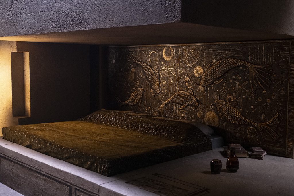
Here, from early in the novel Dune is the description of the bedroom young Paul Atreides selects for himself after his family arrives on the desert planet Arrakis:
Paul’s attention went to the carved headboard of his bed—a false headboard attached to the wall and concealing the controls for this room’s functions. A leaping fish had been shaped on the wood with thick brown waves beneath it. He knew if he pushed the fish’s one visible eye that would turn on the room’s suspensor lamps. One of the waves, when twisted, controlled ventilation. Another changed the temperature.
Quietly, Paul sat up in bed. A tall bookcase stood against the wall to his left. It could be swung aside to reveal a closet with drawers along one side. The handle on the door into the hall was patterned on an ornithopter thrust bar.
It was as though the room had been designed to entice him.
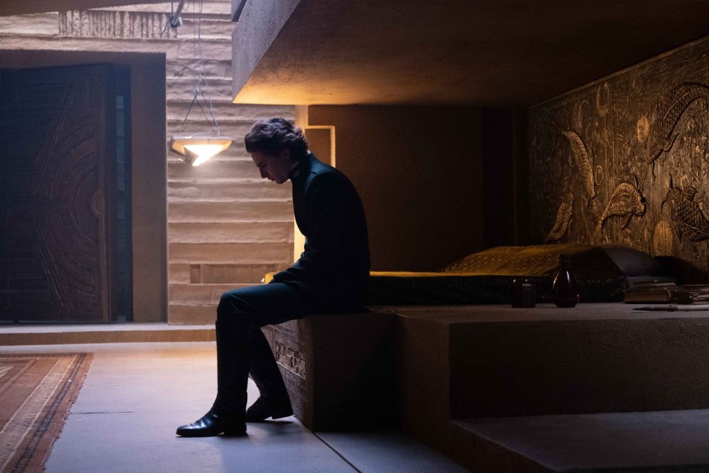
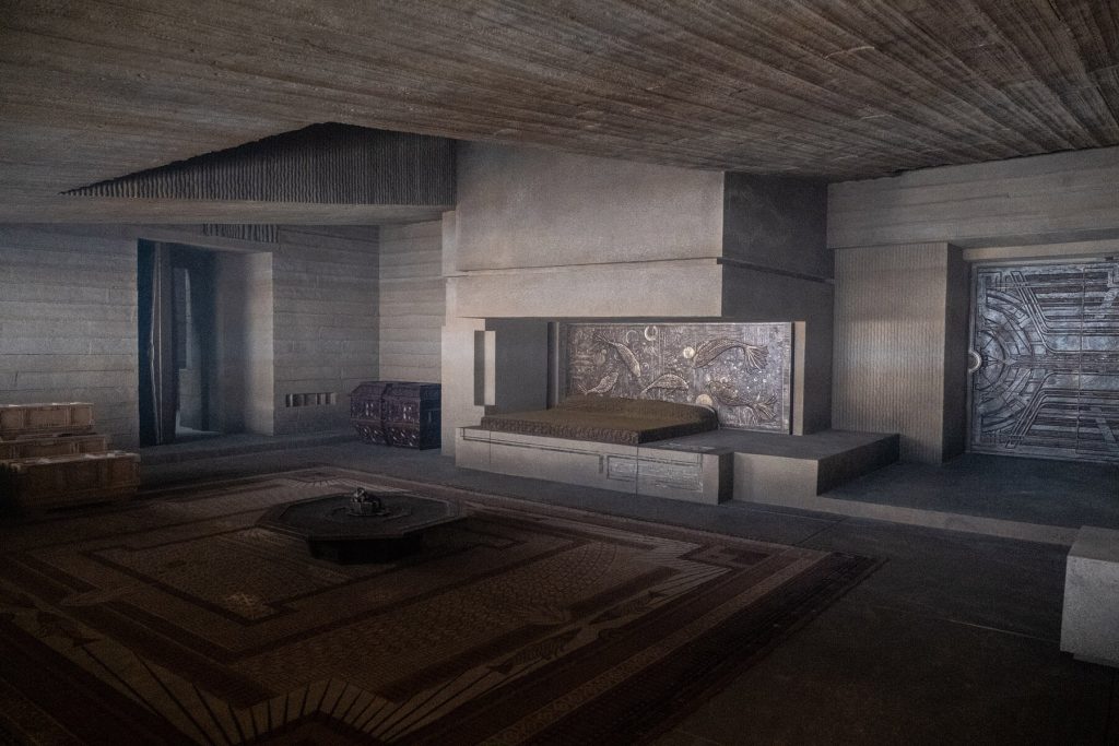
This bedroom will be the setting of the first attempt on Paul’s life shortly after this description, and so of course it was a necessary setting to incorporate into the 2021 film Dune (dir. Denis Villeneuve). The film’s production designer, Patrice Vermette, did not have a lot of detail to work with when it came to designing the room. The leaping fish carved into the wood was a key element, and it would around that detail that the design for the space would evolve:
If you click the stills above you will see the details layered into the set for this scene (which takes place in a bedroom to which the character Paul will soon leave behind forever). “A leaping fish had been shaped on the wood with thick brown waves beneath it” becomes the headboard of the bed detailed on the left, and everything else in the space is added by the Production Designer and his team. Because whereas a novel can conjure up a setting with a sentence or two, a film must render it visible on the screen in meticulous detail.
The attention dedicated to sets was not always so intense. In earlier decades of film, before DVD and streaming, for most people there were no opportunities to return to a film and examine scenes in detail. In addition, most films were watched in crowded theaters or, after 1950, on black and white tv’s with limited resolution. With the rise of digital projection and home screens with ever higher resolutions, and as movies became easily accessible for close study, increasing attention would be dedicated to set design. Before 1950s, such meticulously rendered sets would be the exception.
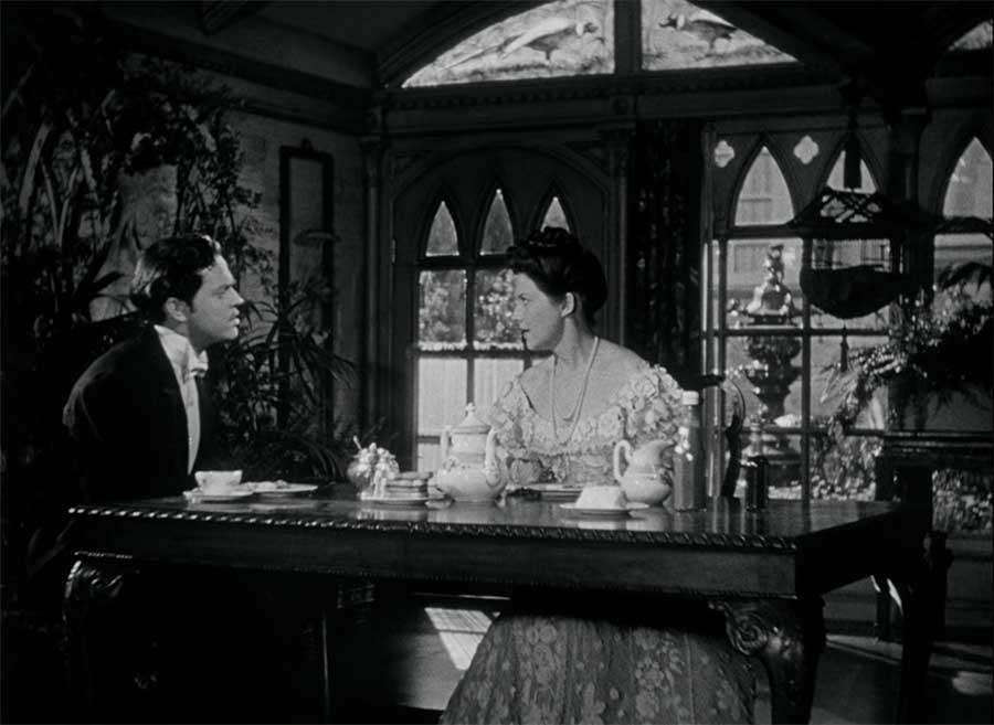
It was such an exception that would get a young Orson Welles in the bad graces of his studio in making Citizen Kane. Orson Welles insisted on building (at considerable expense) ceilings for his often elaborate sets, so as to allow his camera to capture unconventional perspectives on the action, even from below the floorboards themselves. And every detail of the sets and set dressing were meticulously managed throughout. In the famous marriage montage in Kane, which tells the story of a 16-year marriage in under three minutes, Kane’s production design team uses set dressing as well as in the costume and hair of the two actors told a complex story of a failing marriage—from new love to the final retreat into private fortresses:
- Beginning of marriage montage
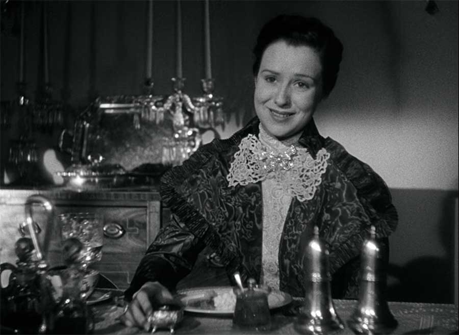
- Last shot of marriage montage
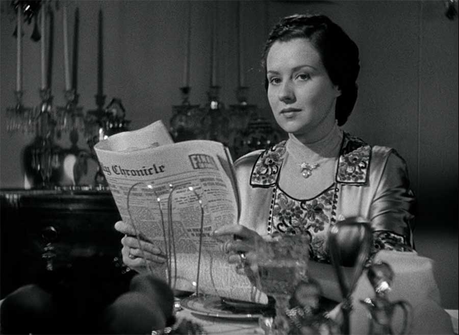
Interestingly, the set itself does not change overly much. They are in the same dining room with the gothic windows and the trellising vines, both at the beginning and at the end of their marriage. But in the still on the left the table feels intimate: they sit next to each other and lean into each other. And we are close as well, as if leaning in with them. But there are subtle changes by the final shot of the sequence: the table seems to have grown longer, and the lighting exaggerates the shadows through the gothic windows, transforming what had seemed elegant and warm in the first shot into something ominous and cold in the final. The passage of time is indicated by the growth of the vines behind Kane, and the newspapers in both their hands serve as props carrying great meaning, as Kane reads his own paper while his wife reads the rival paper.
And of course other elements of the production design shine here, especially costume. Below, for example, we see Emily transform from the scoop-neck openness and softness of her dress in the shot on the left above to a retreat behind an increasingly closed-off shell, as if her clothes are protecting her from Kane’s emotional violence:
In attending to these wardrobe changes which carry so much narrative meaning, we might miss other small details in the set dressing: the shift from the flowers in the centerpiece in the shot on the left, to stiff metal salt and pepper shakers, to a fortress of wire and newspaper between Emily and her husband on the right. And in the background, the cabinet holding a coffee service—a relic of the intimate coffee they shared in the first shot—is replaced by first one and then, in the final shot, multiple candelabras, contributing to the gothic atmosphere of the final shot above and to a sense of the dining room as serving only ceremonial, formal functions at the end.
All of this is the work of the design team: sets and the many objects that “dress” them, wardrobe, hair (notice the tightening of the wide’s hair from the first to the final shot in the marriage montage), and so much more. All of this contributes to the overall mise-en-scène; but more importantly, because all of this is intentional, literally by design—placed in the scene—we can ask and try to answer: why? It cost labor and money, for example, to switch out the coffee service for the cabinet and the candelabras. This effort suggests that meaning inheres in the decisions that we should want to understand, or at least to try and make meaning out of.
Movie sets, of course, don’t have to be realistic. We might look at the set designs in Alien (dir. Ridley Scott; 1979). A lot of screen time in the film is devoted to shots of these unoccupied interior spaces on the ship in which the crew is traveling. The film opens with a long tracking shot through the uninhabited Nostromo, and long after the crew is awake, we continue to pause for long moments looking, seemingly, at nothing:
At first glance, these shots seems primarily to serve to remind us of our setting (an intergalactic spaceship) and with it, our genre (science fiction). But the more we are forced to stare at these sets the more we realize how ominous and threatening this setting becomes once the alien is free among its corridors. Suddenly, instead of a rational symbol of a technologically-enhanced future, the ship has become a maze of corridors that more closely resembles a cavern or haunted house. The ship becomes as threatening as the monster who stalks it, and soon we know why. Without too many spoilers for those who haven’t seen the film (and you should!), by the end we realize that the ship and the corporation which owns it is as much or more the monster here as is the alien herself.
Last chapter, we talked about the role of costume changes in Birds of Prey, as Harley Quinn goes from wearing colorful shredded plastic bags at the film’s beginning to a bright embroidered blazer at the end as she sets out on her new life. But we can see equal meaning in the various sets and settings Harley occupies throughout the film. For example, we first see her in the Big Bad’s nightclub, wearing a sequenced jacket and a star-spangled tank top and generally acting out in her desperate effort to forget about her recent breakup with the Joker:
Along with the sparkles of her jacket, we have the gold reflective paneling of the club’s walls behind her, representing a false glimmering facade that our villain has painted over his criminal empire. This is a place of artifice and violence, a place where nothing can be trusted. This is the last place, in other words, that Harley should be coming to for comfort and escape.
We can compare this space to Harley’s own apartment,:
While the space is dirty and cacophonous, it is here for the first time that Cassie (on the left above) truly begins to trust Harley. The warmth and honesty of this apartment reveals something about Harley that all her performances and acting-out seek to hide, and for once we see Harley herself relax, enjoying the company of a friend and just being in this space.
In all these examples, we see how the Design team has used the preproduction process to prepare every space, every outfit for shooting—not simply to look cool and stylish but also to tell the story visually independent of the screenplay’s lines and action. There is not an element in any of the above examples that happened by accident, or at the last second. All was planned and coordinated for months before the first production day, before the first camera started rolling.
In the digital age, a new aspect of preproduction has begun to play a larger role in many larger budget films—especially those that require complex set design or multiple locations. As many films have become more expensive and more elaborate, earlier approaches to trying to visualize what things would look like before spending the money and the time (models, storyboards) started to feel inadequate to the risks involved. Thus we see the rise of a whole new preproduction specialty that has played a large role in many of our biggest budget films in recent years. As you will see in the introduction to modern previsuallization—or “previz”—below, the technique effectively allows things to be taken for a (relatively low-cost) test drive before shooting begins, and thus to more precisely design the spaces in which the production will be filmed—and even to plan the shooting itself.
Finally, let is turn briefly to an aspect of mise-en-scène that is directly descended from theater, the staging of movement of actors across the spaces to be filed. Of course, while staging is descended from theater (thus its name, “staging,”), but it is also very different: after all, actors move across a stage whose dimensions are fixed in relation to audience members who sit in various fixed physical spaces in the audience, each with a slightly different angle on and proximity to what they are seeing. In film, the camera takes the place of the audience in the theater’s seats, and of course it is not bound to its chair but is able to move freely around. Thus in film we effectively have two primary forms of movement to think about: the movement of actors (or vehicles, or other moving things) across the setting against which the action is filmed, and the movement of the camera in relation to what is being filmed, including those bodies in motion.
When I was starting out as a film student I often got confused (and sometimes still do) about how to distinguish these two aspects of film analysis. It is easiest (although still not always crystal clear) to return to the distinction between preproduction and production in order best to think of them as separate things, at least for the purpose of analysis. The movement of the actors across the “stage” (set/setting) is planned, rehearsed, and blocked out ahead of time. Yes, there will be improvisation and mistakes in the actual filming, but we can still think of the movement of the actors as roughly equivalent to the designing and building of sets and costumes. This has been storyboarded (or previsualized, as in the more modern example in the video above) ahead of time, and in most cases if an actor fails to move as planned during production the director will shout “cut!,” and they will do it again until they get it right.
We can compare this to the movement of the camera, which we will discuss later under the category of cinematography. The distinction is a bit thin to be sure in that camera movements are also planned, but the planning is much looser, the director and cinematographer doing much more on-the-set decision making about how to move the camera in relation to the actors and the sets, how to frame the actors, how close or far to be in relation to the action, etc. Thus we think of this movement as part of production, enabling a distinction that is useful primarily in allowing us to separate what we see in the screen into two distinct sets of decisions. After all, if our goal is to reverse-engineer a film, we want to imagine as best we can all the processes and decisions woven into the final product we see on screen—as well as when in the production process those decisions were made.
I find fight scenes the easiest way to visualize the distinction between preproduction staging and production camera movement. Below, for example, is an elaborate fight scene from Kung Fu Hustle (dir. Stephen Chow; 2004). Needless to say, the movement of the actors—our protagonists and the massive axe-wielding gang that is trying to kill them—cannot be improvised on set. It must be meticulously planned and rehearsed ahead of time to make it both safe and convincing on screen. At the same time, you will notice here camera movement (as the camera adjusts to follow the main action) as well as editing (cuts between shots designed to change the angle or to show something happening elsewhere from the main action. The staging and rehearsal is part of preproduction, the camera movement is central to production, and the editing is part of post-production. We will discuss all of these in more detail later, but for now suffice it to say that the first of these—the movement of the actors across the space being photographed—is the province of our topic this week.
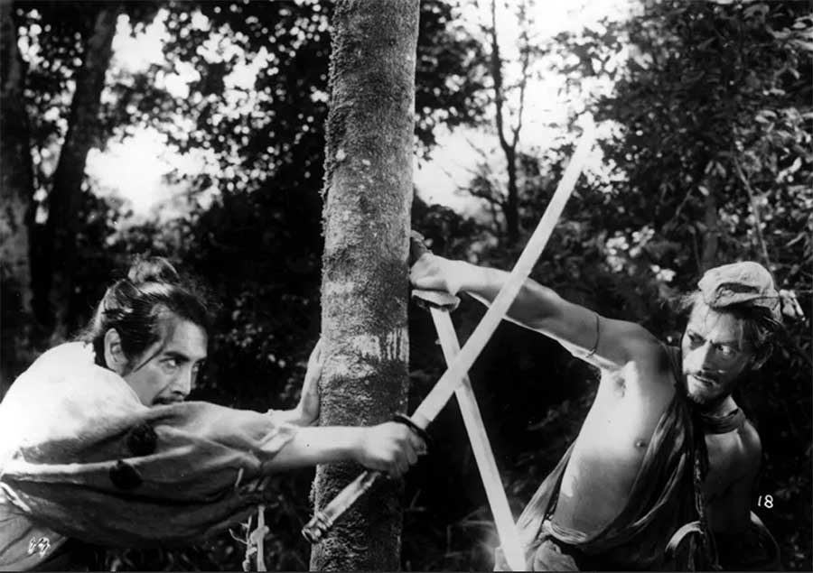
One more example, from Rashomon (Akira Kurosawa was one of the best directors ever at capturing the movement of bodies through space). In this film, the same story is told four times with three very different version of events. In the Bandit’s story, he and the Husband engage in a fierce and heroic battle in which he comes off as a swashbuckling swordsman:
The Woodsman, however, tells a very different story. In his version of the events we see none of the skill and courage the Bandit had claimed. Instead, the combatants scramble and flail about like children playing at warriors:
https://youtu.be/vcSvVmv-BFE?si=sFUXBUc0SghKXzRw&t=67
While the movement of the actors in this scene looks chaotic and unplanned, it is every bit as choreographed ahead of time as the previous battle. It has to be, for the safety of the actors and the crew, but also so that the camera can know what to expect in order to properly frame the action. Here we see how not only movement of the actors, but their facial expressions, the ways in which they hold their bodies, even their acting styles all contribute to mise-en-scène. We will discuss acting as a separate category later in the course, but it is also part of mise-en-scène (cast selection, rehearsals, fight choreography) even as it necessarily bleeds into production (the rehearsals put to purpose while the cameras are rolling).
We talked last about the decisions made by the producers and director in choosing the right Production Designer and Costume Designer, especially vital with a film like Marie Antoinette. But of course, choosing actors is a large part of this process. As we will discuss in more detail when we devote a week to Acting, actors bring with them as much as any other artist on the set both their own unique skillset and style, and a previous body of work that serves to let the producers know the full range of what they might be able to do for the film being made. Unlike a Production Designer or a Set Designer, however, actors often bring with them associations for the audience that are visible the moment they appear on screen. When we see the faces of certain actors we think, inevitably, of other films they have been in, other roles they have played—as we discussed in the context of the casting of Kirsten Dunst as Marie Antoinette.
For those of you who has seen Dunst in other films, you inevitably brought to mind those films when seeing her first on screen in this new role. For example, if you recall her in Spider-man (dir. Sam Rami; 2001) you will think of her character Mary Jane; if you recall her in Melancholia (dir. Lars Von Trier; 2011), a very (very!) different film, you will summon up dark and twisted memories of watching that challenging film. And those will shade—in positive and/or negative ways—your experience of her in this role.
As you are watching movies in the weeks ahead, think about the casting choices. Think also about how the characters move, interact with each other, and engage with their settings. This last one especially will be crucial for this movie’s meanings, and it will definitely reward our attention. But of course, I am saying so as someone who has seen the film before a couple of times. Often we go into movies with no roadmap as to what element will be most important to focus on. Since nothing escapes the camera, our goal, as we continue to train our vision, is to make it so that nothing escapes our critical eye either. Alfred Hitchcock wouldn’t want it any other way.
- Anthony Perkins in Psycho (1960)
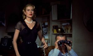
- Grace Kelly & James Stewart in Rear Window (1954)
Playing with Movies
1) After reading the chapter for this week, think about examples in one of the films we have watched where the work of the Production Design team (set designs or location, wardrobe, hair & makeup, set dressings, props, etc) does narrative work
2) As suggested in the chapter, pick a key individual (production designer, art director, costume designer, etc) from the broader design team of a film we have watched together or a film you have watched recently and track down via imdb.com projects they have worked in order to make an educated guess as to why the director selected this individual to contribute to the overall design of this film.
3) As we discussed earlier in the semester, all films drop huge amounts of time invisibly along the way. As a result we can imagine settings and spaces which the characters inhabited that do not appear on film. Want to join the Art Department for a film we have watched this semester? Design a set, or a series of objects/props for set decoration, or a costume for a film we have watched this semester, imagining a scene we didn’t see but whose existence feels implied to you as you imaginatively reconstruct the complete story (as opposed to the narrative we actually see on screen). Share the sketches(s) and briefly describe the scene they would be in and what they would add to it.
Media Attributions
- Screen-Shot-2021-01-19-at-8.44.28-PM
- 02df9765939d832dd641af667f813dd9ca14b4c4
- 1*O-KayYLNeZ5Pdll-vh-XTg
- Screen-Shot-2021-02-15-at-9.03.22-AM
the cumulative effect for the viewer of everything set in front of the camera, including the set design, lighting, and actors.

