Module 4 Chapter 3: Analysis of Single System Design Data
As you learned in the previous module, one approach to evaluating social work practice involves collecting data using a single system design. Many of the approaches we have studied are about what happens with different groups of participants. The single system design is sometimes called “intrasubject” research: the data are related to what happens within an individual system (Nugent, 2010). Single system designs generally involve collecting baseline data repeatedly for a period prior to implementing an intervention (the “A” phase) and collecting data during the intervention period (the “B” phase). A common variation on this design include collecting data during a period when the intervention is removed (another “A” phase), hence the ABA designation. Many other variations exist including adding and comparing alternative interventions (B1, B2, B3 for example) and collecting data during each of those phases. The issue in this current chapter is what to do with the collected data, how to analyze it for meaning.
In this chapter you learn:
- visual graphic approaches to analyzing single system design data;
- assessing changes between single system design phases in level, trend, variability, overlap, means, persistence, and latency of change;
- two statistical analysis approaches for complementing visual approaches (non-overlap of all pairs analysis and two-standard deviation band analysis).
Graphing Single System Design Data
The first step in analyzing single-system design data is the visual analysis. According to Engel and Schutt (2013), visual examination of the graphed data is “the most common method” of analysis (p. 200). The purpose is to determine whether the target variable (outcome) changed between the baseline and intervention phases. Let’s begin by examining the elements of the single system design graph.
First, the phase of a single study design can be considered as the independent variable (the one that is manipulated experimentally) and the measured outcome as the dependent variable. Social work interventions often have multiple goals or objectives—perhaps addressing multiple behaviors, or a behavior and an attitude, or knowledge on several topics. For the purposes of simplifying the understanding single system design data, we will focus on data measuring only one outcome variable at a time.
The single system design graph has “time” as the horizontal (x) axis and the frequency or number count of events on the vertical (y) axis. Clearly identified in the graph are transition points in the phases of the single system design—when baseline ends and intervention begins, for example.
- x axis: Time might be measured in minutes, hours, days, or weeks, depending on the natural frequency of the behavior targeted for change. For example, the frequency of facial and spontaneous vocalization tics might be measured in minutes or hours for a child experiencing Tourette’s syndrome, while the frequency of a couple’s arguments might be measured in days or weeks or the frequency of temptation to drink (alcohol) might be measured in hours or days.
- y axis: The scale used for the “count” data running up the vertical axis is important to consider. A major factor involves the degree of variability in the values counted. If the lowest value is 0 and the highest value is in the hundreds, then it will be very difficult to discern differences of 5 or 15—they will seem very close together in the scale. On the other hand, if the variability runs between 0 and 20, a difference of 5 or 15 will show up very well.
- transition points: One consistent approach is drawing a vertical line through the point in time when a transition occurs and labeling it. It is also possible to use color changes if the graph can be presented in a color format (some printers or copiers will lose this feature).
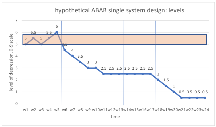
Here is an example of an ABAB single system design graph to consider (adapted from Prochaska, www.sjsu.edu/people/fred.prochaska/courses/ScWk240/s1/ScWk-240-Single-Case-Designs-Slides-Week-8.pdf).
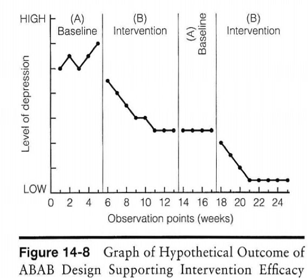
The client and social worker together can see that both the level and variability of depression were high during the five weeks of baseline and there may have been an upward trend occurring at the point when intervention began (week 6). There was a noticeable downward trend in level of depression during most of the intervention period, with a plateau occurring around week 11. Without additional intervention during weeks 14 to 17, the client’s level of depression did not worsen again, nor did it continue to improve—it remained at the previous plateau level. With additional intervention, the level of depression again showed a downward trend until it leveled off at a low level during the final weeks of intervention.
Note that it would be unusual to leave a person experiencing depression without intervention for 5 weeks of baseline data collection; however, this example was created as a hypothetical case. Also note that sometimes target behaviors show a degree of “natural” improvement during baseline as a benefit of the screening and assessment process. For example, in a study of women experiencing alcohol dependency, investigators observed significant improvement in drinking behavior prior to the beginning of intervention, during assessment of their drinking problems:
“Changes in drinking frequency occurred at all four points in the pretreatment assessment process, resulting in 44% of the participants abstinent before the first session of treatment. A decrease in drinking quantity across the assessment period also was found” (Epstein et al., 2005).
The authors concluded several points from these observations:
- the assessment process itself might be therapeutic for some participants—significant changes began with seeking treatment, before treatment started;
- interpreting intervention outcome results should be informed by this fact—interventions should be evaluated in comparison to initial intake/screening levels rather than assessment process data to detect the full impact of the entire experience of assessment and intervention combined;
- intervention outcome results should be informed by the observation that women who showed assessment phase improvement also showed the greatest outcomes during and following treatment (12-month follow-up).
Assessing Change
According to Nugent’s (2010) guide for analyzing single system design data, visual methods allow evaluators to detect several important types of changes or contrasts in the data for different study phases. Let’s explore what these different kinds of information suggested by Nugent (2010) offer in understanding and evaluating social work interventions.
Level
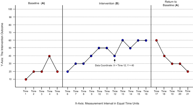
Plotting the “levels” data is simply a matter of identifying the point in a graph where the “y”value for each “x” time point is located. This graph shows where the “point” for week 12 at a value of 40 would go on an ABA (baseline, intervention, remove intervention) single system design graph. Note that it is critically important that the units of time be of equal intervals. It would not work to have the baseline phase measured in days and the intervention phase in weeks, for example.
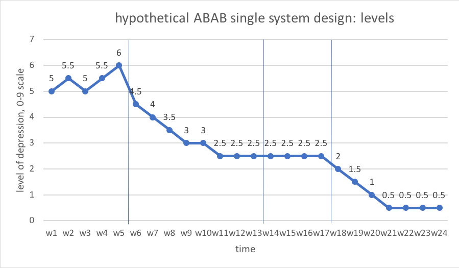
Let’s work with the concrete example concerning a client’s depression levels in an ABAB single system design. Here, in week 1 the level was 5, in week 2 the level was 5.5, and so forth on a 10-point scale (0 to 9 values). This chart shows the data from the previous hypothetical depression levels example where you can see the levels reported for each of the 4 phases:
- A1-weeks 1-5 (first baseline phase), levels range 5.0-6.0
- B1-weeks 6-13 (first intervention phase), levels range 2.5-4.5
- A2-weeks 14-17(removal of intervention phase), levels range 2.5-2.5
- B2-weeks 18-24 (second intervention phase), levels range 0.5-2.0
Interactive Excel Workbook Activities
Complete the following Workbook Activity:
Trend
Trends are less about amount or level of change and more about the rate of change. Rate of change is indicated by the slope of the line between points in a graph, slope being the angle of the line. A “flat” line which runs horizontally, parallel to the x axis, indicates no change. The greater the angle, the steeper the slope, indicating greater degrees of change between points in time. Two methods for determining how the line should be placed on the graph are the statistical computation of the slope for a line connecting the data points and the “Nugent” method (Engel & Schutt, 2013). The statistical method called ordinary least squares computes the “best fitting” line that has the shortest total of distances from each data point to the line. A simpler method resulting in similar conclusions is to simply draw a line between the first and last data points in each phase—this is the “Nugent” method (described by Engel & Schutt, 2013, referring to the author of Nugent, 2010).
Looking at data from our previous hypothetical depression levels data, we can see a couple of trends represented as orange arrow lines created using the Nugent method:
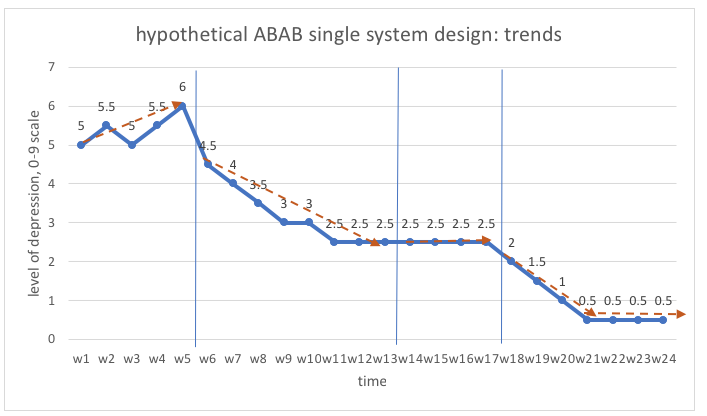
As you can see, the baseline trend was in an undesired direction, the trend during the two intervention phases was in a desired direction, and two “flat” constant periods indicated no change.
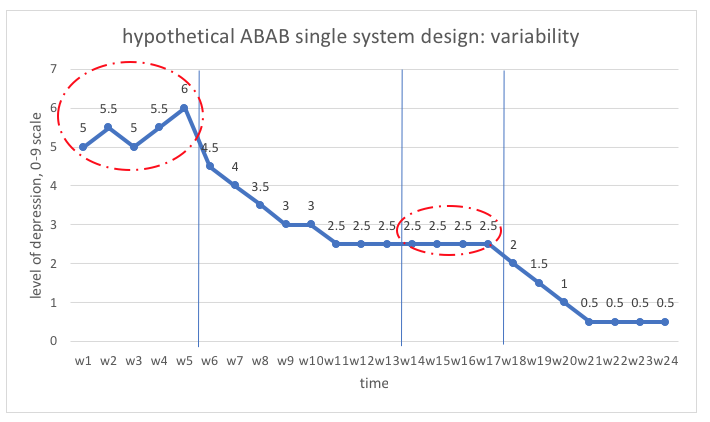
Variability
Fluctuations in the dependent variable may not be consistent across phases of a study. For example, the baseline period might be characterized by wildly fluctuating values and the intervention might help tame the variability, creating greater stability in the behavior of concern. See, for example the differences in the initial baseline (A1) phase compared to the post-intervention phase without intervention (A2). Variability looks different from a unidirectional trend in that it involves up-and-down fluctuations.
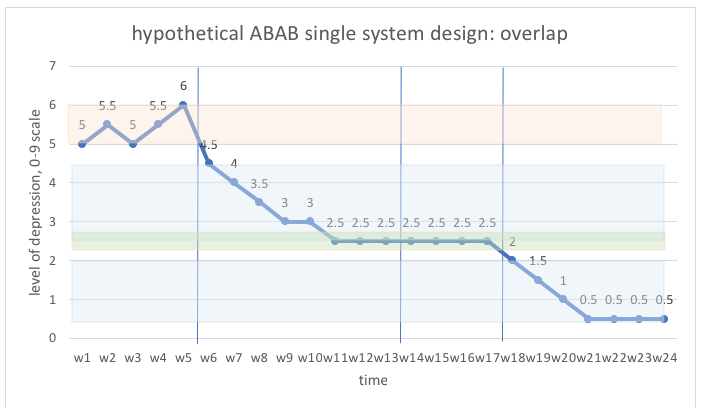
Overlap
The concept of overlap has to do with the range of levels observed in different phases. This is depicted by drawing lines through the top and bottom range values observed in each phase, then seeing if the ranges overlap or are separated. The greater the width of overlap area, the less evident the degree of change; smaller areas of overlap meant change is more evident (Nugent, 2010). Here is what overlap mapping looks like in our hypothetical levels of depression example. There is no overlap between the baseline range and any of the other phases; some overlap between the first intervention phase and the removal of intervention phase; and, no overlap between the second intervention phase and any of the other phases.
Means & medians
One strategy for detecting differences in data from different phases of the single system design study is to compute the mean and/or median of the values in each phase, then draw a line through the phase at each of those points. From our prior coursework, you know how to compute the mean (average) and the median (the 50th percentile, where ½ are above and ½ are below that value). Excel software can compute both of these values in very short order.
In our depression levels example, this is what the values would be:
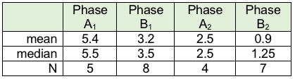
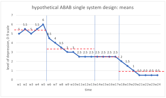
Here is an example of what the graph might look like with the mean lines drawn in, using the data from our hypothetical depression levels ABAB design example. As you can see, there is progressive improvement in levels of depression across the 4 phases of the study design. Later we will look at how to analyze these differences for statistical significance.
One thing to keep in mind, based on what you know about how “extreme” values influence the mean, is that the median might be a better tool to rely on when there exists a great deal of variability in the range of values (Engel & Schutt, 2013). Also Keep in mind that clinical significance is of great importance in analyzing results of the intervention: a difference from 5.4 to 0.5 could be of great clinical significance in an individual’s experience of depression, depending on what the 0-9 scale implies! Engel and Schutt (2013) suggest three means of determining clinical significance in these situations:
- Establish criteria:prior to engaging in the evaluation effort, determine what might be relevant criteria for success. “If the intervention reaches that point, then the change is meaningful” (Engel & Schutt, 2013, p. 202). The criteria could be defined in terms of a specified degree, amount, or level of change. These values should be informed by the literature concerning the measure used.
- Use established cut point scores:if the outcome is measured using clinical tools with established norms and/or cut point scores, determine “whether the intervention has reduced the problem to a level below a clinical cut-off score” (Engel & Schutt, 2013, p. 202). Thus, in determining clinical significance, the outcome (dependent) variable becomes a dichotomous categorical variable—above or below the clinical cut point.
- Weigh costs and benefits:in this case, the goal is to determine whether the efforts to produce change are resulting in sufficient change to “be worth the cost and effort to produce the improvement” observed (Engel & Schutt, 2013, p. 204).
Latency/immediacy of change
One other dimension that Nugent (2010) advises considering has to do with how long it takes before change is evident. In some cases, latencyis short—the beginning of change attributable to intervention are almost immediately observed. In other instances, latency might be longer—it takes a while before the impact is beginning to be observed in the data. For example, changes in knowledge about a topic might happen quickly with intervention but changes in attitudes, values, and beliefs may take longer to appear. This is particularly true of complex behaviors. In our example, changes with intervention seemed to take a relatively short time since we observed change beginning in the week of intervention implementation each time—latency was short.
Statistical Analysis of Single System Design Data
Graphs are quite useful in helping social work professionals and their clients interpret single system design data. However, precision interpretations are supported by statistical analysis of these data. Specifically, when there appear to be changes between phases, how do we know if the observed changes are meaningful? A variety of statistical approaches are described in the literature. Two approaches are presented in this chapter, based on three criteria to consider in selecting analytic approaches adapted from six criteria described by Manalov et al (2016). The statistical approach selected for analysis should:
- be simple to compute and interpret without a high degree of statistical expertise and present a reduced likelihood of misinterpretation;
- complement (rather than duplicate) visual analysis, especially when trend and variability patterns complicate visual analysis, providing different information;
- be free from assumptions of data independence (longitudinally) or homoscedasticity (equal variance).
Thus, the two approaches introduced in this chapter are NAP analysis (non-overlap of all pairs) and the two-standard deviation band approach.
Approach #1: Non-overlap of all pairs (NAP) analysis.
This approach is essentially a non-parametric form of analysis based on probability: the Mann-Whitney U-test. Nonoverlap of all pair (NAP) analysis is about pairs of observations for two different phases in a single system study being in the desired direction. The “all pair” aspect in the title of the approach means that every observation in the time 2 data is paired to each of the observations in the time 1 data. This means that the number of pairs compared is the number of observations in time 1 multiplied by the number of observations in time 2. The probability default in this analysis is that no difference exists between two phases of single system data being compared. If “improvement” means that the observed frequency or amount decreases (such as number of arguments, need for time out, cigarettes smoked, or anxiety scores), then improvement means the “time 1” data will be greater than the “time 2” data more often. The null hypothesis is that there is no difference in the number of times that the paired values reflect improvement compared to the number that reflect no improvement.
To make easier to understand, imagine that we wish to compare the baseline (A1) to the intervention phase (B) in our depression levels example. In this case we had 5 baseline observations and 8 intervention phase observations:
| A1 phase | B phase | A2 phase |
| 5 | 4.5 | 2 |
| 5.5 | 4 | 1.5 |
| 5 | 3.5 | 1 |
| 5.5 | 3 | 0.5 |
| 6 | 3 | 0.5 |
| 2.5 | 0.5 | |
| 2.5 | 0.5 | |
| 2.5 |
Thus, we have a total of 40 pairs of data (5 x 8=40). This can be hand-calculated for a small data set using a somewhat complex formula to compute the probability. Or, the data can be entered in 2 columns in a calculator program at www.singlecaseresearch.org/calculators/nap (nap is an abbreviation for nonoverlap of all pairs; the calculator is attributed to Vannest, Parker, Gonen, & Adiguzel, 2016). In this example, it would look like this after clicking on “contrast” for the comparison of A vs B phases:
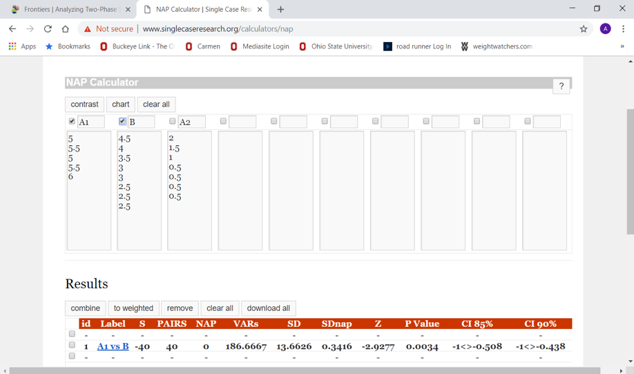
The p-value for the Z test-statistic (-2.93) for our 40 pairs was 0.0034; our p<.05 allows us to reject the null hypothesis of no difference. In other words, there appears to be a statistically significant improvement between the intervention (B) phase and the baseline (A1) phase.
Similarly, if we wish to compare the intervention (B) phase to the post-intervention (A2) phase, we have a total of 56 possible pairs (8 x 7=56). Entering the data into the NAP calculator program we obtain the following result:
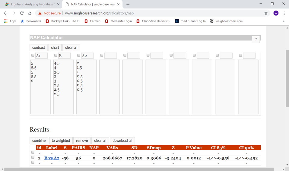
Once again, we observe that p<.05 (Z statistic for our 56 pairs is -3.24, p=0.0012). Therefore, we can again reject the null hypothesis of no difference and conclude that the changes continued in a downward direction during the post-intervention period.
Approach #2: Two-standard deviation band method
This second approach is also valued the simplicity of computations involved (Orme & Cox, 2001). It is called the two-standard deviation band method because it involves computing the mean and standard deviation from the baseline phase data, drawing the “band” representing two standard deviations (2 SDs) around the baseline mean onto the graph, and determining where the intervention phase data points fall in comparison to that “band.” The band includes values that would be 2 standard deviations (SDs) above and 2 standard deviations below the mean for the phase. Another name for this “banded” graph is a Shewhart chart (Orme & Cox, 2001).
A rule of thumb offered by Gottman and Leiblum (1974) is that if at least two consecutive intervention phase data points fall outside the band, a meaningful change was observed. The logic for this rule of thumb is that the probability of this happening by chance is less than the criterion of p<.05 (Nourbakhsh & Ottenbacher, 1994). Here is what it would look like for the hypothetical depression levels example with which we have been working throughout this chapter.
First, compute the mean and standard deviation for the baseline (A1) phase data. Then, compute the values for the mean ± SD (mean plus SD and mean minus SD). Using Excel, we find the following:
M=5.4
SD=0.42
2 SD band=(4.98, 5.82)
Drawn onto the original levels graph, the two-standard deviation band graph would appear as:
As you can see, more than two (in fact, all) of the intervention phase data points fall outside of the two-standard deviation band width. The conclusion would be that a significant degree of change has occurred between these two phases, baseline (A1) and intervention (B). To see this in action, work the exercise presented in your Excel Workbook.
Interactive Excel Workbook Activities
Complete the following Workbook Activity:
Stop and Think
 Take a moment to complete the following activity.
Chapter Summary
This chapter concerned approaches to analyzing data collected through single system design efforts to evaluate intervention outcomes. First, you learned about the visual and graphing approaches. You learned how social work professionals and clients can use levels, trends, variability, overlap, means, medians, persistence, and latency information in interpreting their outcomes data. In addition, you learned two statistical analytic approaches that might be used to determine the significance of observed changes in single system design data. The non-overlap of all pairs (NAP) analysis utilizes a form of nonparametic analytic logic to determine if a null hypothesis of no meaningful change should be rejected—the test statistic was a Z score (the calculation and distribution of which we have not previously studied), and the criterion of p<.05 remained useful to informing the decision. Another easily computed statistic you learned about was the two-standard deviation band analysis which entails calculating the mean and standard deviation for baseline data, then computing the range of values encompassing two standard deviations above and below that mean. The decision concerning meaningful levels of change is based on whether there are at least two consecutive data points in the intervention phase that fall outside of the calculated two standard deviations band. This can be visualized on a graph, but does not need to be—it can be determined based on reviewing a table of values once the band width has been computed. This chapter concludes our module on analyzing data for understanding social work interventions.
