SWK 3402.4-3.2 Analyzing Single Systems Design Data
In our last exercise you graphed the data for the student concerning his experience of drinking craving collected through his use of the “on demand” support delivered through a phone app relapse prevention phone app. In this exercise, we will engage in two types of statistical analysis related to these data: NAP (non-overlap of all pairs) analysis and two-standard deviation band analysis.
Step 1. Open the data file called “cravings two sd analysis start.xlsx” in Excel or the Word document file from our previous exercise called “cravings data.docx”.
Step 2. Copy the data from column A (the baseline A1 phase data), column B (the intervention data), and column C (the post-intervention phase data) into the long columns of the calculator located at www.singlecaseresearch.org/calculators/nap. Or, if you prefer, you can retype the data from this table into the calculator.
| A1 | B | A2 |
| 55 | 30 | 1 |
| 49 | 31 | 2 |
| 50 | 26 | 4 |
| 46 | 18 | 6 |
| 42 | 14 | 5 |
| 44 | 11 | 3 |
| 38 | 10 | 5 |
| 7 | ||
| 4 | ||
| 4 | ||
| 2 | ||
| 0 | ||
| 2 |
Step 3. Fill in the three label boxes, A1, B, and A2 above the data columns. Then, click on the small squares before A1 and B and click on “contrast” to compute your first analysis.
Step 4. Next, select the B and A2 contrast to compute the second analysis. The output should look a lot like this:
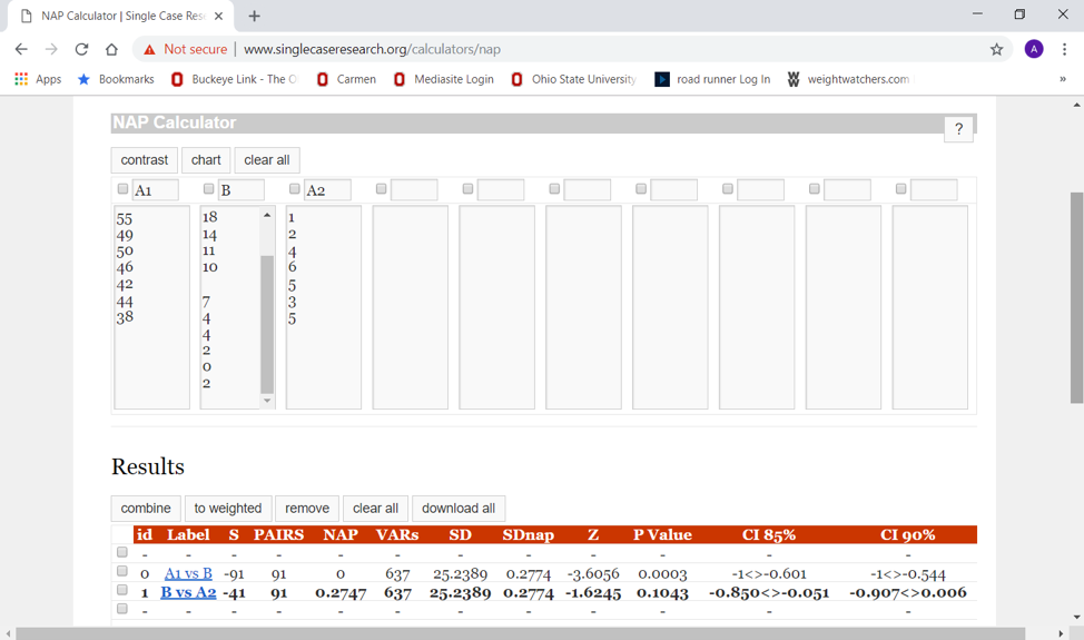
Step 5. How would you interpret the results of these analyses? If you concluded that there exists significant change in the desired direction from baseline to intervention (A1 to B) because p<.05 for the test statistic (Z=-3.61), and that there appears to exist significant change, your conclusions are reasonable. If you also concluded that there is no significant change from the intervention to the post-intervention phases (B to A2) because p>.05 for the test statistic (Z=-1.62) and that you cannot reject the null hypothesis of no difference, you are also drawing a reasonable conclusion.
Step 6. You can close the NAP calculator; we are done with those analyses. Now go to the Excel data file and compute 4 things: mean, standard deviation, and the mean±SD values for the baseline (A1) data appearing in cells A2:A8. The first two items can be computed by clicking on “Data” and “Data Analysis” in the top menu. Then, select “Descriptive Statistics” in the drop down menu and click “ok.” The input range for the baseline data should be A1:A8, it is grouped by columns, you want the labels in the first row, the output range should be any empty cell (try E2 to make the remaining instructions simpler), and you want just the summary statistics checked among the square boxes at the bottom. When you click “ok” you should see the descriptive statistics table presented.
Step 7. To compute the two standard deviation band values, you will need to click on an empty cell (try H4) and enter the command for “sum” of the cells F4 (mean value) and F8 (standard deviation value). This is easiest if you click on the ∑ at the top menu bar on the Home sheet, then select “sum” from the drop down menu and enter the cell addresses F4,F8. (Note: we do not use the “:” here because we do not want to add up all the values on the table between F4 and F8, we only want F4 and F8, so we use the “,” instead.)
Step 8. It should be an easy task to subtract the standard deviation (SD) from the mean, as well. Alas, Excel does not do this as easily as it adds values. One solution is to compute the negative of the SD by multiplying it by -1, then adding that solution to the mean. In an empty cell (try H6) enter the command =F8*-1 to accomplish the first of these tasks. The values for the two-standard deviation band should be: (51.9, 40.7).
Step 9. Now you can add this two-standard deviation band to your graph. Either open, copy, and paste your graph from the prior exercise, or copy the data from B and A2 columns to the bottom of the A1 column, select all the data now in the column A, select “insert” and the line graph icon, then insert the transition lines between weeks 7 and 8 and between weeks 21 and 22.
Step 10. Next, insert a shape (square box) that starts at about the 52 value on the “y” axis in the baseline area of the graph, extends down to about the 41 value on the “y” axis and extends to the right through the intervention (and post-intervention) phases by dragging the box boundaries. If you like, you can format the box using the “shape fill” menu—change its transparency at least so that you can see what is behind it.
Step 11. How do you interpret this two-standard deviations band chart? If you concluded that there exists significant change between the baseline and intervention phases because at least two consecutive values in the intervention phase are outside of the band, you have drawn a reasonable conclusion.
Step 12. If you like, compare your output to the file called “cravings two sd analysis finish.xlsx”. If you came to similar conclusions, you have successfully completed this two-part exercise. Congratulations!
