Chapter 5: Making Purposeful Decisions as Digital Writers
5.2 Thinking Like a Web Designer
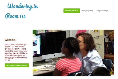
As students had more opportunities to write digitally, it became important that we add web-based texts to our mentor text studies. I knew from past experience using print based mentors that helping students identify and name the writing moves they notice gave them the ability to consciously try those same moves in their writing. I began to gather web-based texts to add to my mentor text collection. I looked for mentors based on my experience as a digital writer. For instance, I understood the importance of choosing the right images for my message. I made purposeful decisions about which words needed linked and where those links would lead my reader. I learned the necessity of writing in short paragraphs, leaving white space and using bold print and headings to guide and engage my readers.
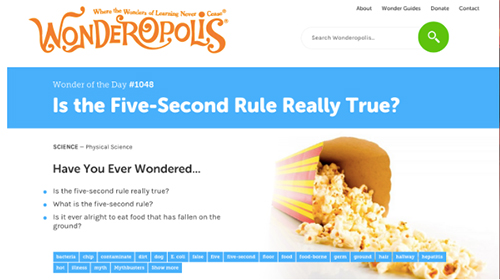
I didn’t need to go far to find mentors. We already had a core set of websites that students returned to again and again in our reading workshop. One of my favorites is Wonderopolis®. Wonderopolis® is a top quality website that encourages a sense of curiosity in children and adults alike. Developed by the National Center for Family Learning, it features a Wonder of the Day®. Their site follows the same structure of: question, video clip related to the topic, article that explores the topic, Wonder Words, a quiz to test out your knowledge and links to a variety of related topics. Readers also have the ability to listen to the article, which allows for even more choice.
I begin by using Wonderopolis® as a digital mentor because there are so many things we can look at:layout and design
- use of nonfiction text features
- organization of the text itself
- use of hypertext
- leads to grab readers’ attention
- use of multimedia to share information.
I find an example that I know will be interesting to the students. For this example, we looked at “Is the Five-Second Rule Really True?” Of course, just bringing up the page brings peals of laughter and stories of eating gross things off the floor, setting off more laughter. After settling them down, I explain that I want them to just explore the web page and jot down what they notice either in their notebooks or in a Google doc. Some students prefer to to hand write their notes, while others would rather type them into a digital document. I also ask them to think about why the author might have done some of the things they noticed and how those actions affect them as a reader. I circulate around the room, listening in on snippets of conversation.
“Ooh, what if your food fell on the floor where there was a bunch of dog hair?”
“One time my brother ate a hot dog in the dirt. He just wiped it off and stuffed it in his mouth. It was so gross.”
“Hey, Mrs. Johnson, if you put your mouse over the yellow words, you can find out the definition.”
After about 15 minutes of exploration, I gather the students together and we create a chart of our findings. Gathering everyone together to share their thinking gives everyone a deeper understanding. It’s not unusual to hear someone say, “I never thought of that.”
We continue to go back to this website and study similar web-based mentor texts throughout the year as we focus on different elements. We also consult with experts in the field. At the beginning of the year, we met via Skype with a digital designer to talk about how we can help our readers stay engaged in our text and navigate through it easily. She explained that people read web-based text differently than print text. Instead of starting at the top and reading the entire text, readers of web-based text scan through the text quickly, reading short chunks of information quickly. Images and white space between the paragraphs help the reader stay engaged. The students immediately connect the designer’s advice to what they observed in the websites that we had looked at carefully.
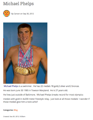
These are lessons that my students can incorporate into their writing right away. In this early in the year post from Carson, you can see that he’s incorporated the use of white space, creating small chunks of information. He’s also chosen an image that signifies the importance of Phelps’ accomplishments. The number of medals hanging from his neck is astounding to Carson.
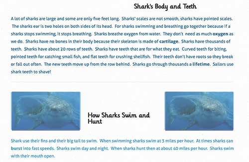
In another example, Nathan also incorporates white space by inserting images between the two paragraphs to help his reader navigate the text. He’s also taken a cue from other websites he’s studied and used color consistently throughout his web page.
Quality Websites to Use with Students |
|||
Site |
Description |
Ways to Support
|
|
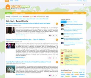
| DOGO News |
Short articles on current events, science and sports. Includes graphics, interactive maps, photographs, video. |
|
 |
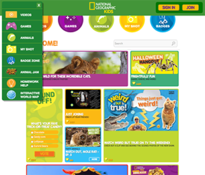
| National Geographic for Kids |
Covers a variety of topics around current events, people and wildlife. Includes polls, video, and games |
|
 |
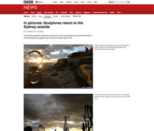
| News in Pictures |
From the BBC, News in Pictures highlights a series of photographs of events happening around the world. |
|
 |