Chapter 5: Making Purposeful Decisions as Digital Writers
5.4 Digging Deeper into Design
The Principles of CRAP
I’m sure you can imagine the chuckles among my students when I begin to describe the four basic design principles that bring any piece together. In the design world, they are referred to as CRAP. The acronym stands for: Contrast, Repetition, Alignment, and Proximity. In The Non-Designer’s Design Book, Robin Williams explains each:
Contrast
This is what bring the reader’s eye to the page. Simply put, if two things are not similar, then make them very different on the page.
Repetition
Repeating visual elements on the page unifies and strengthens the piece by bringing everything together.
Alignment
Alignment brings order to the page. By giving careful thought to alignment, the designer creates visual connections between the elements on the page.
Repetition and Alignment Interactive Image
Proximity
Proximity is important when thinking about organizing information. Items that are related should be grouped together.
It is here that we begin to look closely at web based texts and look for patterns that we might identify. When I show the kids the home page of Wonderopolis®, they notice the following things:
The similar parts are grouped together. For example, each page heading is grouped at the top of the website. All of the important vocabulary is grouped together. The 3 main questions that go with the wonder are listed together. The white space helps the reader know what goes together.
It isn’t long before the students try some of these elements in their own digital work.
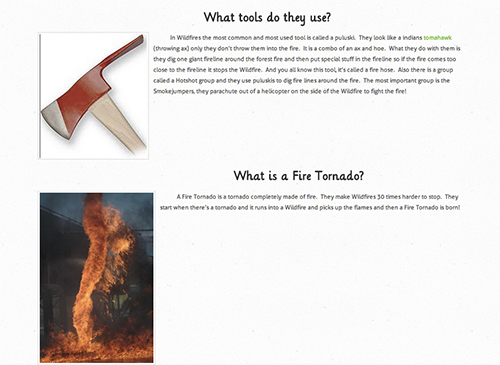
In this excerpt from Will’s webpage about wildfires, he uses the four design principles effectively.
- Contrast: Will uses a different font for his headings, as well as larger size and bolds the letters. He separates the text from the headings with a double space to set the text apart.
- Repetition: His sections are all set up the same way. A left aligned image and heading introduce each section with a short paragraph of information that follows.
- Alignment: The images he chose are left aligned to the page. His headings are centered.
- Proximity: Each section is positioned closely, with double spaces between each section. The white space allows the reader’s eye to follow the text easily. His webpage is clean and not cluttered with arbitrarily placed items.
Choosing Color and Images to Enhance Meaning
I am lucky that our art teacher teaches students about color theory at a young age. My students know the primary colors are red, yellow, and blue. If you mix equal amounts of each color with the one next to it, you’ll get the secondary colors, green, purple, and orange. They learn about the other colors on the color wheel and understand warm and cool colors. Colors on the opposite side of the color wheel are called complementary colors and are used to show contrast. Analogous colors are next to each other on the color wheel and can create a harmonious tone to a piece of work. Adding black to a color creates different shades and adding white creates different tints. A monochromatic combination is composed of using one color with any corresponding tint or shade. With this basic knowledge, elementary students can begin to make purposeful decisions when incorporating color into their digital compositions.

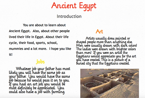
One of the first things we do at the beginning of the school year is introduce ourselves by sharing a variety of images and items. Many students choose to create a digital poster, using the tool Glogster. This project is important because we begin to lay the foundation for making purposeful decisions about the visual aspects of a composition.
In her digital poster, Alex chose a pink background because it’s her favorite color. The frames she chose to surround her photographs complemented the pink in different ways. The green and bright floral frames create a nice contrast to the background and make her images pop out. The purple and hot pink frames contain varying amounts of pink and work well with her background. She chose images that tell us more about her.
Thinking Like Filmmakers and Sound Engineers
Mentors are not just text based. We also look at videos and web-based texts that have embedded multimedia compositions. Our young readers and writers spend an average of 7 hours and 38 minutes using entertainment media in a typical day. Because much of that time is spent using more than one medium at a time, they actually fill up to 10 hours and 45 minutes worth of media content into those 7 hours and 38 minutes. (Kaiser Family Foundation, Generation M2: Media in the Lives of 8 to 18 year olds). Our students are experts when it comes to knowing what they like and don’t like in multi-media compositions. They have their favorites and it’s important that we help them unpack what makes a video or other media project work for them.
When looking at videos we can begin to ask kids,
“What makes this video engaging ?
What keeps your attention?
What distracts you?”
For example when watching Penguins vs. Pelicans, a short video by National Geographic, the following conversation ensued when I showed this video to a class of young digital composers:
J: I noticed that the music has a fast beat at the beginning and it felt like the action was going really fast.
M: Yeah, I noticed that too. While the music was going really fast, the penguins were swimming really fast too. The action went with the music.
K: The music at first sounded really snappy and happy. They used some kind of drum.
L: The narrator sounded happy too as he was talking about the penguins eating the anchovies.
J: The music changed when he started talking about the pelicans. It wasn’t as happy. It was like the pelicans were being the boss.
Me: Why do you think the creator decided to change the music here?
J: Because now the pelicans are taking some of the anchovies from the penguins. That probably bothers the penguins to have pelicans diving down and grabbing food out of their mouths.
Noticing that they paid particular attention to the sound details, I asked the students to watch the video again and think about the words the narrator was using as well as the images and transitions and how everything worked together.
D: The narrator uses a lot of fun words.
Me: Let’s name some examples.
D: rocket through a swarm of your favorite food
L: making pickin’s easier
M: every party needs a pooper
J: Sometimes he says words that begin with the same sound like /sh/.
Me: That’s right. I noticed him say, “shoal of shallow water” and “gleeful gluttons”
Me: What about the transitions where the scenes change from one to the other? What did you notice?
A: When he starts to talk about the pelicans, there is a big splash and then the music changes.
Me: Why do you think the author decided to do that?
A: He’s telling us something is going to change. And it does. Now the we are finding out how the pelicans take the food away from the penguins.
M: I also noticed that the scenes go from one to the other really fast.
D: Yeah, it goes with the music and the action. Everything is happening really fast.
Our conversation continued and I was glad that the students were making connections between the action, narration and visual images of the short film. Having these kinds of conversations about digital compositions helps students in their own composing. They begin to accumulate their own ideas for what will work and what won’t work, which allows them to make purposeful decisions about their compositions.
The following is an example of a movie made by two third grade girls as part of a QR code project we did in collaboration with another building in our town.
“Fairgrounds” video by Mauriana and Rachel
After researching a part of our town’s history, the students created a storyboard that outlined their movie. They then made decisions about photos, background music, and transitions. Mauriana and Rachel chose music they felt reflected the happy atmosphere you’d find at the fairgrounds. They paid careful attention to make sure the images matched up with the story being narrated. Finally, they used the Ken Burns effect, a panning and zooming technique to keep the viewer engaged.
Decisions About Sound
Sound adds an emotional element to any multi-media composition. We’ve all had the experience of our hearts racing as the villain approaches the unsuspecting victim and the thrumming music gets louder and louder. Or the opposite, we know that nothing bad is going to happen if we hear light-hearted lilting music in the background. It’s fun to have the kids close their eyes and listen to music and identify how the music makes them feel. Background music isn’t the only way that sound is incorporated into digital compositions. Amy Ludwig Vanderwater’s blog, The Poem Farm provides a mentor for students to see how incorporating a recording of her poetry helps the listener/reader hear the author’s intended meaning of the poem. Amy shared that recording her poetry actually becomes another revision tool as she listens and realizes that something might not sound right.