Module 5 Chapter 2: Creating Strong Presentations
Presenting evidence to audiences depends a great deal on the audience. A room full of scientists will be looking for a different emphasis in the information shared than an agency board, group of practitioner colleagues, policy decision makers, or a community group like the League of Women Voters, Parent Teachers Association, or Kiwanis service club. However, all audiences want to be respected with interesting, accurate, concise, and clearly presented information. The major difference between preparing a written report and a live presentation has more to do with style than content. In this chapter, you will learn:
- Basic elements of strong presentations;
- PowerPoint® tips;
- Using images in presentations, including copyright issues and locating open source materials;
- Presentation style tips.
Elements of Strong Presentations
One of the most important aspects of a strong presentation is its organization—how content flows from start to finish. However, a strong presentation requires appropriate and adequate preparation up front. Here are six important tips (based on experience and tips from http://thevisualcommunicationguy.com/2015/10/30/how-to-give-a-powerful-presentation-eight-steps-to-an-awesome-speech/ and https://www.entrepreneurship.org/learning-paths/powerful-presentations).
- Preparation. Effective presenters prepare for their specific audiences. At the very least, they develop an understanding of who the audience is, what the audience expects to learn from the presentation, and how the presentation fits into the rest of the day’s experiences. For example, a presenter would want to know if their presentation is keeping the audience from lunch or if it is following a meal that makes people sleepy; if it is being presented at a critical, contentious time in the group’s process; if are they being forced to attend or attending out of interest; if it is one of many presentations in a day or stands alone. Knowing the audience expectations is also important: are they looking for the science behind the key points (emphasis on the methodology) or the implications of the evidence? A strong presentation starts with understanding why the audience wants to hear what the presenter has to say instead of looking at their smartphones or laptops as they politely (or impolitely) endure the presentation.
Timing is another important preparation point. Attention tends to wane after only a few minutes—is the presentation expected to be a short 15-minute Ted-style talk or an hour-long lecture? In either case, preparing to engage the audience at multiple points is critical for maintaining attention, interest, and learning. Having appropriate and interest-grabbing visual, auditory, and/or action-oriented aids planned into the presentation is important. Long gone are the days when audiences tolerate presentations from lecturers who “wing it”—they expect the respect of strong preparation. Realize that it can take several hours to prepare a 15-minute presentation when you have a great deal of expertise in the topic—it can take days or weeks to prepare for one where you are developing the expertise at the same time.
“It usually takes me more than three weeks to prepare a good impromptu speech.”
–Mark Twain - A strong opening. Audiences are most attentive in the first minute or two of a presentation. This is the time to capture attention and interest with a briefstory, anecdote, or fable to make the topic relevant; a sensitive and appropriate joke; a thought-provoking question; some “Wow!” statistics.
For example, which lecture would you rather hear in your child development class:
– Theories of psychomotor development during infancy, or
– Why can’t the baby ride a bike?
The opening should be a form of “Wow!” statemen, one or two sentences—never more than three (according to Kauffman Founders School, www.entrepreneurship.org). You have learned in this course how to locate powerful, informative, “oh, wow” statistics and data—evidence-supported facts that grab attention. This is also an option for a strong opening. Or, perhaps a powerful quote—maybe from a client or study participant, maybe from history or pop culture (but be very certain about citing the person properly—there are many misquoted and miscited quotations circulating on the internet). Showing the audience an object or image is the way to capture their attention. Pro tip: if you start with a story, be sure that you end with the story’s resolution.

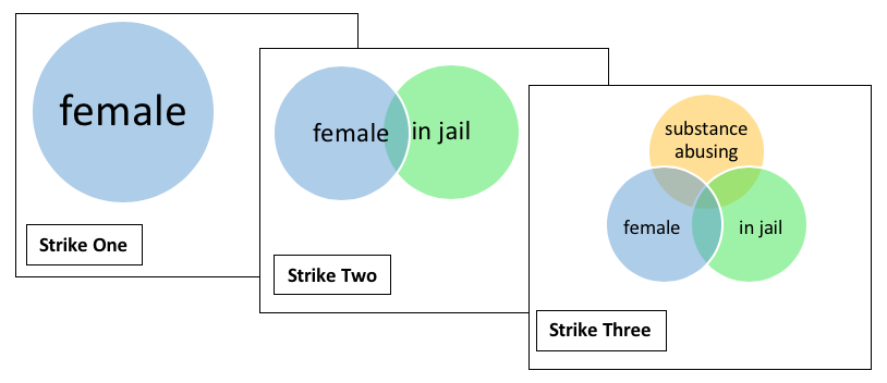
- Integrate Visual and/or Auditory Elements. According to thevisualcommunicationguy (http://thevisualcommunicationguy.com/2015/10/30/how-to-give-a-powerful-presentation-eight-steps-to-an-awesome-speech/), people recall information better when an image is attached to the message—almost twice as well as when the message is delivered in text alone. The trick with visual tools is to make them clear and simple. If the message is complex, build from a simple visual toward a complex one. Here is an example adapted from a lecture “Three Strikes: Female, In Jail, and Substance Abusing” (Begun & Rose, 2007)—the images build towards the final complex visual aid and the presenter is able to discuss what is relevant to each sphere as it is added.
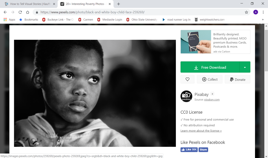
 Images (pictures, charts, diagrams) may come from open access resources, or you may have to create them specifically for your message (see Chapter 3 of this module). Sources to consider include pexels.com, pixabay.com, and 123rf.com where all or a limited number of images may be downloaded for free. These are royalty-free sources where it is relatively easy to identify the copyright conditions for use of the images; capturing images from the wider internet or blogs or advertisements can be risky with regard to potential copyright infringement. Note that cartoons are usually copyright protected, as well. You want to focus your search on objects with “Creative Commons” status that has no restrictions or where your presentation meets the restrictions in place. In this screenshot example, see what it says under the CC0 License information on the far right: free for personal and commercial use, and no attribution required.

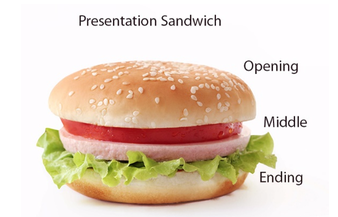
If you decide to incorporate audio (or video) components to your presentation, it is important to make sure the platform and facilities where you will be presenting can support the presentation. For example, ensuring sufficient connectivity if the material is being pulled from the internet and not locally embedded and that speakers and volume control are sufficient for the facility. Some agencies where you might be asked to present lack projection equipment and screens, as well. - Progress Logically Start to Finish. Follow an outline of key points and follow a consistent format for making each point. Within the first minutes, it is important to tell the audience what you are going to tell them: a statement of the presentation goal and objectives is helpful. This provides the audience with a roadmap for where you are taking them with this presentation. In the opening you tell the audience what you are going to tell them about. Next, in the middle, you tell them (the “meat” of the sandwich). Here you provide “signposts” to cue them as to where on the roadmap they are. Make clear when the topic has shifted to a new point with transition cues (new slide headings, numbered points, and transition statements). Next, see how to finish the presentation “sandwich.”

- Wrap up/Conclude. In conclusion, you summarize or remind the audience of what you told them. This is not the place for new content to be introduced. If you followed a story line throughout your presentation, this is the place to deliver the “punch line” (for a joke) or the story’s resolution. Or, it may be the place for a new (brief) story with a different outcome. Or, perhaps a (different) quote. It is the place to summarize the key points if your purpose was to share information, or to identify key action points if your purpose was to stimulate an action response. You might even end with a group “evaluation” activity—a quick survey or quiz that everyone can now get correct after hearing the presentation. This is effective if you chose to open with a couple of “quiz” questions that they might not know how to best answer or where their opinions could change in the course of the presentation.

- Prepare for Q&A. After a presentation concludes there may be a formal period for question and answer by the audience. Prepare for these questions—try to predict what they might ask and have a response prepared. And, have a response ready for questions that you did not anticipate and are not prepared to answer, too!

Tips for Presentation Slides
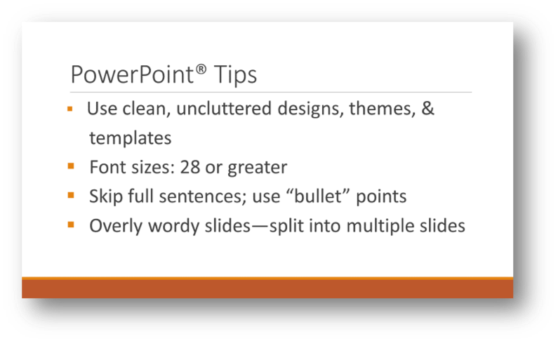
PowerPoint® is a commonly used tool for creating visual presentations. Presentations created using this software can be relatively simple or quite complexly structured. Suggestions for a strong PowerPoint® presentation are presented in this example “slide.”


Create the first 3 slides of a simple PowerPoint presentation. The first should be a title slide, the second a list of either what the presentation covers (if it were a full presentation) or learning objectives for the audience to achieve from the presentation, and the third should include an image (it is the first slide of your information content). Assess your presentation slides for clarity, design, and succinct writing. Suggested topic: the most useful knowledge you have learned from this course.
Chapter Summary
In this chapter we examined the elements of strong presentations and some tools to help create and deliver strong presentations to various audiences. You were introduced to six steps for developing strong presentations, tips for using visual aids. Copyright concerns and resources for avoiding them were identified. Next, you will learn tips for creating your own visual aids (figures graphs) when just the right thing is not readily available.
