Module 4 Chapter 2: Working With Quantitative Descriptive Data
Prior modules introduced quantitative approaches and methods, including study design and data collection methods. This chapter examines what investigators do with collected quantitative data to begin answering their research questions. As you work your way through the contents of this chapter, you will find it helpful to have a basic calculator handy (even one on your smart phone will do). In addition, you are presented with links to the Excel workbook for learning activities that need to be completed using a computer (data analyses do not work on most tablets or phones).
In this chapter you will learn:
- the distinction between univariate and bivariate analyses,
- descriptive statistics with categorical and numeric variables,
- computing and interpreting basic inferential statistics
- understanding graphs, figures, and tables with basic statistics.
Univariate and Bivariate Analyses
The way we think about quantitative variables has to do with how they are operationalized in a particular study. First, let us consider the distinction between univariate and bivariate work with quantitative variables, then explore distinctions between independent and dependent variables. When the goal is to describe a social work problem, diverse population, or social phenomenon along a particular dimension, investigators engage in univariate analyses. The prefix “uni” means one (like a unicycle having one wheel).

Univariate Analysis. Univariate analysis means that one variable is analyzed at a time; if multiple variables are of interest, univariate analyses are repeated for each. Univariate analysis has the purpose of describing the data variable-by-variable, and are often referred to as descriptive statistics, or simply as “descriptives.” See Table 2-1 for an example of how this might appear in a research report. The example is based on a subset of data about the Safe At Home instrument developed to assess readiness to change among men entering a treatment program to address their intimate partner violence behavior (Begun et al., 2003). The study participants are described in terms of several variables, with the descriptive statistics reported for each variable, one at a time.
Table 2-1. Univariate descriptive data example for N=520* men entering treatment
| N | % | Range | Mean (M) | sd | |
|---|---|---|---|---|---|
| Referral Type | |||||
| nonvoluntary | 424 | 81.5% | --- | --- | --- |
| voluntary | 96 | 18.5% | --- | --- | --- |
| Race / Ethnicity | |||||
| African American | 215 | 41.8% | --- | --- | --- |
| White | 205 | 39.9% | --- | --- | --- |
| Latino/Hispanic | 71 | 13.8% | --- | --- | --- |
| Other | 23 | 4.5% | --- | --- | --- |
| Relationship Status | |||||
| Married/living with partner | 234 | 45.6% | --- | --- | --- |
| Single in a relationship | 101 | 19.7% | --- | --- | --- |
| Not in a relationship | 178 | 34.8% | --- | --- | --- |
| Age | --- | --- | 18-72 | 33.2 | 8.8668 |
| Time Since IPV Incident | --- | --- | 0-520 weeks | 40 weeks | 56.4120 weeks |
| Readiness Score | --- | --- | .14-7.62 | 4.60 | 1.2113 |
| *Note: totals may not equal 520 due to missing data or may not total 100% due to rounding. | |||||
Bivariate Analysis. When investigators examine the relationship between two variables, they are conducting bivariate analysis (“bi” meaning two, as in a bicycle having two wheels). This is contrasted to the descriptive work using univariate analysis (one variable at a time).

For example, investigators might be interested to know if two variables related to each other (correlated or associated). Turning back to the Safe at Home example (Begun et al., 2003), the variable indicating men’s readiness to change their intimate partner violence behavior was positively correlated with the variable about their assuming responsibility for the behavior: men with higher readiness to change scores were more likely to assume responsibility for their behavior than were men with lower readiness scores. Looking at this pair of variables together, in relation to each other, is an example of bivariate analysis. Other examples of research questions leading to bivariate analysis include: having a history of child maltreatment victimization associated with school absenteeism in a Swedish study (Hagborg, Berglund, & Fahlke, 2018) and mothers’ smoking during pregnancy being associated with children’s behavioral regulation problems (and other variables) at the age of 12 years (Minnes, eAdd Newt al., 2016).
How Univariate and Bivariate Analyses Are Used: In earlier modules you were introduced to the types of research questions that lend themselves to quantitative approaches (Module 2) and to different kinds of quantitative variables (Module 3). Likewise, the type of data analyses and reports that investigators generate are directly related to the nature of the questions the data answer. Univariate and bivariate analyses are used descriptively. In other words, when the question to be answered calls for a description of a population, social work problem, or social phenomenon, these are useful analyses to conduct and present. Univariate and bivariate analyses help develop a picture of how the numeric values for each quantitative variable are distributed among a sample of study participants. Bivariate analyses are also used to test hypotheses about the relationships between variables—the subject of Chapters 3, 4, and 5 in this module. The next section goes into greater detail as to the nature of descriptive analyses.
Univariate Descriptive Analysis
Here we explore ways that investigators might analyze specific types of variables in order to help answer their research questions. First, our focus is on descriptive statistics: statistics that help describe populations and groups, or the dimensions of social work problems and social phenomena. As we work through these Module 4 materials, you may find that the question “Statistics or sadistics?” asked in the book Statistics for people who (think they) hate statistics (Salkind, 2017) changes to the statement “Statistics, not sadistics!”
Descriptive Statistics
Descriptive statistics help develop the picture of a situation. Since the point of variables is that their values vary across individual cases, investigators need to understand the way those values are distributed across a population or in a study sample. The three main features about distribution are of great interest to investigators:
- frequency,
- central tendency, and
- variance.
These three features are reported for one variable at a time (univariate analysis). The descriptive statistics reported about a variable depend on the type of variable: categorical, ordinal, and interval variables that you learned about in Module 3. In Module 3 you also learned about descriptive research: quantitative descriptive research reports the results of descriptive statistical analyses. Descriptive analyses are reported for variables used in quantitative exploratory and explanatory studies as background for understanding the additional (bivariate and other) statistical analyses reported.
Frequency Analysis: Categorical Variables
The first descriptive analyses are concerned with frequency. Frequency is a count of how much, how often, or how many, depending on what the variable was measuring.
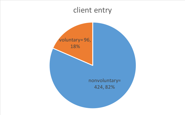
Frequency Count. Counting “how many” is among the simplest descriptive statistics. In the Safe At Home example above (Table 2-1), investigators wanted to know how many men participating in the study entered batterer treatment voluntarily and how many were mandated to enter treatment by court order (nonvoluntary clients). As you can see in Table 2-2, the total number of participating clients was 520 (this would be written as N=520, where the capital N reflects total sample size). In addition, you can see that the study included 96 “voluntary” clients and 424 “nonvoluntary” clients (this is sometimes written as n=96 and n=424, where the lower case “n” is about a group within the larger, full set where we used “N”). Not only do we see that more clients entered nonvoluntarily, we can calculate how many more nonvoluntary clients there were: 424 – 96 = 328 more nonvoluntary than voluntary clients participated in the study.
Table 2-2. Frequency report for voluntary and nonvoluntary participants.
| N | % | |
|---|---|---|
| nonvoluntary | 424 | 81.5% |
| voluntary | 96 | 18.5% |
| Total | 520 | 100% |
Interactive Excel Workbook Activities
Complete the following Workbook Activity:
Pie-Chart. The pie-chart is a useful tool for graphically presenting frequency data. It is a quick, easily-interpreted visual device. Here is a sample pie chart depicting the nonvoluntary and voluntary client frequency (and proportion) data described in Table 2-2.
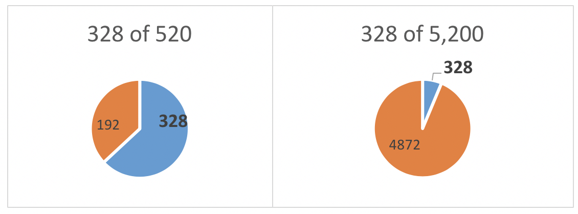
Frequency, Proportion, or Percentage. The investigators in our example not only wished to know how many voluntary and nonvoluntary clients were involved in their study, they also wanted to consider their relative proportions. You might wonder why it matters since they already know how many men were in each group, and that there were 328 more involuntary than voluntary clients in the study. It matters because the investigators wish to evaluate how meaningful that difference might be. A difference of 328 clients is proportionately large in a sample of 520, but the same 328 would be proportionately small among a very large sample such as 5,200.
A proportion is simply a fraction, or ratio, calculated by dividing the number in each group (fraction numerator) by the total number in the whole sample (fraction denominator). To simplify interpretation, the fraction is often converted to percent—the proportion of 100% represented in the fraction.
- For nonvoluntary clients, this would be computed as: (424/520) x 100%, which comes out to be (.815) x 100%, or 81.5%.
- For voluntary clients, this would be computed as: (96/520) x 100%, which comes out to be (.185) x 100%, or 18.5%.
The investigators provided these percentages in Table 2-2; the percentages total to 100% (81.5% + 18.5% = 100%). You can see that the two groups were not equivalent in actual size, relative proportion, or percentages of the total sample. In Chapters 4 and 5 you will learn about statistical analysis approaches that allow investigators to test if the size of the observed difference is statistically significant.
Interactive Excel Workbook Activities
Complete the following Workbook Activity:
Univariate Central Tendency Analysis: Numeric Variables
Knowing the frequency with which certain categories or levels of a categorical variable are reported in the data is useful information, as witnessed above. Frequency counts are less useful in understanding data for a numeric variable, however. For example, in the Safe At Home study, it would be difficult to interpret information about the participants’ ages: 3 were age 18, 7 were age 19, 17 were age 20, 8 were age 21, 14 were age 22, and so forth for all 520 individuals between 18 to 72 years. A more useful way of looking at these numeric (interval type) data is to consider how the study participants’ values for age were distributed and how any individual’s values for age might differ from the rest of the group. Ideally, we would like to see a meaningful summary of the data.
The concept of central tendency refers to a single value that summarizes numeric data by characterizing the “center” values of a data set—a single value around which individuals’ values tend to cluster. Central tendency helps make sense of the variability observed among participants on a numeric variable. The most commonly used central tendency ways to summarize data are:
- mean,
- median, and
- mode.
For example, within a classroom of public school students we might see many different values for the variable “number of days absent” during a school year. Most states in the U.S. require 180 student instruction days in the school year. Let’s consider a hypothetical example (see Table 2-3) where hypothetically:
- we have a class of 28 students
- the number of days absent for each student ranges from 0 to 49 out of the year’s 180 days
- the total number of absent days for the class members combined was 194.
Table 2-3: Number of days absent for each student in (hypothetical) class.
| student | # days | student | # days |
|---|---|---|---|
| 1 | 2 | 16 | 6 |
| 2 | 4 | 17 | 4 |
| 3 | 0 | 18 | 49 |
| 4 | 0 | 19 | 0 |
| 5 | 26 | 20 | 3 |
| 6 | 0 | 21 | 0 |
| 7 | 15 | 22 | 4 |
| 8 | 3 | 23 | 10 |
| 9 | 9 | 24 | 1 |
| 10 | 12 | 25 | 2 |
| 11 | 1 | 26 | 0 |
| 12 | 1 | 27 | 2 |
| 13 | 3 | 28 | 12 |
| 14 | 19 | --- | --- |
| 15 | 6 | total | 194 |
Our goal is to find a single central tendency value that helps represent the group on this days absent variable; summarizing the variable without having to rely on all 28 values at once. Let’s look at each of the common central tendency options.
Mean. The first central tendency indicator we consider is the mean. You might recognize this as numeric average; average and mean for a set of values are the same thing. The mean is computed by adding up all the values, then dividing by the actual number of values. In our example, we would first find the sum of the number of days absent across all the students together (194), then divide that total by the number of students contributing to that total (N=28). This would be the mean value for our students on the variable for number of days absent: 194 divided by 28 (194/28) = 6.93 with rounding. We would report this as M=6.93.
Interactive Excel Workbook Activities
Complete the following Workbook Activity:
Median. The median is the next common central tendency feature, and it can be thought of as the half-way point in a distribution of values. In other words, it is the point where half of the values are higher and half of the values are lower. Another name for the median is the 50th percentile—since 50% is halfway to 100%. In other words, the 50th percentile is the value where 50% (half) of the scores are lower and the other 50% (other half) are higher. In our classroom absenteeism example, the median value is 3 days: three is the point where half of the students had more and half had fewer days absent. We can easily compute that half of the 28 students is 14, so we identify the median point as where the lowest 14 values are included and all of the higher values are excluded—14 students had scores of 3 or less. We would report this information as: Mdn=3.
Mode. The last common measure of central tendency to consider is the mode. Sometimes it is useful to know the most common value for a variable. This is simply a frequency count—how many times did each value appear in our data. For our student absenteeism data, the most common value was 0—six of our students did not miss any days of school (see Table 2-4). This would be written as Mode=0.
Table 2-4. Frequency of each value for days absent example.
| # days absent | # of students with that value | # days absent | # of students with that value |
|---|---|---|---|
| 0 | 6 | 10 | 1 |
| 1 | 3 | 12 | 2 |
| 2 | 3 | 15 | 1 |
| 3 | 3 | 19 | 1 |
| 4 | 3 | 26 | 1 |
| 6 | 2 | 49 | 1 |
| 9 | 1 | total | 28 |
Interactive Excel Workbook Activities
Complete the following Workbook Activity:
Comparing Mean, Median, and Mode. Why wouldn’t we always use the mean to describe the variable of interest? The answer is demonstrated in our student absenteeism example: even a few extreme values (sometimes called outliers) can seriously distort or skew the picture. The most common value (mode) was 0 but we had a couple of students with some really high values compared to the others: 26 and 49. When we add those two extreme values into the total number of absent days to compute the group mean, they have a big impact on the total (194): the mean for the 28 students was 6.93 days absent. Without those two extreme values, the total would have been 119, making the mean for the 26 remaining students (28 – 2 = 26) only 4.6 days (119/26=4.6). This mean of 4.6 days is considerably less than the mean of 6.93 days we observed with these two extreme students included. Thus, you can see that the two extreme values had a powerful skewing impact on the mean.
As a real-world example, consider data about the 2017 incomes (salary plus bonuses) for 1,999 NFL professional football players. The range was $27,353 to $23,943,600—a difference between 5-figure and 8-figure incomes! In 2017:
- mean player income was $1,489,042 (we would report this as M=$1,489,042),
- median income was $687,500 (Mdn=$687,500), and
- mode income was $465,000.
The mean and median incomes are very different, and the mean differs markedly from the mode, as well. This NFL player income example demonstrates what data look like when great disparities exist between individuals across a group or population—because the mean is highly sensitive to extreme values, there exist large differences between the mean, the median, and the mode. This is an important social work and social justice issue in poverty, health, incarceration, and other rates where large disparities between population groups exist.
In a relatively small sample (like our 28-student classroom), one or two extreme values made a big difference between the mean and median. Think about the mean income of people in a room where everyone is a social work student learning about social justice issues. Then, think about what would happen to that mean if Bill Gates arrived as a guest speaker invited to talk about social justice on a global scale. Just that one person would drastically change the summary picture based on mean income. However, the median would not really shift much; Bill Gates would be only one person out of the total number of people in the room; the halfway point is not affected much by one person being extreme, since the median is a frequency count of people on either side of the central midpoint value regardless of how far out the values are spread. The mode also is not affected since Bill Gates’ one extreme value is certainly not going to be the most common value (otherwise it would not be extreme). This all leads to a discussion of the importance in understanding the nature of variance as it relates to distribution of values for a variable.

Take a moment to complete the following activity.
Univariate Data Distribution: Numeric Variables
Central tendency is about how the set of values for a specific variable are similar, how they cluster around a mean, median, or mode value. However, investigators are also interested in how individual values differ. This is a curiosity about how those values are distributed or spread across a population or sample: the range and variance of the values. These elements are explained below, along with the more commonly reported standard deviation.
Range. Turning once again to our school absenteeism example, we can see that there exist very great differences in the numbers of days absent among the students in this class. The minimum value observed was 0 and the maximum value observed was 49. The range of values in a set of data is computed as the highest value minus the lowest value. In our example, the range would be 49 – 0 = 49 days absent. It is just a coincidence that the range in our example equals the highest value: this is only because our lowest value was 0 (if the lowest value was different from zero, the range would be different from the highest value).
The range has its greatest meaning when we understand the context in which it exists: a 49-point range is large for the possible 180 days but would not be if the context for possible values was 1,800 instead. Therefore, it becomes helpful to consider the range in ratio or percent absent days, giving the range greater meaning. This is calculated as the observed value divided by the possible value for the ratio, then multiplying by 100% to determine percent.
- Missing 0 of 180 days possible is a division (ratio) problem: (0/180) x 100% = 0 x 100% = 0% days absent;
- Missing 49 of 180 days possible is computed as (49/180) x 100% = 27.2 x 100% = 27.2% days absent.
- Thus, the range is 0% to 27.2% days absent.
Variance. One way of thinking about variability in the data is to compare each individual’s score to the mean for the group—how far from that central, summary value each individual’s value falls. When individuals’ scores are clustered very close to the mean, the variance is small; when individuals’ scores are spread far from the mean, the variance is large.
This sequence of steps describes how variance is computed in a sample.
- Step 1. Compute the mean of all the values together (overall mean).
- Step 2. Compute the distance of each individual value from that mean—this becomes a subtraction problem where the mean is subtracted from each individual score, showing the “difference” between the individual score and the group mean.
- Step 3. Multiply each of those distance values by itself (square the difference value). Why bother with this step, you might wonder? This is done to resolve potential problems with negative numbers from our earlier subtraction step. Some values were smaller than the mean and some were larger than the mean—when we subtract the mean from those smaller values, we end up with a negative number. In our next step (step 4) we are going to add the computed distances together. If we add in negative numbers, we are essentially subtracting values from the total which does not give an accurate picture of the total distances from the mean. To solve this negative number problem, we capitalize on the fact that multiplying two negative numbers together gives a positive value. Therefore, if we multiply a negative value by itself (square a negative difference score) we get a positive distance value (the distance squared).
- Step 4. This step is where we add up the squared distance values to get a single total (sum) of the squared distances.
- Step 5. Divide this sum by the number of values in the data set minus 1—one less than the number of contributions to the variance calculation. Why is this not just divided by the number of values instead, you might wonder? It has to do with the fact that we are computing variance of a sample, not the whole population. Without this adjustment, the computed sample variance would not be quite the same as the population variance—more about this distinction between sample and population parameters later, when we talk about statistical analyses and the conclusions drawn from the statistical calculations.
Here is what it looks like with our school absenteeism example.
- Step 1. We know that the mean is 6.93 from our earlier discussion about means.
- Step 2. Our first student missed 2 days, so the distance or difference score is:
- (2 – 6.93) = -4.93 (a negative number).
- Step 3. Now we compute those differences for every one of our 28 students. Once we have done this, we compute the square of each difference by multiplying it by itself. For our first student, this is:
- (-4.93)2= (-4.93) x (-4.93) = 24.3 (rounding)
- Step 4. After computing each student’s squared difference, we add them up (sum or total).
- Step 5. We take that total value and divide it by one less than the number of students contributing data: (28-1) = 27. The value we end up with for variance in the class is 109.25 (see Table 2-5).
Table 2-5. Computing variance in student absenteeism example: (2949.86)/(27)=109.25
| student | # days | distance from mean | (difference)2 | student | # days | distance from mean | (difference)2 |
|---|---|---|---|---|---|---|---|
| 1 | 2 | -4.93 | 24.30 | 16 | 5 | -.93 | .86 |
| 2 | 4 | -2.93 | 8.58 | 17 | 4 | -2.93 | 8.58 |
| 3 | 0 | -6.93 | 48.02 | 18 | 49 | 42.07 | 1769.88 |
| 4 | 0 | -6.93 | 48.02 | 19 | 0 | -6.93 | 48.02 |
| 5 | 26 | 19.07 | 363.66 | 20 | 3 | -3.93 | 15.44 |
| 6 | 0 | -6.93 | 48.02 | 21 | 0 | -6.93 | 48.02 |
| 7 | 15 | 6.07 | 65.12 | 22 | 4 | -2.93 | 8.58 |
| 8 | 3 | -3.93 | 15.44 | 23 | 10 | 3.07 | 9.42 |
| 9 | 9 | 2.07 | 4.28 | 24 | 1 | -5.93 | 35.16 |
| 10 | 12 | 5.07 | 25.70 | 25 | 2 | -4.93 | 24.30 |
| 11 | 1 | -5.93 | 35.16 | 26 | 0 | -6.93 | 48.02 |
| 12 | 1 | -5.93 | 35.16 | 27 | 2 | -4.93 | 24.30 |
| 13 | 3 | -3.93 | 15.44 | 28 | 12 | 5.07 | 25.70 |
| 14 | 19 | 12.07 | 145.68 | ------ | ------ | ------ | ------ |
| 15 | 6 | -.93 | .86 | total | 194 | ------ | 2949.86 |
Standard Deviation
Working with variances can be unwieldy, for two reasons. A practical reason is that the numbers can become very large, making them difficult to work with. Another practical reason is that variance is a bit difficult to interpret. Remember when we calculated the square of the differences in days absent minus the mean? We started with the unit of analysis being days absent. By squaring the values, our units are now the square of the difference in days absent. That just is not very intuitive. Instead, we find it easier to convert the figure back to the unit of days of absent. To do this is straightforward math: we take the square root of the variance of the squared distances. This gets both the value and the units back to a more interpretable, practical place.
- Square root of 109.254 is 10.452 (using the square root calculator on www.math.com)
- Cross-check this yourself: multiply 10.452 x 10.452 and see what result you get—it is slightly different in the third decimal place because of rounding.
- Thus, the standard deviation in our example is reported as: sd=10.45 days absent.
The way to think about standard deviation is that the greater a standard of deviation is, the more variable the values are—the more they spread rather than cluster around the mean. This is an important aspect of understanding the distribution of values on the variable of interest. A graph is also very helpful.
Graphing Numeric Variables
The way the numeric values of a variable are distributed can be visualized using what is called a histogram. The histogram is a graph where the x-axis represents the set of observed values for a specific variable (a univariate analysis), and the y-axis represents how many times each of those values was observed in the data (see Figure 2-1). You can see from the height of the bars that the frequencies begin to taper off after about 4 days absent and how far from the rest of the class those few extreme students are situated.
Figure 2-1. Histogram depicting distribution of days absent data, mean, and median.
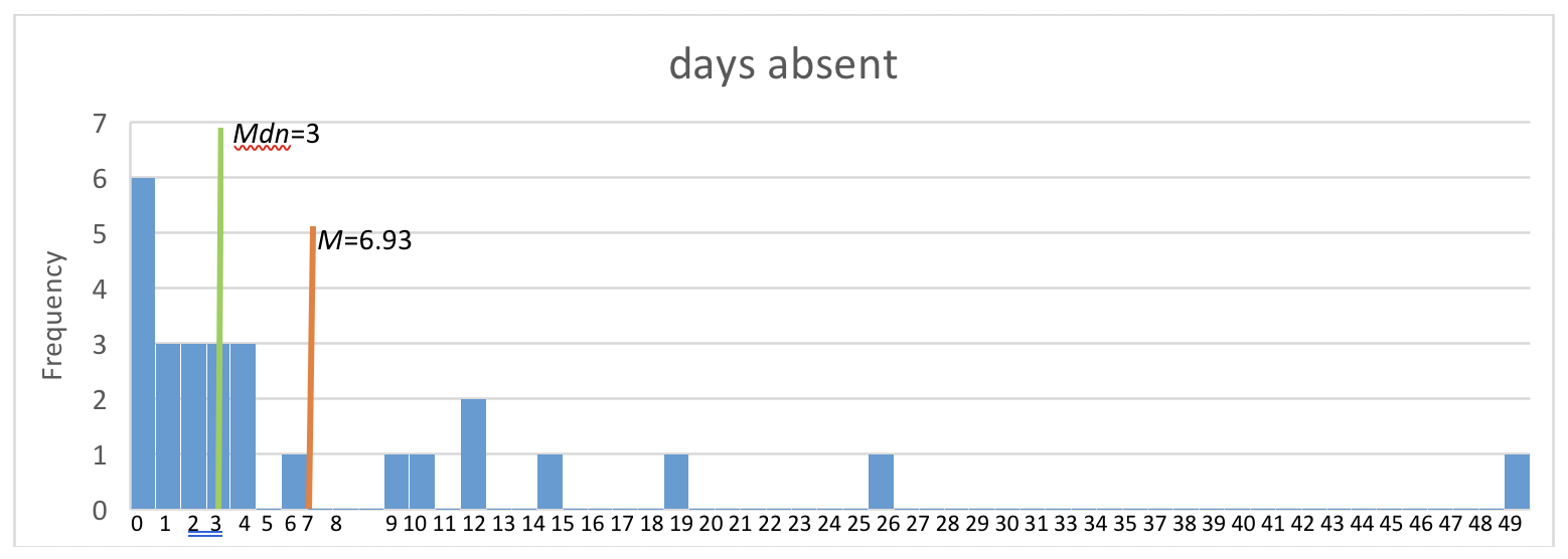
Another clue about the degree of spread or variability is the relative size of the sample’s standard deviation compared to the sample mean. In our example, the sd=10.45 is greater than the M=6.93. This indicates that a great deal of spread exists in the data. This observation relates to understanding the characteristics of normal distribution.
NORMAL DISTRIBUTION
You have probably been exposed to at least the general concept of the bell curve or normal curve at some point in your education. A normal distribution curve is sometimes called a “bell” curve because of its shape: high in the middle, low in the “tails,” and even on both sides of center. Bell-shaped curves do not necessarily meet all criteria of a normal distribution curve—you will see examples in this chapter. We focus on the true normal curve at this point, a fundamental concept related to many of the statistics used in social work, social science, and behavioral research.
Our in-depth exploration of its importance in understanding data begins with the picture of a normal distribution curve (Figure 2-2). The type of variable mapped onto a normal distribution curve is an interval or continuous variable—the units are equal intervals across a continuum.
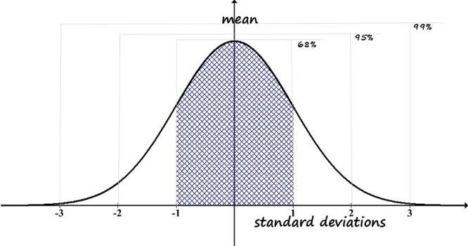
Figure 2-2. Generic normal distribution curve (histogram).
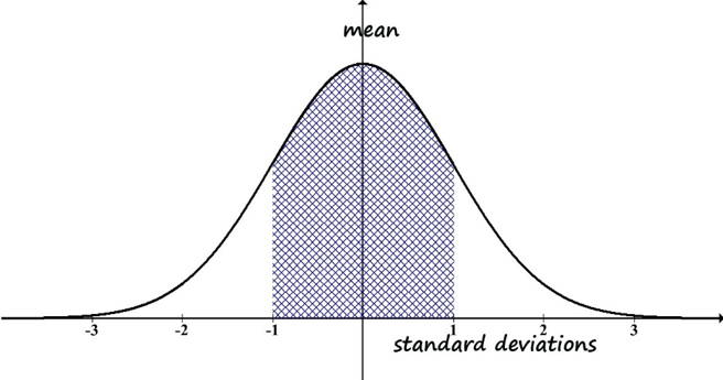
- The mean is the center of the curve.
- The observed data values are distributed equally on either side of the mean—the right and left sides are mirror images. This goes along with the mean being in the center; the right and left ends are called “tails” of the distribution curve.
- The median is equal to the mean. This also goes along with the mean being in the center of the distribution.
- The set of observed data values (the frequency each value is observed) are distributed in the following way, with regard to the standard deviation value (see figure 2-3):
- 68% are within one standard deviation of the mean (34% on each side of the mean)—see the grid-marked area under the curve in Figure 2-3.
- Combining all values observed for 2 standard deviations either side of the mean will include a total of 95% of the values (all of those within 1 standard deviation plus those from 1 to 2 standard deviations from the mean).
- Combining all values within 3 standard deviations of the mean accounts for 99% of the values.
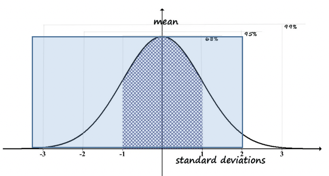
Percentile Scores.You may wonder how this relates to information such as someone having a 95th percentile score on some measure. Look at the right-side tail, out at 2 standard deviations from the mean. You can see that very few scores are way out in the tail beyond that point—in other words, it is rare to be more than 2 standard deviations away from the mean, and exceedingly rare to be more than 3 standard deviations away.
We saw that 95% of the scores fall between -2 and +2 standard deviations. This, however, is NOT the 95th percentile score. The reason it is not has to do with the definition of the 95th percentile: it is the point with 95% of the observed scores falling below and only 5% of the observed scores falling above. In this case, at 2 standard deviation above the mean (+2) we have 95% of scores in the -2 to +2 standard deviation range, which means 5% of scores are outside the range (100% – 95% = 5%). But, these are not all on one tail; there are those scores in the -2 to -3 standard deviation range to contend with. Those scores are also below the point we identified for being 2 standard deviations above the mean. So, using the +2-standard deviation value as our decision criterion, we would actually have half of the left-over 5% (5%/2 = 2.5%), plus the original 95%. This means 2 standard deviations above the mean is the 97.5 percentile (95% + 2.5% = 97.5%). The trick is to keep in mind which standard deviation range is relevant to the question being asked—is it about a range around the mean or is it about a range up to a standard deviation criterion value (see Figure 2-4)?
Figure 2-4. Computation of percentile for +2 SD.
Here is another example to consider. Imagine that policy makers want to provide services to individuals whose IQ scores are equal to or less than 1 standard deviation below the mean (this would be written as: ≤ -1 SD). This decision concerns one tail of the distribution—those at the far left (bottom) of the range, not the mirror tail on the right (top) of the range. If you wanted to determine what percentile would be covered, you would start with figuring out the total percent that fall outside of the -1 to +1 standard deviation range. That would be 100% minus the 68% that ARE in the range: 100% – 68% = 32% outside of the range. We also do not want to include those individuals in the range greater than 1 standard deviation above the mean (> +1 SD). They account for half of the number who are outside the -1 to +1 standard deviation range, which was 32%. So, we are going to subtract half of 32% (32%/2 is 16%) and we are left with only 16% of individuals falling below 1 standard deviation being eligible for the services (see Figure 2-5).
Figure 2-5. Computation of percentile for -1 SD.
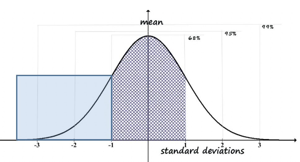
In fact, this scenario became an issue in one state during the 1970s. IQ scores are presumed to distribute on a normal curve with a mean of 100 across the population, and each standard deviation defined by 26 points on the test. As a cost-saving plan, the state determined that services to persons with intellectual developmental disabilities would be offered to individuals whose IQ scores were 68 or below. Previously, the criterion value had been 70. Rather than having “cured” individuals whose scores were between 68 and 70, the state simply ceased providing services to them—several thousand individuals no longer met criteria.
Next, let’s consider the real-world example of NFL player salaries mentioned earlier. Looking at the histogram, it does not seem to be very normally distributed. First, the mean does not seem to be in the middle, the bars to the right and left of the mean are not mirror images, and the median is very much lower than the mean—they are not even close to equal (see Figure 2-6). These are ways in which distribution on a variable fails to be normal.
Figure 2-6. Histogram of NFL player salaries.
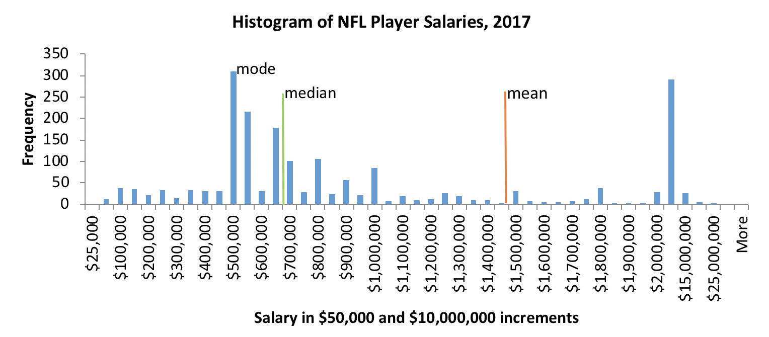
Bimodal Curve. Another way in which distributions are non-normal is when we see a bimodal curve. The normal, or “bell” curve, has only one peak or hump in the data. Sometimes, we get a curve that has two humps. If there had been more players in the 400,000 to 600,000 range we might have seen a second “hump” after the first one at around 500,000 to 600,000.
This scenario is “scary” in statistical terms, because it means that our assumption of normal distribution, the basis of many statistical analyses, has been violated. If you ever read The Little Prince (de Saint-Exupéry, 1943), you might understand the scary picture better. The Little Prince shows his scary picture (Drawing Number one) to the adults, who say a hat is not scary at all.

But, the picture is scary because it is not a picture of a hat, it is a picture of a snake who ate an elephant.
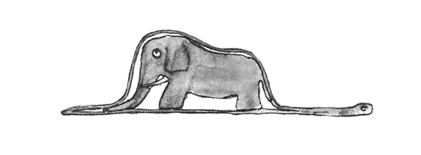
To statisticians, a bimodal curve is a scary picture—it has two “humps.” In other words, there exists a second peak in the data and this needs to be explored. As an example for explaining the bimodal curve in The Little Prince’s Drawing Number One, perhaps the curve is showing salaries where the left peak (lower salaries) is for women and the right peak (higher salaries) is for men; or, it could be about salary differences for two different raceial groups; or, it could depict an inequity or disparity in the frequency for some other variable.
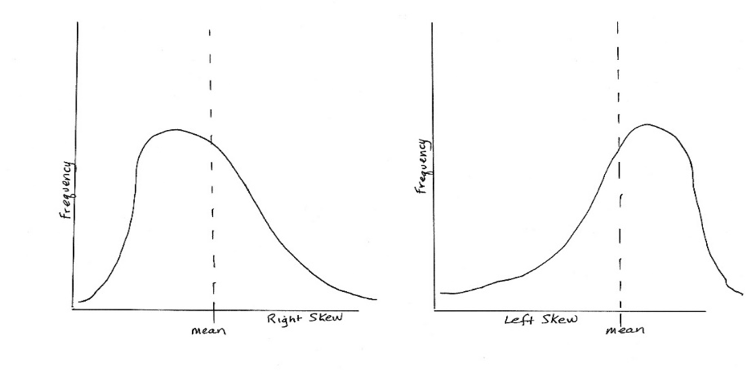
Skew and Kurtosis. Two other ways that a variable might be distributed in a non-normal way is that it is skewed to one side or the other in relation to the mean, and/or the peak of the bell is either too tall or too flat to represent those probabilities we mentioned earlier (e.g., 68% being within one standard deviation of the mean). The first of these is called skew and the second is called kurtosis. A curve with a lot of skew fails to look normal because the curve is no longer symmetrical on both sides of the mean. This is how skewed curves might look:
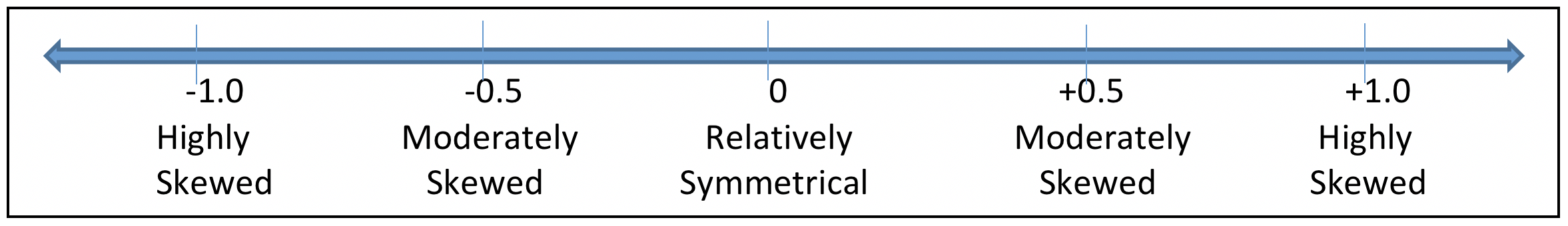
- If the value for skewness is less than -1.0 or greater than +1.0, far from zero, the distribution is highly skewed (asymmetrical or non-normally distributed).
- If the value for skewness is between -1.0 and -0.5, or it is between +.5 and +1.0, then the distribution is considered to be moderately skewed (asymmetrical).
- If the value for skewness is between -0.5 and +0.5 (including zero), the distribution is considered relatively symmetrical.
Kurtosis, on the other hand, has to do with how much of the distribution is sitting out in the tail or tails instead of being in the center “peak” area compared to a normal distribution. On one hand, there may be too few cases in the tails (clustered too much in the “peak”); on the other hand, there may be too many cases in the tails (spread away from the “peak”). This is how curves with kurtosis might look:
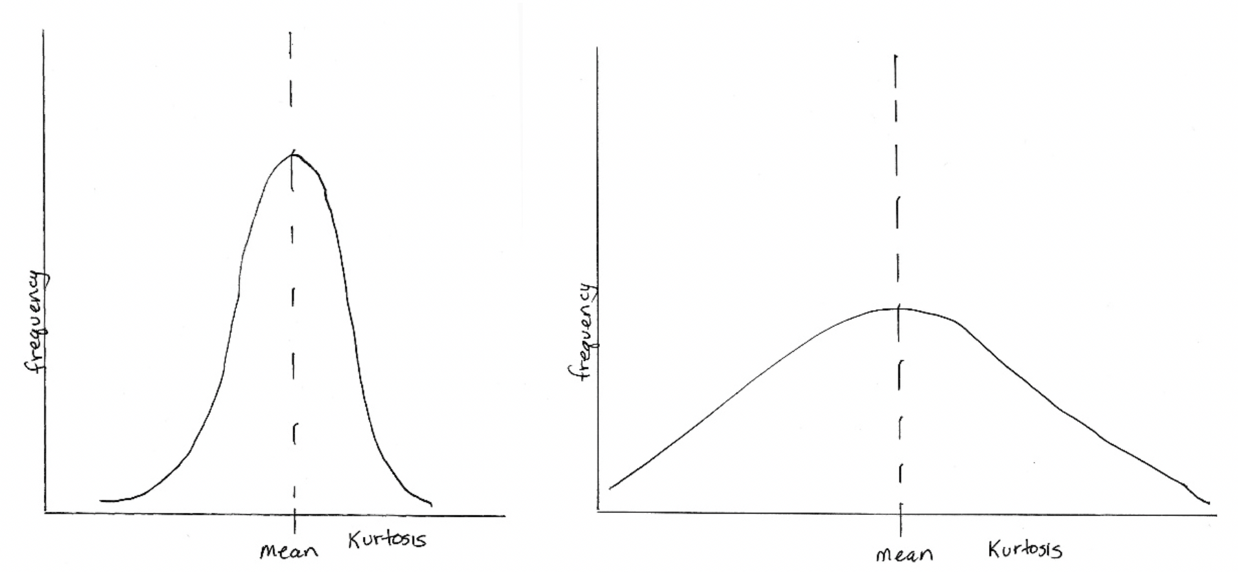
Kurtosis values are a bit more complicated to interpret than skewness values. When we learn about statistical tests of significance we can revisit the issue. In general, kurtosis is considered to be problematic when the value falls outside of the range from -7.0 to +7.0 (for social work, social science, and behavioral research). Some scholars argue for applying criteria with a tighter range, from -2.0 to +2.0.
The website called Seeking Alpha (α, https://seekingalpha.com/article/2100123-invest-like-taleb-why-skewness-matters) explains the importance of skew and kurtosis by using an example from Nassim Taleb (2012):
Suppose you placed your grandmother in a room with an average temperature of 70 degrees. For the first hour, the temperature will be -10. For the second hour, it will be 140 degrees. In this case, it looks as though you will end up with no grandmother, a funeral, and possibly an inheritance.
(Note: for our purposes, degrees Celsius were translated into degrees Fahrenheit to make the point from the original example clear.) The website goes on to state:
While this example is rather extreme, it does show one important principle that is highly relevant…It is dispersion around the mean that matters, not necessarily the mean itself.
Take a moment to complete the following activity.
_
Interactive Excel Workbook Activities
Complete the following Workbook Activity:
Understanding Graphical Representations: Categorical Variables
There exist at least 3 different ways of presenting the very same information about categorical variables: as text (words) only, as a table of information, or in graphs/figures. We can compare these approaches using a real-world data example: suicide rates by age group, as reported by the Centers for Disease Control and Prevention (CDC, 2017). A “rate” is similar to a frequency: rather than being an actual count (frequency), the frequencies are converted into population proportions. So, we often see a rate described as some number per 1,000 (or per 10,000, or per 100,000) of the population, instead of seeing the actual number of individuals.
Text: During 2016, middle-aged adults between the ages of 45 and 54 represented the group with the highest suicide rate (19.7 per 100,000 persons in the population). This was closely followed by individuals aged 85 or older (19.0 per 100,000), adults aged 55 to 64 (18.7), and older adults in the 75 to 84 age range (18.2 per 100,000). Next were adults in the 35 to 44 age group (17.4 per 100,000), adults in the 65 to 74 age range (16.9 per 100,000), and adults aged 25 to 34 (16.5 per 100,000). The suicide rate among adolescents and young/emerging adults aged 15 to 24 was somewhat lower (13.2 per 100,000), and the very lowest rate occurred among persons under the age of 15 (1.1 per 100,000). The rate for all ages combined was 13.42 per 100,000 persons in the population (age-adjusted).
Table: Table 2-6 presents the same information described in the text above, but much more succinctly.
Table 2-6. Suicide rate per 100,000 by age group during 2016.
| Age Group | Rate per 100,000 |
|---|---|
| Under 15 | 1.1 |
| 15 – 24 | 13.2 |
| 25 – 34 | 16.5 |
| 35 – 44 | 17.4 |
| 45 – 54 | 19.7 |
| 55 – 64 | 18.7 |
| 65 – 74 | 16.9 |
| 75 – 84 | 18.2 |
| 85 or older | 19.0 |
| overall age-adjusted rate | 13.42 |
Bar Charts: The same information is presented once again in Figure 2-6, but graphically this time, where you can visually compare the height of the bars representing each age group.
Figure 2-6. Suicide rate bar chart.
Take a moment to complete the following activity.
Chapter Summary
The emphasis in this chapter surrounded univariate descriptive statistics. You learned about describing frequency and percentage results. Then, you learned about the “Central Tendency” statistics most commonly used in social work, social, and behavioral research: mean, median, and mode. You also learned about the statistics concerned with how data are distributed: variance and standard deviation. Related to the issue of data distribution, you learned about normal distribution (and histograms), as well as the nature of skew and kurtosis in relation to non-normal distribution. Finally, you witnessed the power of graphs and table to present univariate statistics information compared to written text. In the next chapter, we begin to explore bivariate analyses.
