Module 5 Chapter 3: Creating Figures and Graphs
Just as you learned in Module 4, information is often better understood by audience when presented in a table, figure, or graph compared to lengthy verbal descriptions. Previously, you learned how to interpret different types of graphs; in this chapter you are introduced to building them using Word®, PowerPoint®, and Excel® software. In this chapter you will learn:
- Simple tools for creating figures;
- Tools for creating graphs.
Creating Figures
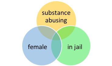
Word® and PowerPoint® have tools available for creating basic figures or diagrams. For example, the “Three Strikes” Venn diagram presented in Chapter 2 was created using the SmartArt design feature in Word®.
In the Word® top menu bar is a tab called “Insert.” If you select this tab, then select “SmartArt” from the next menu, an array of options becomes available which are preformatted for making simple figures. It is also possible to use a combination of “Shapes” from the menu to create your own figure, but this can be more challenging, time and effort consuming, and difficult to format.
Another “Insert” option for creating your own figures is the “Icons” menu. Here is an example of the icons available under the heading of “people.”
![]()

Follow the steps outlined for creating a simple figure using SmartArt. Some suggestions: a hierarchy diagram of who lives in your household (including pets), a process diagram explaining your current mood, a relationship diagram depicting your various interests, or other ideas. See what you can create on your own.
Creating Graphs
In the Word® “Insert” menu is an option called “Charts.” This option provides tips and tools for creating the kinds of charts and graphs we studied in Module 4: bar charts, pie charts, scatterplots, histograms, and line charts for example. If you need charts or graphs in a PowerPoint® presentation, you can also create them the same way or you can create them in Word® and then perform a “copy & paste” operation to place them in a PowerPoint® slide. Furthermore, you can create a graph in Excel® and copy it into a Word® or PowerPoint® document, as well. The three programs are compatible in this way. In addition to these types of quantitative charts and graphs, you are introduced to one additional quantitative type (bubble charts) and one for demonstrating more qualitative types of information (word clouds).
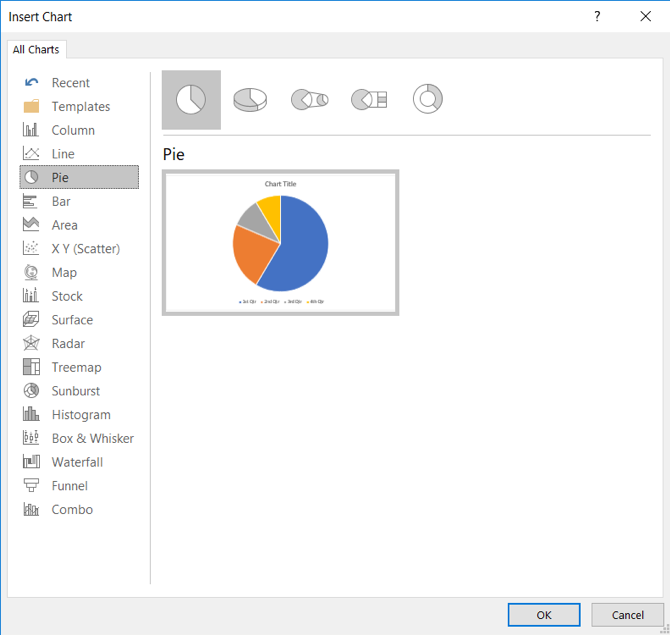
Basic Steps. The steps for creating graph or chart are, basically, selecting “Insert” and “Charts” from the toolbar menus, select the type of graph or chart you wish to create, enter the data for the chart or graph in an Excel® spreadsheet that opens for this purpose, then fine tune the “look and feel” features of the chart or graph (labels, fonts, color scheme, proportions, and more). Here is a screen shot of the options for types of graphs or charts available in Word® and PowerPoint®.
Pie Chart
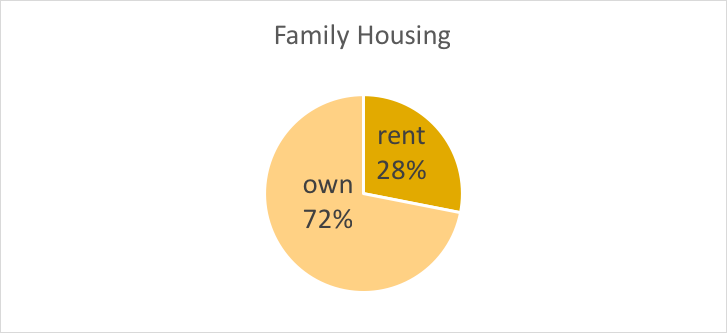
A pie chart is used to represent univariate distribution (proportion) on a categorical variable: the proportion out of 100% (the full pie) of individuals in each group on that variable. In our hypothetical example of children living in rental versus family owned homes (n=50 rental, n=128 family owned, from the “count” Excel workbook exercise in Module 4), the pie chart would be created in the following manner.
Step 1. Open the “Insert” and “Chart” menu, select “Pie” chart option and click “OK.”
Step 2. A small Excel spreadsheet box opens for you to enter the relevant information. The “Sales” column is waiting to be overwritten with your data; the 1stQtr, 2ndQtr, 3rdQtr, and 4thQtr are also place holders waiting to be overwritten with your data. Replace the number 8.2 in cell B2 with the number 50, and the cell B3 number 3.2 with 128. Then delete the rows for 3rdQtr and 4thQtr since we only had 2 categories in our variable.
Step 3. Change the place holder label “Sales” to the variable name you want to have showing in your chart (try Family Housing) and the place holder labels 1stQtr and 2ndQtr with the category names you want to have showing (try rent and own).
Step 4. Close the Excel box by clicking on the X in the upper right corner—this puts the data entry routine in the background but you will not lose your work.
Step 5. Now is the time to adjust the appearance of the pie chart. Right now, it is unclear to an audience what they are seeing. You can start by clicking on the “legend” which is the area of the chart where the color for rent and the color for own are being defined. This should open a menu to the right of the chart with four symbols.
- The second symbol, a + sign in a box allows you to manipulate the labels. Select each option to see what it changes in your chart—”data labels” inserts the values of the data you entered.
- The third symbol, a paintbrush in a box allows you to manipulate the design and color scheme of your pie chart.
- The fourth symbol, that looks like a funnel in a box allows you to manipulate more about the appearance.
Additionally, if you right click on one of the pie segments, you should see a drop-down menu with one of the options being “format data labels.” This allows you to select the “percentage” as what shows in the chart instead of the actual raw numbers. Selecting this should change the 50 and 128 to 28% and 72%. You could also delete the legend and check “category name” to make the chart easier to interpret. Then, you can double click the name and number in a slice of the pie chart to edit the font (different font size, bold, different color, different font) using the regular Word tools. You can also drag the box around to place it where you like.
Another option is to work with the toolbar menu running across the top of the screen once you have clicked on the chart (it will appear within a box). The Chart Tools” menu is what you want to work with in design or format. Note that there is also an option to edit the data (this will reopen that Excel box) or even to change the chart type if you decide a different type is preferable (a bar chart, for example).
Here is an example of what it might look like when you are finished—many options exist. You want to make the chart as easy to interpret as possible.
Follow the steps outlined for creating a pie chart for the children from rental or family owned homes. See what you can create on your own.
Bar Chart
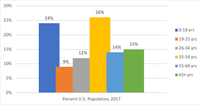
A bar chart, like the pie chart, is used to represent univariate distribution (frequency) on a categorical variable: the number (frequency) of individuals in each group on that variable. When the frequencies do not represent a total 100% in proportions, a bar chart is more easily interpreted than a pie chart; it is also easier to interpret a bar chart if there are more than a few categories involved–wedges of the pie might become very small and too numerous to understand easily. For example, according to the Henry J. Kaiser Family Foundation (www.kff.rg/other/state-indicator/distribution-by-age/) the U.S. population census can be reported in terms of age groups: children aged 0-18 years (24%), adults aged 19-25 years (9%), adults aged 26-34 years (12%), adults aged 35-54 years (26%), adults aged 55-64 years (14%), and those aged 65 and older (15%) as of 2017. The percentages total 100%, so it could be presented as either a pie or bar chart. If, however, the data were in the form of numbers (not percentages/proportions), a bar chart would be preferable regardless of there being more than a few categories represented,
A bar chart of this age group information would be created in the following manner.
Step 1. Open the “Insert” and “Chart” menu, select “Column” chart option and click “OK.” Note: the “bar chart” option is a sideways presentation.
Step 2. A small Excel spreadsheet box opens for you to enter the relevant information. The “Series” columns are waiting to be overwritten with your data. The series would be the 6 age groups. Categories would be relevant if you had the same series in multiple years or multiple locations, for example (1997, 2007, and 2017 perhaps). In our example, we have only the one category, so you could begin by deleting the rows for category 2 through 4 from the Excel spreadsheet.
Step 3. Enter the data into the Excel spreadsheet. Cell B2 would be the percent for children aged 0-18 (24%), C2 is 9%, D2 is 12%, E2 is 26%, F2 is 14%, and G2 is 15%. Change the place holder label “Category 1” with the variable name (try Percent U.S. Population, 2017) and the “series” place holder labels with category labels (try 0-18 yrs, 19-25 yrs, and so forth).
Step 4. Close the Excel box by clicking on the X in the upper right corner—this puts the data entry routine in the background but you will not lose your work.
Step 5. Now is the time to adjust the appearance of the bar chart—right now, it is a little confusing to an audience. You can start by clicking on the chart itself. This should open the “Chart Tools” menu on the upper tool bar, as well as the four symbols to the right of the chart.
- The second symbol, a + sign in a box allows you to manipulate the labels. Select each option to see what it changes in your chart—”data labels” inserts the values of the data you entered and moving the legend to the right might help. The “format data series” option allows you to alter the spacing between the bars (columns) which can make the chart a bit more interesting.
Another option is to work with the toolbar menu running across the top of the screen once you have clicked on the chart (it will appear within a box). The Chart Tools” menu is what you want to work with in design or format. Note that there is also an option to edit the data (this will reopen that Excel box) or even to change the chart type if you decide a different type is preferable (a bar chart, for example).
Here is an example of what it might look like when you are finished—many options exist. The goal is to make the chart as easy to interpret as possible.
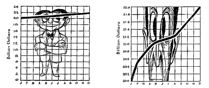
A word of caution about bar charts: their interpretation is influenced by the scale of the y-axis. In other words, if you increase the spread of the values on the y-axis, it makes even small differences between columns seem impressive; if you compress the spread of values, it makes the columns seem more similar. This point is made in images from a book called How to Lie with Statistics (Huff & Gels, 1954); here is the authors’ example demonstrating that the very same numbers (a difference of 2 billion dollars) can be interpreted as “great” or “alarming” news. Imagine the y-axis is about billions of dollars spent on [insert any category of spending you like here] during different months of a single year; the x-axis reflects which month the data represent. The chart on the left uses a scale where each increment represents 2 billion dollars. The movement from 20 billion to 22 billion does not look like very much; the line is only slightly angled (Huff & Gels, 1954, p. 61). The chart on the right uses a scale indicating 0.2 billion dollars for each increment (Huff & Gels, 1954, p. 63). The movement from 20 billion to 22 billion looks like a whole lot; the line is very dramatic. Yet, both charts are representing the same 2 billion dollar difference! So, the moral of this story is that scale matters in graphing.
Follow the steps outlined for creating a bar chart for the population by age group. See what you can create on your own.
Histogram
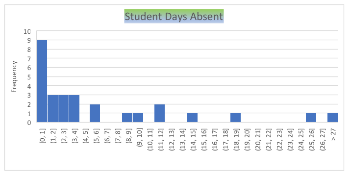
In Word® and Powerpoint®, histograms essentially are column/bar charts that include many columns—they are univariate description tools just like the bar chart. As previously explained, the histogram depicts the frequency with which each value on an interval (continuous) variable appears in the data. With enough data points, it is possible to assess how close to normal the distribution appears. Turning to the student absenteeism data with which we worked in Module 4, these are the steps involved in creating a histogram using Word.
Step 1. Open the original data file and sort the data by the variable of interest (days absent). Then, copy the column of data for that variable. This step would not be engaged if you are entering the data from “scratch” into the Excel® spreadsheet in the histogram creation routine.
Step 2. Open the “Insert” and “Chart” tabs from the Word® menu bar. Replace the “series” placeholder data with the data copied from your Excel® data file. Or, replace the “series” placeholder data with the data you are entering from “scratch.”
Step 3. Now you will specify the increments that you want included in each column of the histogram. The “placeholder” increments are “chunking” your data in increments of 12. However, you want a more refined picture. To change the increments, double click on the area of the graph where [0,12] (12,24] and so on appear (horizontal axis). This should open a “format axis” menu to the right of your work. In Excel® the increments are called “bins” and you want to adjust the bin width. If we change the 12.0 in the Bin width box to 1, the chart shows the frequency with which each value for number of days appears among our 28 students—since the lowest value was 0 and the highest value was 39, the result is a total of 49 bins (increments) in our chart. This seemed to be confusing because of that one outlier at 49 days absent. Checking “overflow bin” in the format axis menu and changing the default value (38) to 27 retains that one student in the picture but doesn’t spread the axis out as much: the student is in the >27 bin (all values greater than 27). Then, the format axis menu can be closed.
Step 4. The final steps relate to the chart’s appearance. Double clicking on the Chart Title placeholder allows overwriting of those words with a meaningful title. It also opens a Format Chart Title menu where color, position, and other aspects can be modified. Clicking on the chart opens the three symbols menu where axis titles may be added.
Here is an example of how a histogram of these data created in Word® might appear.
Another option is to create the histogram in Excel® and perform a copy & paste operation into the Word® document or PowerPoint® presentation slide.
Follow the steps outlined for creating a histogram for the student absenteeism data (located in the Excel file called student absenteeism start.xlsx). See what you can create on your own.
Scatterplot
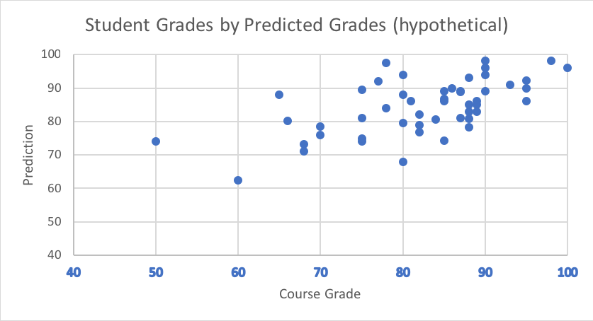
As previously discussed, a scatterplot is used to visually depict the relationship between two variables (bivariate). Using a hypothetical set of data from 50 undergraduate social work students in a research and statistics course, a scatterplot is created depicting the relationship between their predictions about their course grades generated at the start of the course and their actual final course grades.
Step 1. Open original data file (unless entering data from “scratch” into the chart development routine); copy each column and replace the “placeholder” values in the “Scatterplot” Excel® spreadsheet that opens with “Insert” and “Chart” selected from the toolbar.
Step 2. Double click on the chart to access the formatting tools—for example, the format axis tool allows you to adjust the “y” axis values (“Number” option) to remove the irrelevant decimal place; it allows you to adjust the scale of the “y” axis, as well. Not only does it allow adjusting of the scale (e.g., 10-point increments versus 20-point increments), it allows deletion of the bottom or top range where there are no values in the data—instead of starting at 0.0 (no one predicted a score this low), the scale can start at 40 instead. Instead of extending to 120 (the highest possible value was 100%), it can end at 100.
Step 3. Formatting the “x” axis allows similar functions. These formatting tools also allow insertion of labels for the “x” and “y” axis. Changing the chart title is likely to be necessary. If the axes are labelled, the “legend” can be deleted.
Here is how a scatterplot of these data might appear.
Line Graph
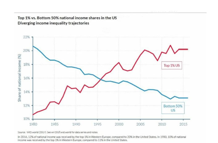
In many instances the point that a presenter wishes to make relates to a trend in data, for example how some feature has changed over time. Here is a modified line graph with two lines showing the trend in income shares between 1980 and 2016 (see the World Inequality Report, Alvaredo et al., 2018, p. 8). In this chart, you can quickly see that households in the bottom 50% of income level have declined in their share of income and households in the top 1% have climbed. In other words, the income inequality gap increased considerably.
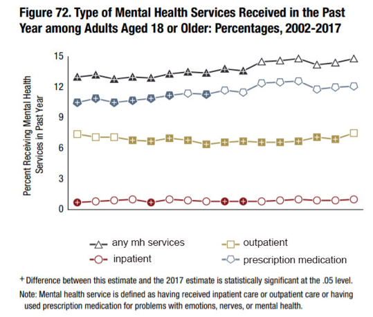
These charts can be created using the same “Insert” and “Charts” menu we have been working with so far. The choice is “Line” in the menu of options. The data are inserted into the drop-down Excel® worksheet, just as in the previous chart examples. Editing the features of the chart are the same as in previous examples, as well. The income inequality line graph shows an interaction between the two lines, one for each group. Line charts can be as simple as tracking one variable at two time-points or can be very complex, showing a trend for multiple groups. Here is an example from the National Survey on Drug Use and Health (SAMHSA, 2017). This figure depicts the percent of adults receiving different forms of mental health services each year from 2008 to 2017. The legend at the bottom shows the different types of services—a separate line is presented for each. Not only can you see the trend for each type, you can see the types in relation to each other (e.g., inpatient services are less common than prescription medicine).
Bubble Chart
A type of chart with a different emphasis is called a bubble chart. It is basically a type of scatterplot, but in a bubble chart the “dots” (bubbles) vary in size. The size of the bubbles represents an added dimension of information. As in the scatterplot, we still have an x-axis and y-axis. In a bubble chart, there is a 3rd dimension (variable) in the diagram. The 3rd dimension is represented by the size (area) of the bubble, or sometimes by colors. Bubble charts do not work if there are too many bubbles (cases) represented (see https://datavizcatalogue.com/methods/bubble_chart.html). Microsoft hosts a site where you can learn more about how to use Excel to create a bubble chart: https://support.office.com/en-us/article/present-your-data-in-a-bubble-chart-424d7bda-93e8-4983-9b51-c766f3e330d9
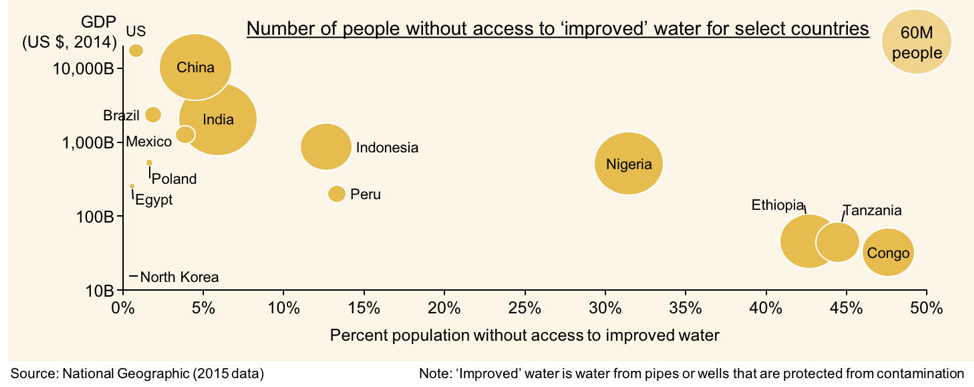
Here is an example of a bubble chart based on National Geographic data, posted on the website www.aploris.com/blog/charts/category/bubble-chart/. The x-axis represents the percent of population in each country who lack access to water from pipes or well protected from contamination. The y-axis represents the GDP (gross domestic product, indicator of national wealth) in billions of U.S. dollars for each nation in the sample. The size of each bubble reflects the number of persons affected in each nation (this is different from percent and reflects a 3rd variable).
You can see that relatively wealthy nations, like the U.S. have very small bubbles far on the left of the graph (very small percent of population affected). Four African nations have the largest percent of population without access to water from protected sources (Congo, Tanzania, Ethiopia, and Nigeria) and these are also nations in the lower quadrant which indicates they have lower GDP. Nigeria has a larger sized bubble than Tanzania, for example, indicating that the problem affects a larger number of persons in the nation, even though a larger percent of the Tanzanian population is affected. The “legend” on this chart shows the size of a bubble representing 60 million persons, allowing for comparisons on this dimension. The size of the bubble for the U.S. is very small compared to this 60 million persons bubble, whereas China and India have larger bubbles, even though their percent of affected population is near the U.S. value.
Word Cloud
You have seen them: Word Clouds. A word cloud is a graphic image composed of a cluster of words that fit together under a general theme or topic. A resource for learning to create them using Word® software with an add-in from Microsoft Office Store (created by Orpheus Technology, called Pro Word Cloud) is available at https://www.youtube.com/watch?v=my1JRX84tyc, and there exist several free software programs for creating them, as well. They also can be created in PowerPoint® with an add-in, or you could create one in Word® that you then copy and paste into a presentation slide.
A word cloud begins with a set of words. These can be entered as a list or a body of text can be copied into the program. They can be created with frequency of each word’s appearance determining its positioning and prominence. Common words like “a,” “the,” “and,” can be ignored in the options, and other features can be modified (color, orientation, and others).
Here is an example of a word cloud used as an online textbook cover for a different course.

Take a moment to complete the following activity.
Chapter Summary
In this chapter you were introduced or re-introduced to 7 types of visual graphs and charts that are useful in communicating information to an audience. Not only did you refresh your skills at interpreting them yourself, you also learned how to set about creating them. These tools can be easily embedded in a written report or presentation. The next chapter describes another communication tool gaining in popularity for communicating powerful messages: the infographic.
