Chapter 13: Visual Messaging
Telling Stories with Infographics
Infographics use visuals to make information easy to understand. They can present complex information quickly and clearly, or tell a more compelling story by fusing graphics and text.
To create a strong infographic:
- Have a planning process to determine the overall purpose and message
- Select strong details and data to support the primary message
- Find a relevant hook for your infographic: is something significant or new?
- Create a branded design with colors and font that connect to brand and/or topic. But make sure style never overwhelms substance.
- Use graphics and visuals that make information easier to understand. An infographic is not just an illustration and needs to tell a story.
- Treat the infographic as visual journalism: no factual or grammatical errors and be sure to include proper citation of all included information
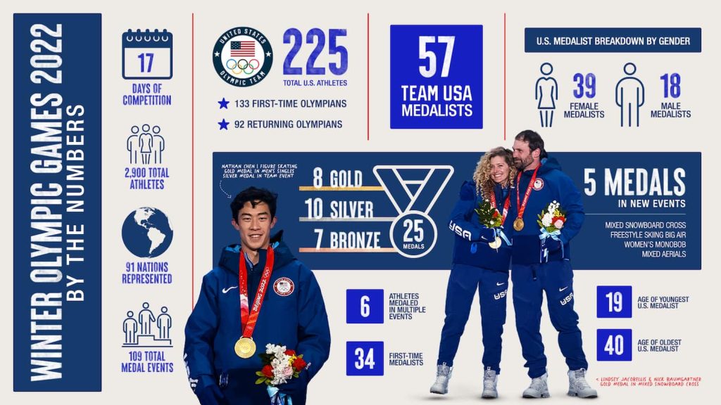
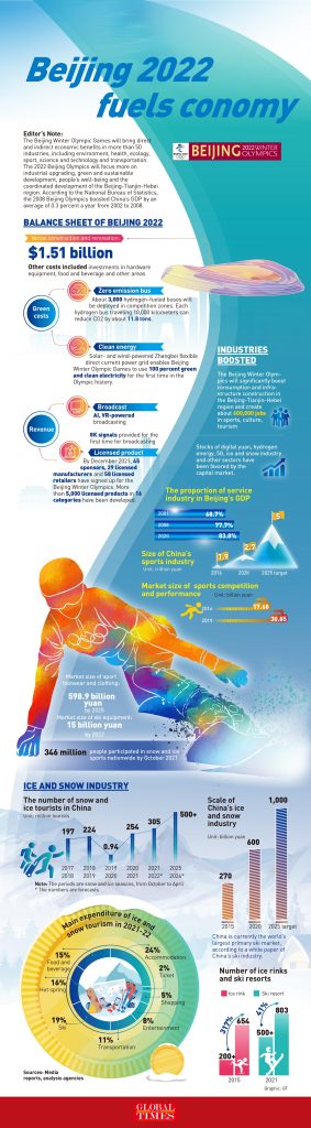
There are many potential infographic angles and messages based on the same pool of information. Both infographics below are about the Olympics, but they send different messages and so select different facts and visuals to support each message.
Message #1: USA Athlete Performance
Message #2: Olympic Games Fuel Economy
Even two infographics on the same topic might look very different based on the visuals used.
If you follow the process above and need help with the graphic design, the free online tool Canva provides templates and other support for infographic design.
