Chapter 18: Scientific Visualization
18.1 Introduction

Visualization in its broadest terms represents any technique for creating images to represent abstract data. Thus much of what we do in computer graphics and animation can fall into this category. One specific area of visualization, though, has evolved into a discipline of its own. We call this area Scientific Visualization, or Visualization in Scientific Computing, although the field encompasses other areas, for example business (information visualization) or computing (process visualization).
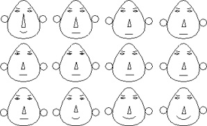
In 1973, Herman Chernoff introduced a visualization technique to illustrate trends in multidimensional data. His Chernoff Faces were especially effective because they related the data to facial features, something which we are used to differentiating between. Different data dimensions were mapped to different facial features, for example the face width, the level of the ears, the radius of the ears, the length or curvature of the mouth, the length of the nose, etc. An example of Chernoff faces is shown to the left; they use facial features to represent trends in the values of the data, not the specific values themselves. While this is clearly a limitation, knowledge of the trends in the data could help to determine which sections of the data were of particular interest.
In general the term “scientific visualization” is used to refer to any technique involving the transformation of data into visual information, using a well understood, reproducible process. It characterizes the technology of using computer graphics techniques to explore results from numerical analysis and extract meaning from complex, mostly multi-dimensional data sets. Traditionally, the visualization process consists of filtering raw data to select a desired resolution and region of interest, mapping that result into a graphical form, and producing an image, animation, or other visual product. The result is evaluated, the visualization parameters modified, and the process run again. The techniques which can be applied and the ability to represent a physical system and the properties of this system are part of the realm of scientific visualization.
Visualization is an important tool often used by researchers to understand the features and trends represented in the large datasets produced by simulations on high performance computers.
From the early days of computer graphics, users saw the potential of this image to present technology as a way to investigate and explain physical phenomena and processes, many from space physics or astrophysics. Ed Zajac from Bell Labs produced probably one of the first visualizations with his animation titled A two gyro gravity gradient altitude control system. Nelson Max at Lawrence Livermore used the technology for molecular visualization, making a series of films of molecular structures. Bar graphs and other statistical representations of data were commonly generated as graphical images. Ohio State researchers created a milestone visualization film on the interaction of neighboring galaxies in 1977.
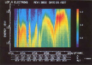
One of the earliest color visualizations was produced in 1969 by Dr. Louis Frank from the University of Iowa. He plotted the energy spectra of spacecraft plasma by plotting the energy against time, with color representing the number of particles per second measured at a specific point in time.
One of the most well-known examples of an early process visualization is the film “Sorting out Sorting”, created by Ronald Baecker at the University of Toronto in 1980, and presented at SIGGRAPH 81. It explained concepts involved in sorting an array of numbers, illustrating comparisons and swaps in various algorithms. The film ends with a race among nine algorithms, all sorting the same large random array of numbers.The film was very successful, and is still used to teach the concepts behind sorting. Its main contribution was to show that algorithm animation, by using computer generated images, can have great explanatory power.
Three-dimensional imaging of medical datasets was introduced shortly after clinical CT (Computed axial tomography) scanning became a reality in the 1970s. The CT scan process images the internals of an object by obtaining a series of two-dimensional x-ray axial images. The individual x-ray axial slice images are taken using a x-ray tube that rotates around the object, taking many scans as the object is gradually passed through a gantry. The multiple scans from each 360 degree sweep are then processed to produce a single cross-section.
The goal in the visualization process is to generate visually understandable images from abstract data. Several steps must be done during the generation process. These steps are arranged in the so called Visualization Pipeline.
![]()
Data is obtained either by sampling or measuring, or by executing a computational model. Filtering is a step which pre-processes the raw data and extracts information which is to be used in the mapping step. Filtering includes operations like interpolating missing data, or reducing the amount of data. It can also involve smoothing the data and removing errors from the data set. Mapping is the main core of the visualization process. It uses the pre-processed filtered data to transform it into 2D or 3D geometric primitives with appropriate attributes like color or opacity. The mapping process is very important for the later visual representation of the data. Rendering generates the image by using the geometric primitives from the mapping process to generate the output image. There are number of different filtering, mapping and rendering methods used in the visualization process.
Gabor Herman was a professor of computer science at SUNY Buffalo in the early 1970s, and produced some of the earliest medical visualizations, creating 3D representations from the 2D CT scans, and also from electron microscopy. Early images were polygons and lines (e.g., wireframe) representing three-dimensional volumetric objects. James Greenleaf of the Mayo Clinic and his colleagues were the first to introduce methods to extract information from volume data, a process called volume visualization, in 1970 in a paper that demonstrated pulmonary blood flow.
Mike Vannier and his associates at the Mallinckrodt Institute of Radiology, also used 3D imaging as a way of abstracting information from a series of transaxial CT scan slices. Not surprisingly, many early applications involved the visualization of bone, especially in areas like the skull and craniofacial regions (regions of high CT attenuation and anatomic zones less affected by patient motion or breathing). According to Elliot Fishman from Johns Hopkins, although most radiologists at the time were not enthusiastic about 3D reconstructions, referring physicians found them extremely helpful in patient management decisions, especially in complex orthopedic cases.In 1983, Vannier adapted his craniofacial imaging techniques to uncover hidden details of some of the world’s most important fossils.
There are other early examples that used graphics to represent isolines and isosurfaces, cartographic information, and even some early computational fluid dynamics. But the area that we now call scientific visualization really didn’t come into its own until the late 1980s.
Herman Chernoff, The use of faces to represent points in k-dimensional space graphically, Journal of the American Statistical Association, V68, 1973.
To see a Java based demonstration of sorting algorithms, similar to the visualization done by Baecker, go to
https://cs.uwaterloo.ca/~bwbecker/sortingDemo/variants.html
Herman, G.T., Liu, H.K.: Three-dimensional display of human organs from computed tomograms, Computer Graphics and Image Processing 9:1-21, 1979
Michael W. Vannier , Jeffrey L. Marsh , James O. Warren, Three dimensional computer graphics for craniofacial surgical planning and evaluation, Proceedings of SIGGRAPH 83, Detroit, Michigan
