Chapter 18: Scientific Visualization
18.4 Algorithms
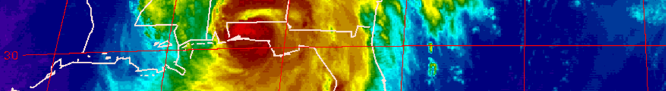
Most of the early visualization techniques dealt with 2D scalar or vector data that could be expressed as images, wireframe plots, scatter plots, bar graphs or contour plots. Contour plots are basically images of multivariate data that represent the thresholds of data values, that is for example fi(x,y)<=ci. The contours ci are drawn as curves in 2D space, and the shading represents values that are less than the contour value, and greater than the lower one. Often, the contour plots are redrawn over time, to get an animated sequence of a phenomenon. For example, Mike Norman of NCSA created an animation of a gas jet using sequential shaded contour plots.
-
- Contour Plot
-
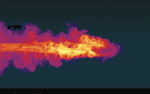
- Contour Plot – Norman
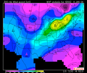
Vector or flow fields provide an effective means of visualizing certain phenomena, such as wind, gases, smoke, etc. By giving a direction to data within a certain interval, one could easily determine patterns within the data. For example, a stream plot was an example of a vector field which can be used to depict wind over the United States, as in the image to the above right. The image below the stream plot shows cool air entering a kitchen through ceiling vents, and the vectors show how the direction and temperature of the air changes as it is influenced by a gas-fired appliance, like a stove.
-
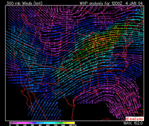
- Vector Field – Wind flow over the U.S.
-
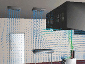
- Vector Field – Air flow in commercial kitchen.
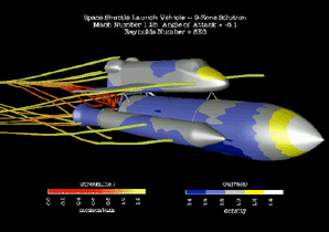
Any of these techniques can be combined, as is shown in the visualization of the energy over the space shuttle In this case, stream lines represent one data domain, while shaded contours represent another domain.
3D visualization presented a more difficult problem. Data that is obtained in 3D usually needs to be converted to an alternative geometric form in order to send it to the rendering part of the pipeline. Early researchers, like Herman (mentioned in Section 1) and Harris in the late 1970s used primitive techniques to map the “values” of CT scans into 3D volumes, but the computational overhead was tremendous. One approach, which utilized the “lofting” algorithm developed by Henry Fuchs, et al, involved tracing the important boundaries from the planar scans, and then joining the adjacent traces with triangles to create a 3D surface.
Probably the most important 3D geometry conversion algorithm was presented by Bill Lorensen an Harvey Cline of General Electric in 1987. The Marching Cubes algorithm defined cubes between two adjacent planar data scans. Then it used a particular density value, or contour value, and “marched” from cube to cube, finding the portions of the cube that had the same contour value, subdividing the cube as necessary in the process. When all surfaces of all cubes having the same value were presented, a “level” surface or isosurface was created, which could then be rendered.
One of the most famous examples of isosurfaces in visualization was done by Wilhelmson and others at NCSA at the University of Illinois in 1990. It was an animated visualization of a severe storm, and besides the surfaces, it used other techniques, like contour shading, flowlines, stream lines and ribbons, etc. to tell the scientific story of the storm. The isosurfaces were supplemented with flow lines and stream lines to depict the details of the storm.
-
- Scenes from NCSA Severe Storm Visualization
As mentioned above, data acquisition can be accomplished in various ways (CT scan, MRI scans, ultrasound, confocal microscopy, computational fluid dynamics, etc.). Another acquisition approach is remote sensing. Remote sensing involves gathering data and information about the physical “world” by detecting and measuring phenomena such as radiation, particles, and fields associated with objects located beyond the immediate vicinity of a sensing device(s).
It is most often used to acquire and interpret geospatial data for features, objects, and classes on the Earth’s land surface, oceans, and atmosphere, but can also be used to map the exteriors of other bodies in the solar system, and other celestial bodies such as stars and galaxies.
Data is obtained via aerial photography, spectroscopy, radar, radiometry and other sensor technologies. The filtering and mapping steps of the visualization pipeline vary, depending on the type of data acquisition method. One of the most famous remote sensing related visualizations is seen in the animation L.A. the Movie, produced by the Visualization and Earth Sciences Application group at JPL. The VESA group has performed data visualization at JPL since the mid 1980’s.
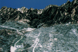
L.A. The Movie is a 3D perspective rendering of a flight around the Los Angeles area starting off the coast behind Catalina Island and includes a brief flight up the San Andreas Fault-line.
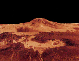
Since then the group produced other animations including flights around Mars, Venus, Miranda (a moon of Jupiter) and more. L.A. the Movie was created in 1987 utilizing multispectral image data acquired by the Landsat earth orbiting spacecraft. The remotely sensed imagery was rendered into perspective projections using digital elevation data sets available for the area within a Landsat image.
For more information about remote sensing, go to
https://landsat.gsfc.nasa.gov/education/formal-education/
To read more about the L.A. the Movie process see Animation and Visualization of Space Mission Data in the August 1997 issue of Animation World Magazine
Harris, Lowell D., R. A. Robb, T. S. Yuen, AND E. L. Ritman, “Non-invasive numerical dissection and display of anatomic structure using computerized x-ray tomography,” Proceedings SPIE 152 pp. 10-18 (1978).
H. Fuchs , Z. M. Kedem , S. P. Uselton, Optimal surface reconstruction from planar contours, Communications of the ACM, v.20 n.10, p.693-702, Oct. 1977
William E. Lorensen , Harvey E. Cline, Marching cubes: A high resolution 3D surface construction algorithm, ACM SIGGRAPH Computer Graphics, v.21 n.4, p.163-169, July 1987
The Visualization Toolkit — An Object-Oriented Approach to 3D Graphics, by Will Schroeder, Ken Martin and Bill Lorensen, Prentice Hall, 1996
David M. Reed, Lawson Wade, Peter G. Carswell, and Wayne E. Carlson. “Particle Tracing in Curvilinear Grids,” Proceedings of the IS&T/SPIE Symposium on Electronic Imaging: Science and Technology, Visual Data Exploration and Analysis II, The International Society for Optical Engineering, IS&T/SPIE Proc. 2410, February, 1995, pp 120-128.
Movie 18.2 L.A. The Movie (1987) – 3D terrain animation created at JPL, circa 1987.
http://www.youtube.com/watch?v=6RsXCbpJG54
Movie 18.3 Mars The Movie (1989) – 3D terrain animation created at JPL, circa 1989 – a follow-up to their prior film LA: The Movie
http://www.youtube.com/watch?v=vMjlD6h2qko
Movie 18.4 NCSA Severe Storm Visualization (Visualization Of An F3 Tornado Within A Supercell Thunderstorm Simulation) – Scientists used pre-storm conditions from an observed F4 tornado in South Dakota in 2003 to initialize a simulation that produces a severe supercell storm that produces a powerful tornado and terabytes of data, which is used to drive the visualization.
http://www.youtube.com/watch?v=EgumU0Ns1YI
